Stimulus dependence of directed information exchange between cortical layers in macaque V1
- Biosciences Institute, Newcastle University, United Kingdom
Figures
Figure 1 with 1 supplement

Example experiment (A) Illustration of probe position and electrode contacts in relation to cortical gray matter during a recording session.
Position in depth is aligned to input layer 4c at 0 µm. Gray dotted lines show boundaries of neuronal responsivity across panels (A–D). (B) Minimum response fields of MUAe for each channel. Vertical solid black line shows RF center, white circle indicates a 1° diameter. Left column shows low latency response between 30 and 50ms after stimulus onset. Right column shows response between 50 and 130ms after stimulus onset. Activity is z-scored to baseline period. (C) Response profile of LFP activity for a single trial with a stimulus of 3° in diameter. (D) Depth profile of the CSD signal averaged across all stimulus presentations. Red colors indicate current-sinks and blue colors indicate current-sources. Colormap represents CSD amplitude normalized to the positive peak at 0 µm between 40 and 60ms.
Figure 1—figure supplement 1

Analysis of minimum response fields derived from RF-mapping paradigm.
(A) CSD-profile of responses evoked by the mapping stimulus at the RF-center averaged across sessions. (B) Depth-profile of the MUAe response evoked by the RF-mapping stimulus averaged across sessions. (A, B) For each session, we averaged the responses in each channel evoked by stimulus positions that elicited the maximum MUAe response in any of the 16 channels of the probe. (C) The position of RF-centers (orange) and the RF-outlines (blue) of all channels in all sessions. To generate RF-maps for each of the 16 probe contacts we averaged the MUA level in a window of 40–120ms post stimulus onset and computed the z-score relative to a window before stimulus onset (−50–0ms). The 12 × 9 RF-maps were upscaled (x10) via bicubic interpolation (Figure 1). For each map the stimulus position with the maximum z-score ( > 1) was defined as the RF-center. The RF-outline was then defined as all the stimulus positions around the RF-position with a z-score of at least 1. (D) Depth-profile of distribution of RF diameter (average radius of the times 2) across all experiments. The reduced RF size at –750 µm depth is probably due to activity associated with fibers from the LGN.
Figure 2 with 2 supplements
Centre surround effects on early responses of MUAe and CSD depth-profiles.
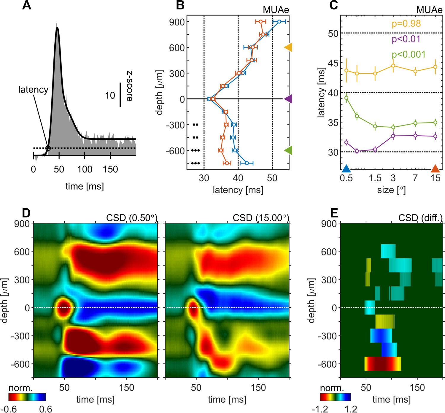
(A) Initial MUAe response used to derive response latencies across depths. The example is from the alignment channel of the experiment shown in Figure 1. (B) Depth-profiles of MUAe latency. Black dots indicate significant levels of latency differences (signed-rank test, •••: p < 0.0001, ••: p < 0.001, •: p < 0.01; FDR-corrected) between large (red, 15°) and small (blue, 0.5°) stimulus. (C) Size-tuning of MUAe latency for three laminar compartments (yellow: supragranular, purple: granular, green: infragranular). Latencies from supragranular and in infragranular layers were averaged across two adjacent channels (see triangles on depth in B). p-Values indicate size dependent differences in latency for the three contacts (ANOVA). (D) CSD depth-profile for a small (left, 0.5°) and a large (right, 15°) stimulus, averaged across experiments. Profile of each session was normalized to the amplitude of the early current sink in putative layer 4c (pos. peak at 0 µm between 40 and 70ms). (E) Depth-profile showing significant differences (large minus small) between the two depth-profiles in D (p < 0.05, cluster-mass-test).
Figure 2—figure supplement 1
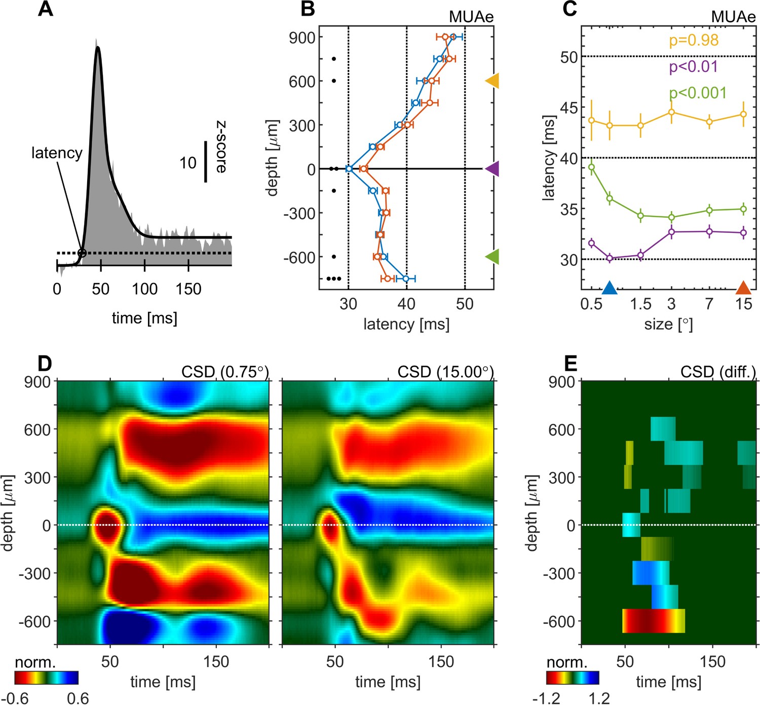
Centre surround effects on early responses of MUAe and CSD depth-profiles.
The figure is identical to Figure 2, except using the responses to a 0.75° stimulus as the ‘small’ stimulus response.
Figure 2—figure supplement 2
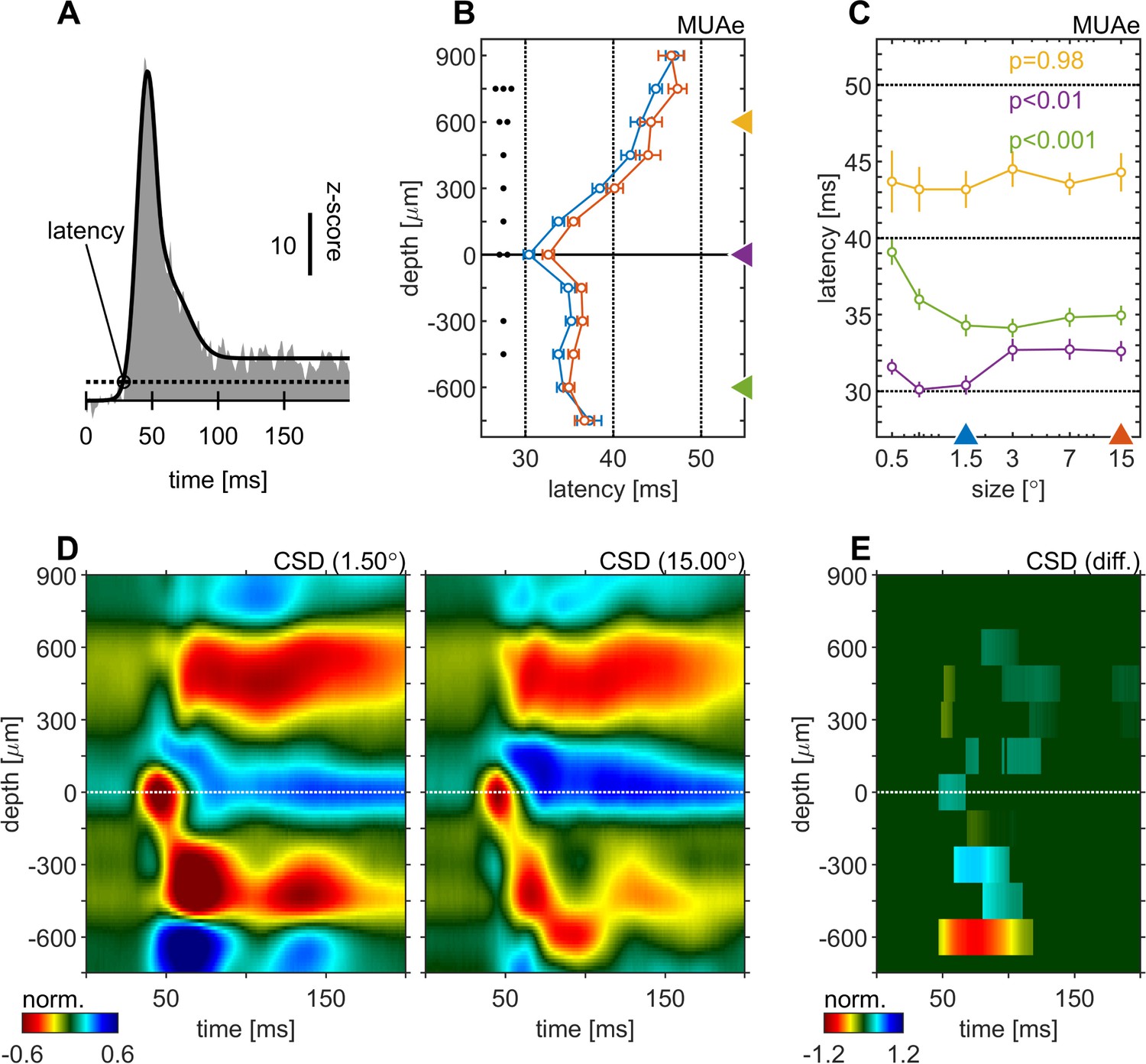
Centre surround effects on early responses of MUAe and CSD depth-profiles.
The figure is identical to Figure 2, except using the responses to a 1.5° stimulus as the ‘small’ stimulus response.
Figure 3
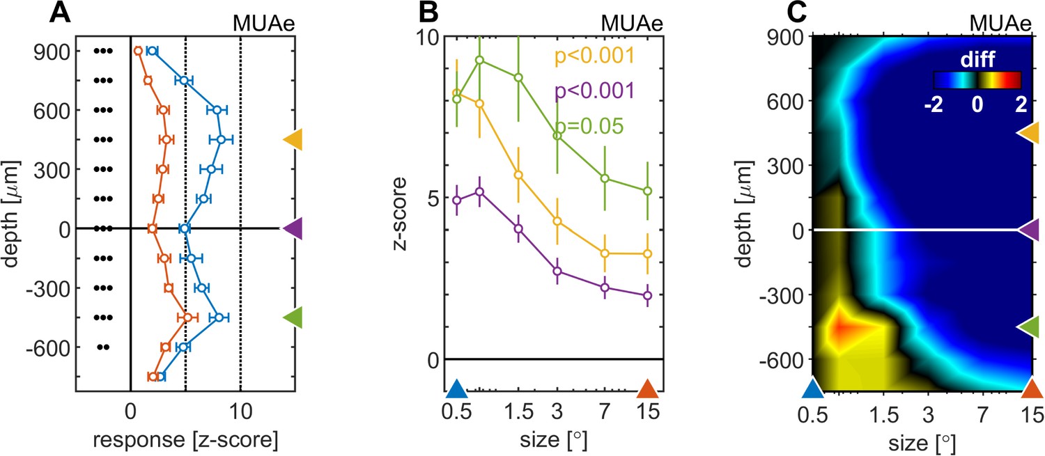
Centre surround effects on late/sustained (200–500ms) response properties of MUAe.
(A) Depth-profiles show average z-scores (normalized to spontaneous activity) across experiments and error bars represent the s.e.m. for two selected stimulus sizes. Grouped black dots indicate significant levels of signed-rank test (•••: p < 0.0001, ••: p < 0.001, •: p < 0.01; FDR-corrected) between small (0.5°, blue) and large (15°, red) stimulus diameter (B) Size-tuning and response-depth-profiles of MUAe data for all grating diameters and three laminar locations. Yellow, green, and purple lines/symbols refer to different depths in the supragranular ( + 450 µm), infragranular (–450 µm) and granular (alignment, 0 µm) regions. (C) Surface plot of the differences of MUAe z-score response relative to reference size 0.5°.
Figure 4 with 3 supplements

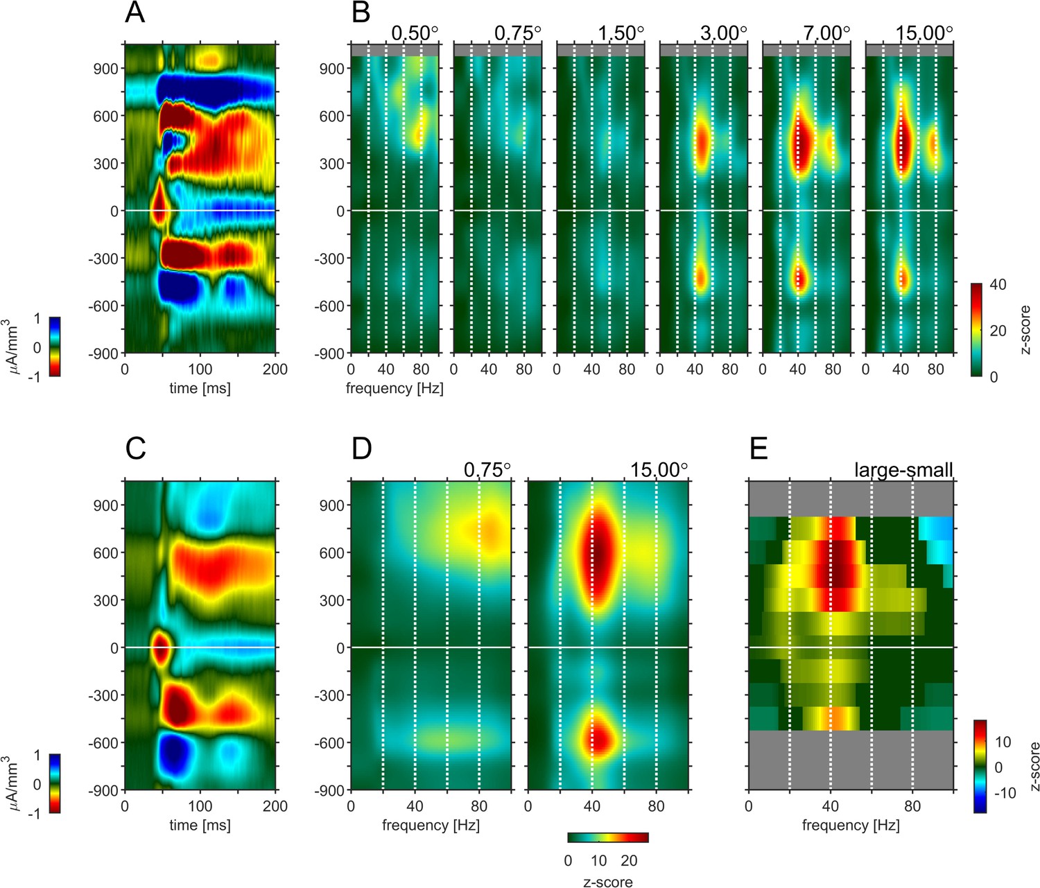
Depth-profile of spectral density for ‘small’ and ‘large’ stimuli.
(A) Depth profile of the CSD signal for a 0.5° grating in the example experiment (see Figure 1). (B) Depth-profile of LFPbp-spectral-density (normalized to spontaneous activity as z-score) for all six grating diameter in the example experiment. (C) Depth profile of the CSD signal for a 0.5° grating across all experiments (n = 24). (D) Depth-profile of LFPbp-spectral-density for ‘small’ (0.5°) and ‘large’ (7.0°) gratings across all experiments. (E) Depth-profile of the difference in spectral-density between ‘large’ and ‘small’ gratings. Warm and cold colors indicate increases and decreases with stimulus size. Gray color indicates cortical depths which were not covered by all of the n = 24 experiments. Dark green color indicates non-significant differences according to a ‘non-parametric cluster analysis’ or ‘cluster-mass-test’ (Bullmore et al., 1999; Maris and Oostenveld, 2007; Self et al., 2013).
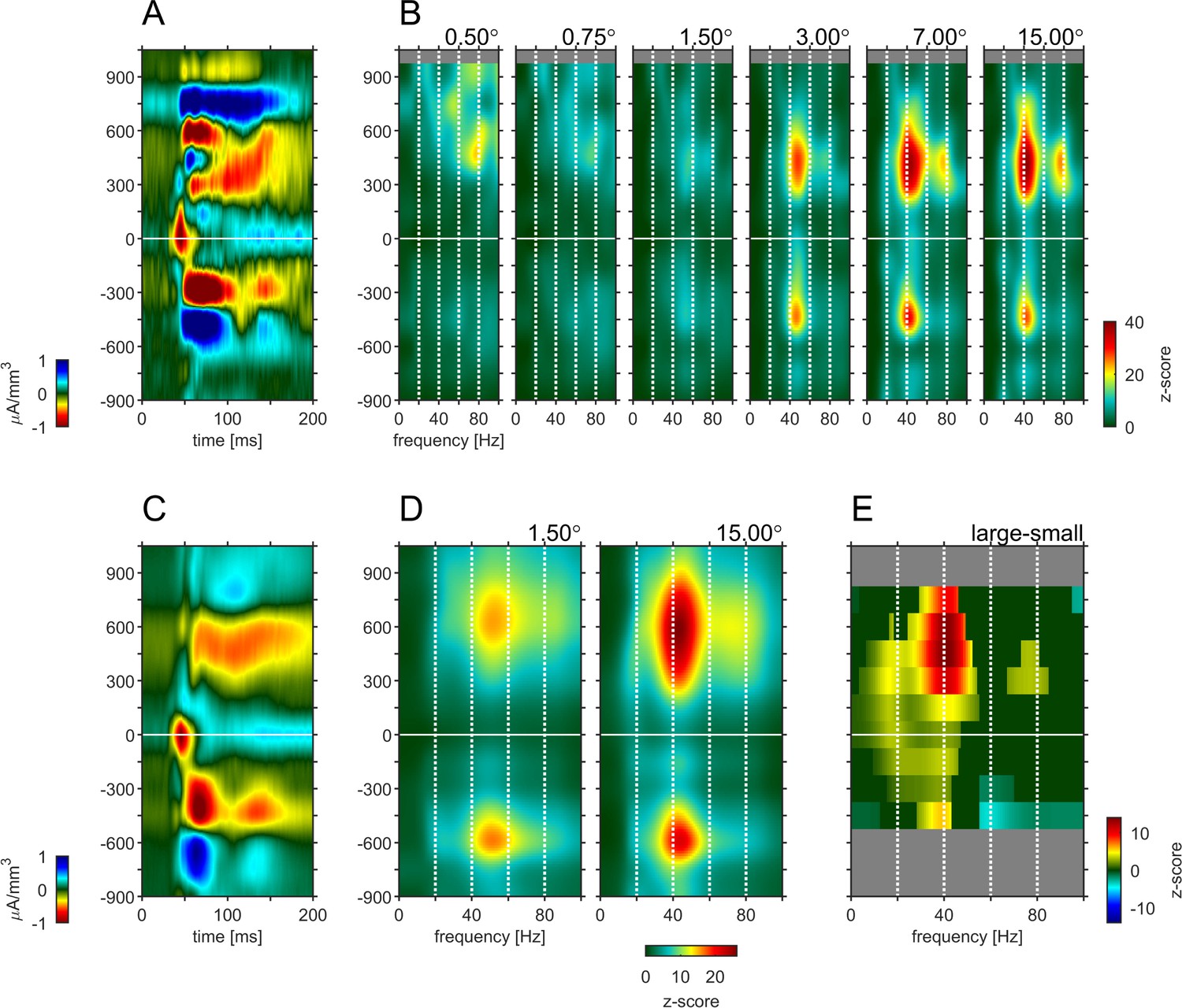
Figure 4—figure supplement 1
Depth-profile of spectral density for ‘small’ and ‘large’ stimuli.
The figure is identical to Figure 4, except using the responses to a 0.75° stimulus as the ‘small’ stimulus response.
Figure 4—figure supplement 2
Depth-profile of spectral density for ‘small’ and ‘large’ stimuli.
The figure is identical to Figure 4, except using the responses to a 1.50° stimulus as the ‘small’ stimulus response.
Figure 4—figure supplement 3

Average power spectrum at four representative depth positions relative to the alignment layer for each of the tested stimulus sizes.
(A) + 750 µm (B) + 450 µm (C) 0 µm (D) + 450 µm.
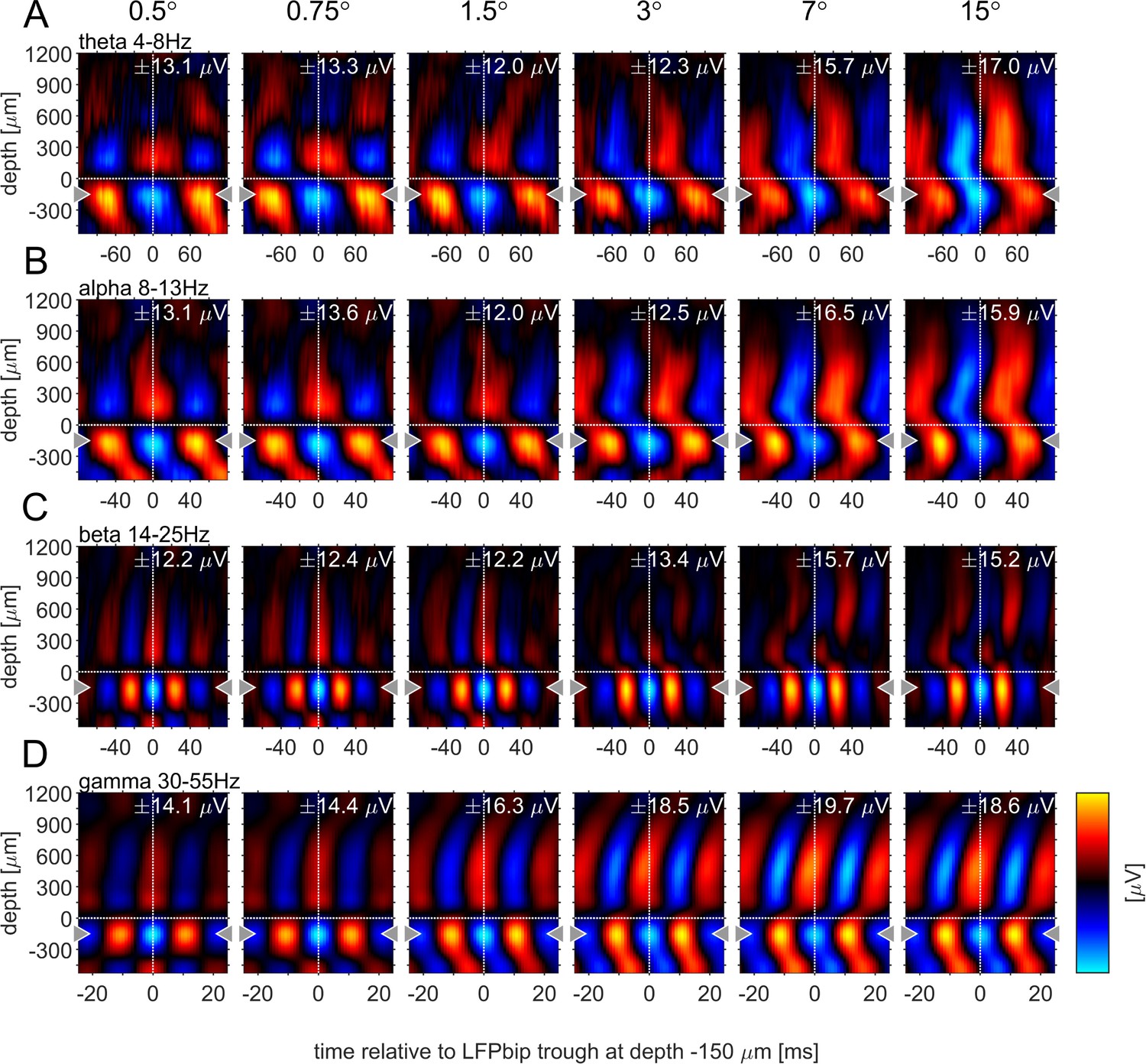
Figure 5

Centre surround effects on late/sustained (200–500ms) responses in 4 ‘classic’ frequency bands.
Panel rows show the analysis in four spectral bands, θ: 4–8 Hz (A–C), α: 8–13 Hz (D–F), β: 14–25 Hz (G–I), γ: 35–55 Hz (J–L). The first panel column (A, D, G, J) are response-depth-profiles of average power of LFPbp signal for small (0.5°, blue) and large (15°, red) stimuli. Grouped black dots indicate significant levels of signed-rank test (•••: p < 0.0001, ••: p < 0.001, •: p < 0.01; FDR-corrected). The second panel column (B, E, H, K) show size-tuning-curves of LFPbp spectra for all grating diameters and three laminar locations cherry-picked for each frequency band. Yellow, green and purple lines/symbols refer to depths in the supragranular, infragranular and granular (alignment, 0 µm) regions, respectively. The third panel column (C, F, I, L) shows color-map representations of the differences of LFPbp spectral response for each stimulus size relative to 0.5°.
Figure 6 with 5 supplements
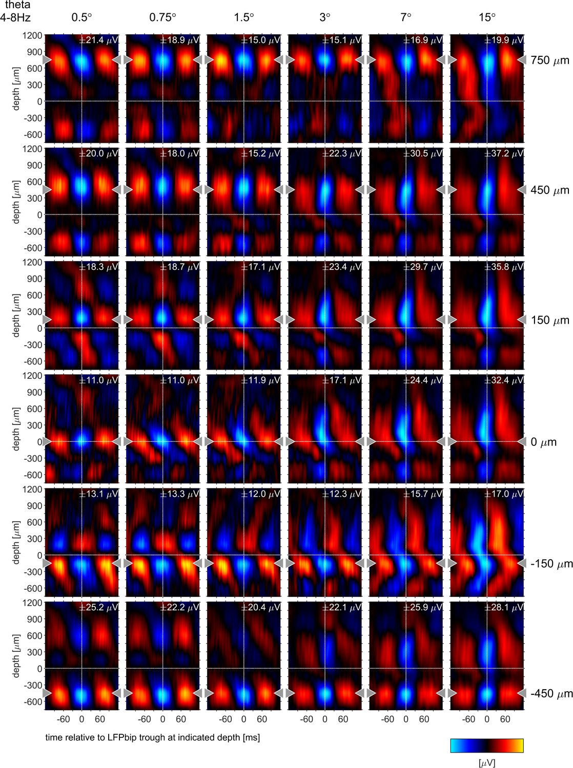
Phase-triggered-average (PTA) between cortical layers in four frequency bands.
Laminar profiles of cortical oscillations of the LFPbp triggered by the phase of the LFPbp at the reference contact at –150 µm (indicated by the gray triangle). (A) Trigger LFP θ-band filtered [4–8 Hz]. (B) Trigger LFP α-band filtered [8–13 Hz]. (C) Trigger LFP β-band filtered [14–25 Hz]. (D) Trigger LFP γ-band filtered [35–55 Hz]. Each plot shows the phase-coupling between the reference contact and all other contacts (−750–1200 µm) for the sustained response 200–500ms after stimulus onset. The color scaling (amplitude of the averaged LFPbp) is the same for all plots within a row. Blue color indicates a trough, red colors indicate a peak in the broadband LFPbp.
Figure 6—figure supplement 1
Phase-triggered-averages (PTA) of local LFPbp aligned to six different reference channels (top to bottom: 750, 450, 150,–150, –450 µm) for the θ frequency band [4–8 Hz], The figure follows the conventions set out by Figure 6 in the main text.
Figure 6—figure supplement 2

Phase-triggered-averages (PTA) of local LFPbp aligned to six different reference channels (top to bottom: 750, 450, 150, –150, –450 µm) for the α frequency band [8–13 Hz], The figure follows the conventions set out by Figure 6 in the main text.
Figure 6—figure supplement 3
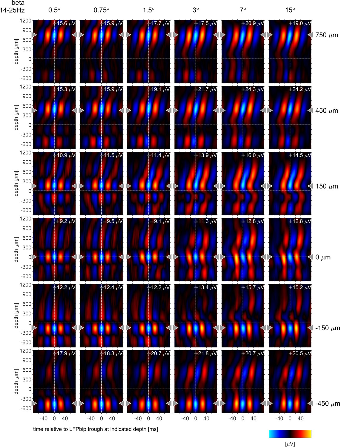
Phase-triggered-averages (PTA) of local LFPbp aligned to six different reference channels (top to bottom: 750, 450, 150,–150, –450 µm) for the β frequency band [14–25 Hz], The figure follows the conventions set out by Figure 6 in the main text.
Figure 6—figure supplement 4
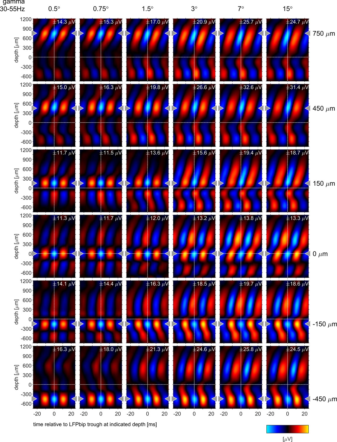
Phase-triggered-averages (PTA) of local LFPbp aligned to six different reference channels (top to bottom: 750, 450, 150,–150, –450 µm) for the γ frequency band [35–55 Hz], The figure follows the conventions set out by Figure 6 in the main text.
Figure 6—figure supplement 5

Phase-triggered-averages (PTA) for comparison to Figure 3 in van Kerkoerle et al., 2014.
The LFP (A,E,I,M), LFPcsd (B,F,J,N), LFPbip (C,G,K,O) and MUA (D,H,L,P) were aligned to the trough of the LFP alpha band (A–H) and LFP gamma band (I–P) at depth 0 (layer 4). The panel rows show PTAs for small stimuli (0.5°: A-D, I–L) and large stimuli (15°: E-H, M–P).
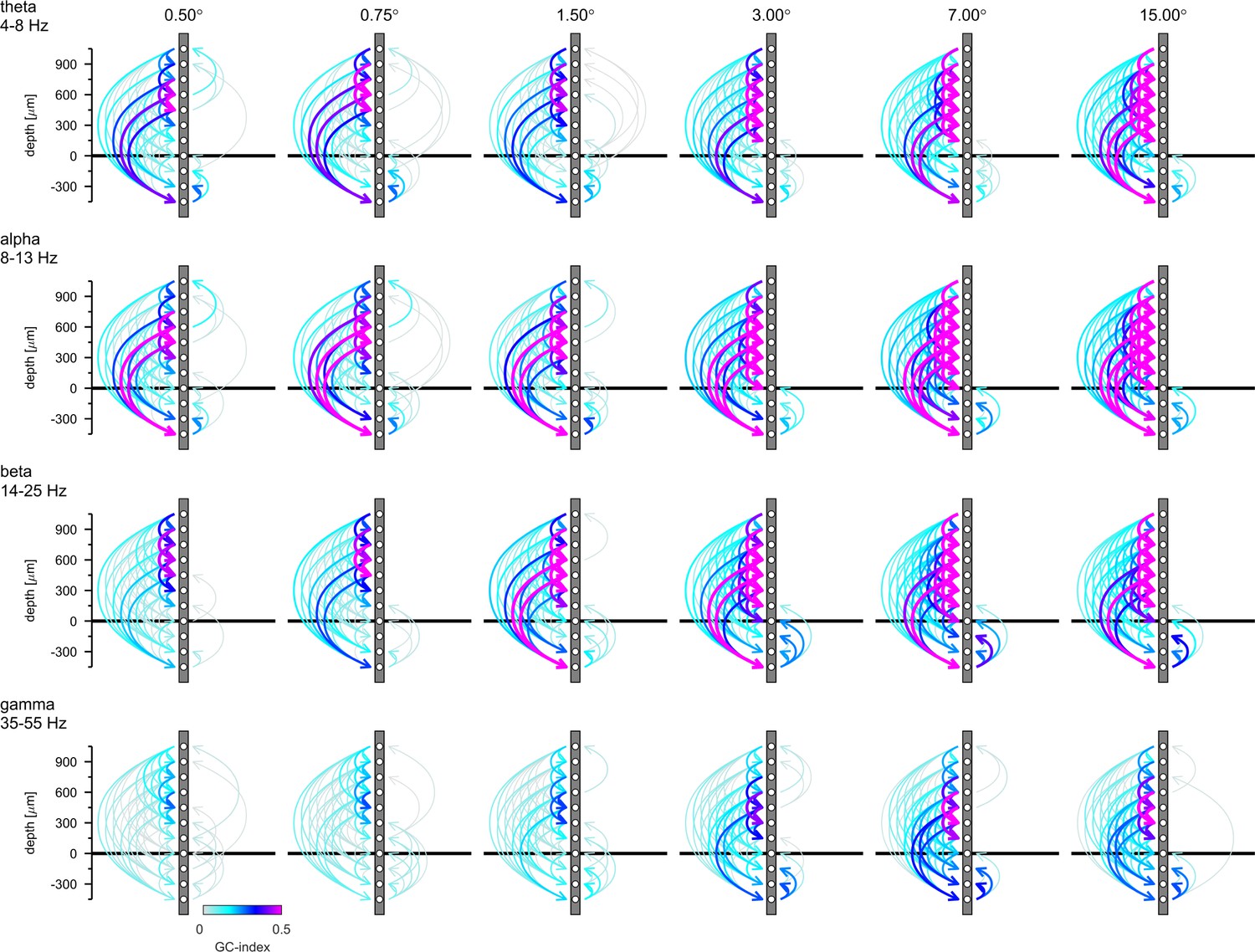
Figure 7 with 4 supplements
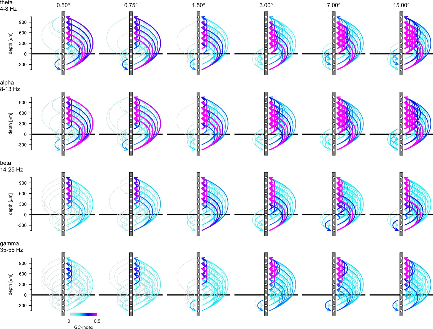
Granger-Causality (GC) analysis reveals directed coupling between cortical layers.
Causal-coupling pattern derived from non-conditional GC analysis in the frequency domain and tested with time-reversed GC analysis. GC-indices were integrated across the four classic frequency bands (top row: θ [4–8 Hz], second row: α [8–13 Hz], third row: β [14–25 Hz], bottom row: γ [35–55 Hz]). Each arrow indicates the dominant direction of causality between a given pair of contacts. The color represents the value of the difference between the GC-indices in each direction. Downward directions are plotted on the left, upward directions are plotted on the right of each profile.
Figure 7—figure supplement 1
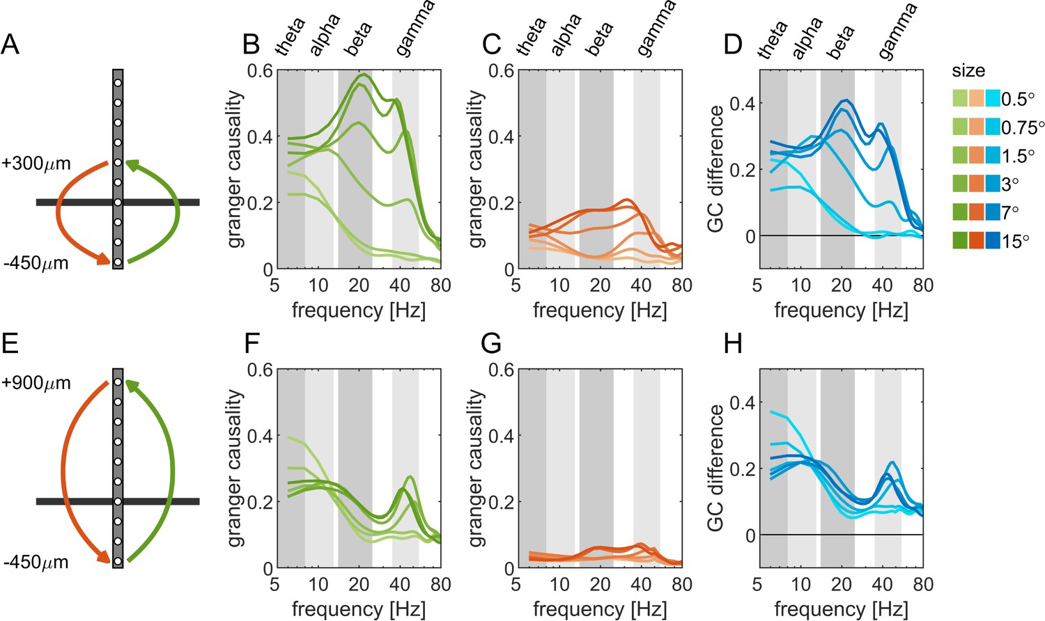
Spectral Granger-causality for selected connections between infragranular and supragranular layers.
(A, E) Diagram of the connections analyzed in panel B-D (−450–300 µm) and in panel G-I (−450–900 µm). (B, F) Spectral Granger-causality for the connections in upwards (infra- to supragranular, green) direction. (C, G) Spectral Granger-causality for the connections in downwards (infra- to supragranular, red) direction. (D, H) Net Granger-causality as the difference between the GC-indices of upwards and downwards direction (B-C and F-G, blue). The brightness of colors indicates the size of the stimulus (dark: large, light: small).
Figure 7—figure supplement 2

Connection plots of net Granger-causality in four frequency bands.
Conventions are the same as in Figure 7 in the main text. The figure shows the raw GC-indices without testing the directionality with the reverse-granger-test.
Figure 7—figure supplement 3
Connection plots of net Reverse Granger-causality in four frequency bands.
Conventions are the same as in Figure 7 in the main text, but the figure shows the results of the reverse-granger-test, that is the net Granger-causality calculated with time reversal.
Figure 7—figure supplement 4
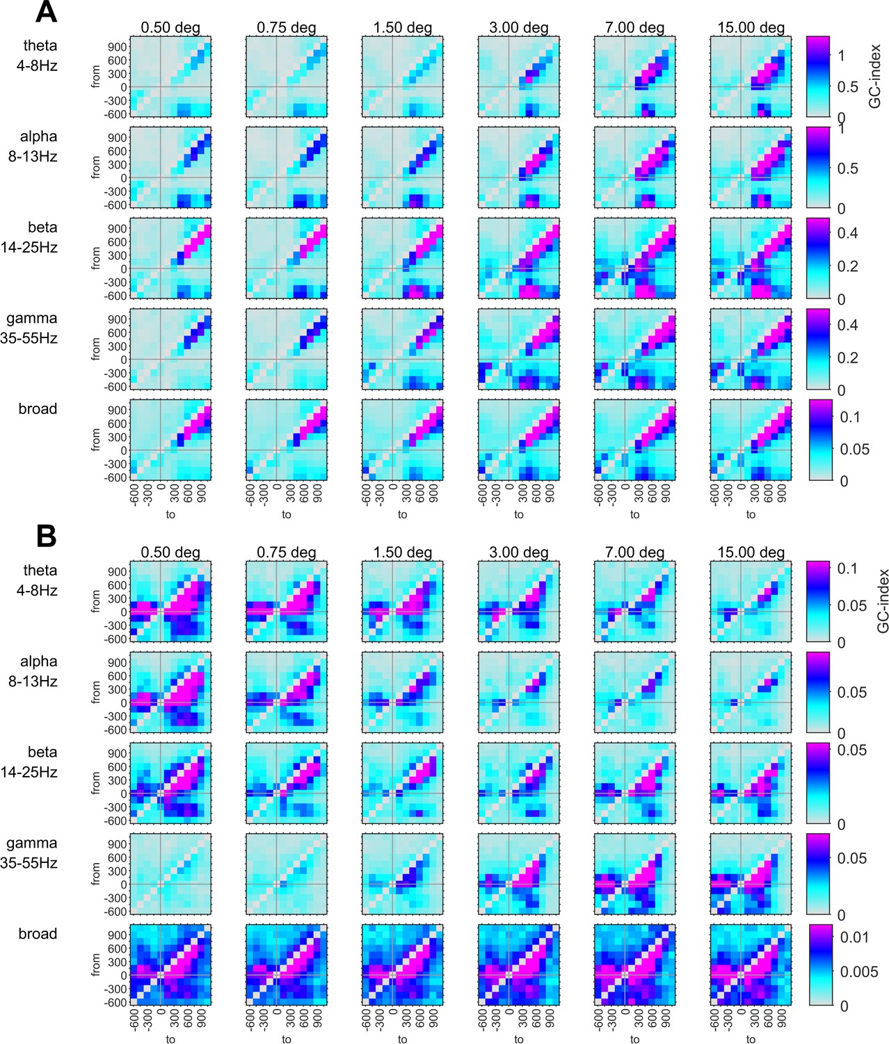
Comparison of Granger-causality indices for LFPbip and MUAe.
(A) Matrices of Granger-causality index for all possible connections for the LFPbip. Granger-causality indices that did not pass RGT are set to zero. (B) Same as in A but for MUAe.
Additional files
Download links
A two-part list of links to download the article, or parts of the article, in various formats.
Downloads (link to download the article as PDF)
Open citations (links to open the citations from this article in various online reference manager services)
Cite this article (links to download the citations from this article in formats compatible with various reference manager tools)
Stimulus dependence of directed information exchange between cortical layers in macaque V1
eLife 11:e62949.
https://doi.org/10.7554/eLife.62949


