Interplay between external inputs and recurrent dynamics during movement preparation and execution in a network model of motor cortex
Figures
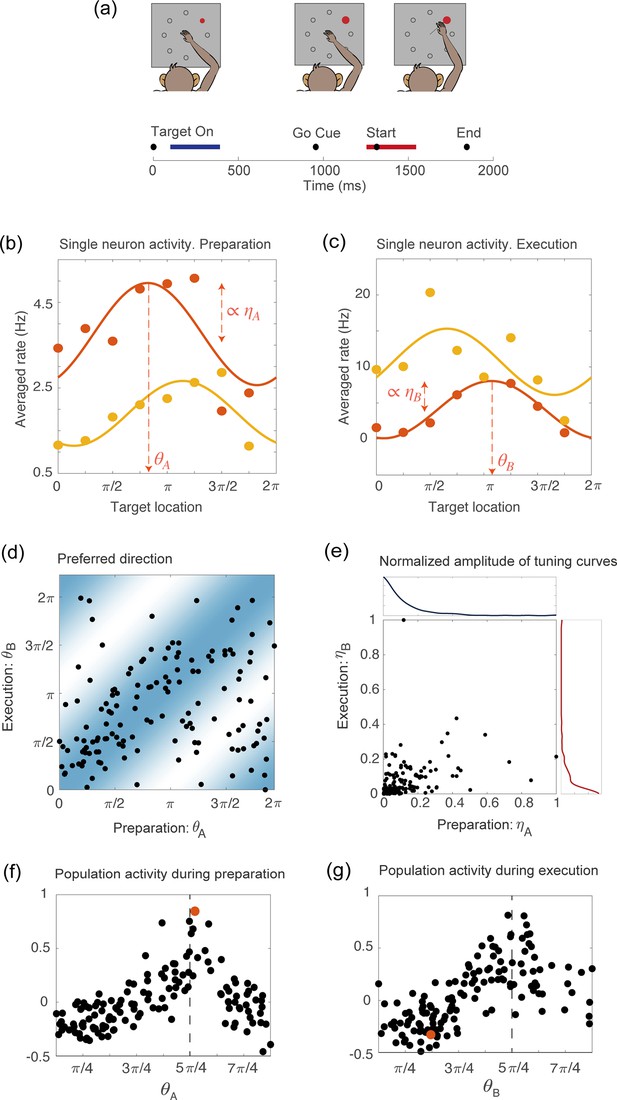
Tuning to the direction of motion during movement preparation and execution in a delayed reaching task.
(a) Schematic of the center-out delayed reaching task and definition of the preparatory (blue) and of the movement-related (red) epochs. Black circles represent the time of: target onset; go cue; start of movement; end of movement, averaged across trials. (b) Example of the trial averaged firing rate of two neurons during movement preparation as a function of the target location. Solid lines represent the corresponding cosine fit. For one example neuron, we show its preferred direction (), defined as the location of the peak of the cosine function; and its degree of participation (), which is proportional to the amplitude of the cosine function. (c) Same as in (a), but for the activity of the same neurons during movement execution. The preferred direction is denoted as and the degree of participation is . (d) Scatter plot of the preferred direction during execution () vs preparation () for all neurons; preferred directions are defined as the location of the peak of the cosine tuning functions (circular correlation coefficient ). The heat map represents the joint distribution over () inferred from the data (Equation 4). (e) Scatter plot of the normalized amplitude of the cosine tuning curve during execution () vs preparation () for all neurons (correlation coefficient ). Blue line: empirical distribution of from kernel density estimation; red line: empirical distribution of . (f–g) Trial averaged firing rate for all neurons during movement preparation as a function of (f) and (g), for the condition with target location , indicated by the dashed vertical line. The activity is normalized across condition for each neuron. The activity of one neuron chosen at random is indicated by the orange dots in panels f and g.
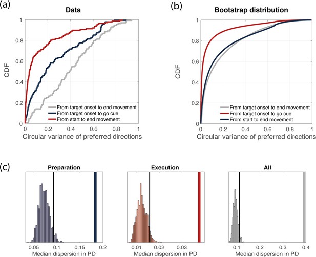
Variance of preferred directions across time.
(a) Cumulative density function of the circular variance of preferred directions. We binned time into time bins of length 160 ms, and computed neurons’ preferred directions in each time bin. We then considered the delay period only (3 time bins) and computed the circular variance of preferred directions across time bins, for each neuron. Its cumulative distribution is plot in blue. We repeated the same procedure for the movement-related epoch (3 time bins, red) and for the whole duration of the experiment (9 time bins, gray). (b) Bootstrap analysis (see Methods for details). Cumulative density function of the circular variance of preferred directions as in (a), but considering trials from the bootstrap distribution. (c) Thick line: median (across neurons) circular variance of preferred directions from data, for the delay period. Histogram: distribution of median circular variances of preferred directions from bootstrap samples, for the delay period. The dotted line represents the 95% quantile of the distribution.
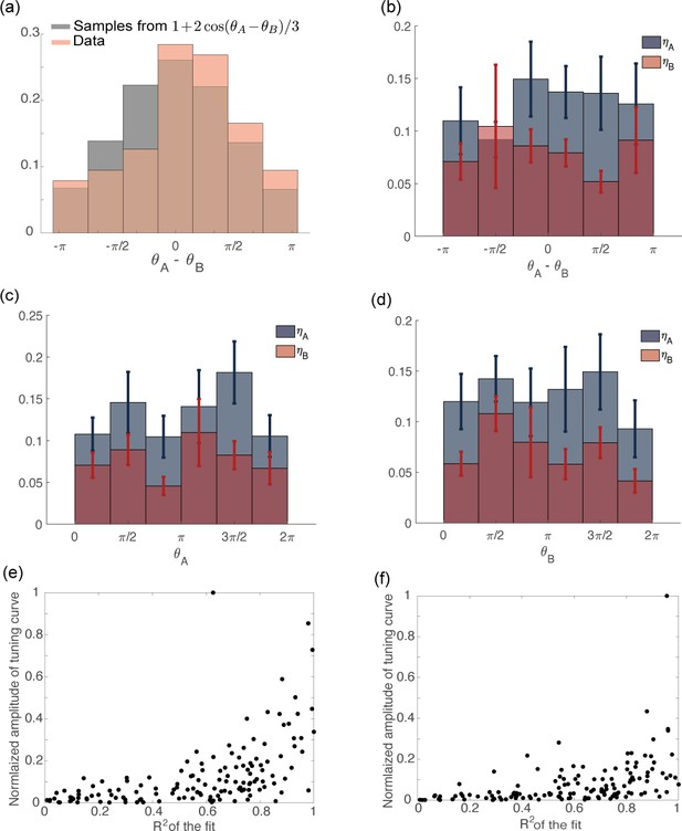
Distribution of tuning parameters from data.
(a) Distribution of computed from recorded data (orange) and data generated from the distribution: (gray). (b) Variables plotted as a function of . The circular correlation is (), for both and . (c) Variables plotted as a function of . The circular correlation is () for and () for . (d) Variables plotted as a function of . The circular correlation is () for and () for . (e) Scatter plot of the amplitude of a cosine function fitted to the tuning curve of the preparatory activity vs the coefficient of the fit. The neurons with larger tuning amplitude are the ones with higher . (f) Same as in (c) but for movement-related activity.
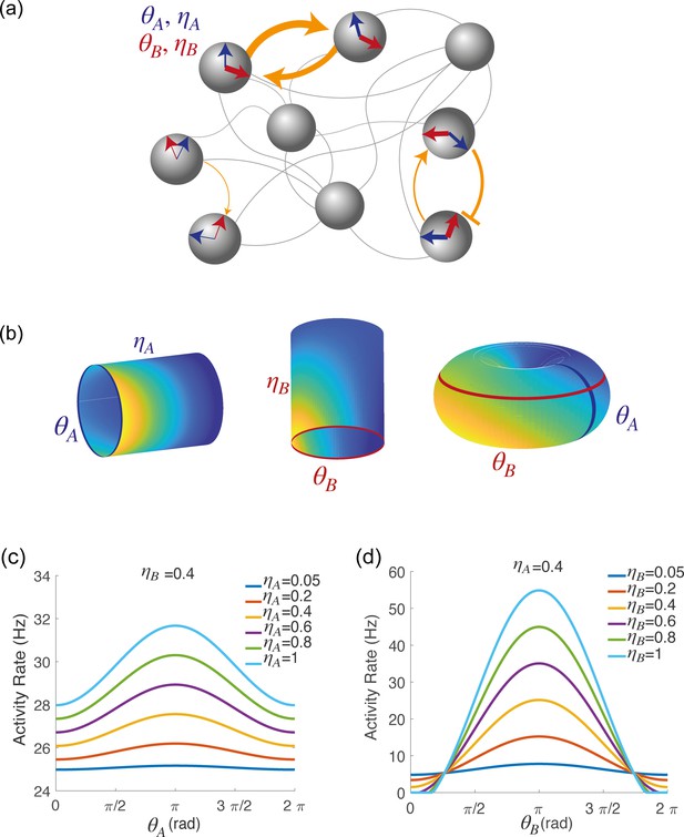
Spatially localized activity of the network model.
(a) Schematic depiction of the network model. Each shaded disk corresponds to one unit in the network. The direction of the blue and red arrows within each disk represents the neurons preferred direction during preparatory () and execution () epochs, respectively, while the thickness of the arrows represents the degree of participation () in these epochs. The orange arrows show the strength of synaptic connectivity (defined by equation 5) between units. It contains both a symmetric component, that depends on the distance between preferred directions of pre and post-synaptic neurons separately for the two epochs (see strong connections between the two top left neurons), and an asymmetric component that depends on the distance between the preferred preparatory direction of the pre-synaptic neuron and the preferred execution direction of the post-synaptic one (see connections between bottom right neurons). (b) Spatially localized activity of the network at a given time , shown in three different 2-dimensional subspaces of the 4-dimensional selectivity space. Left: activity plotted on map A () at fixed . Center: activity plotted on map B () at fixed . Right: activity plotted as a function of , at fixed . (c) Network activity at a given time , plotted as a function of , at fixed and for different values of . (d) Network activity at a given time , plotted as a function of , at fixed and for different values of .
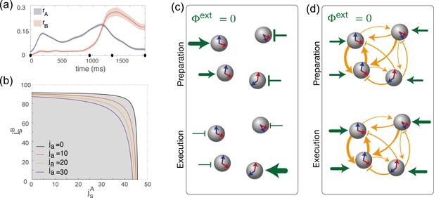
Dynamics of the order parameters and phase diagram of the model.
(a) Dynamics of the order parameters (degree of spatial modulation of the activity in map A) and (degree of spatial modulation in map B) computed from data (solid line; shaded area: ± SEM across trials). Black dots on the x-axis represent the trial-averaged time of: target onset, go cue, start of movement and end of movement. (b) Phase diagram of the model, shown as a function of the parameters , that describe how strongly maps A and B are embedded in recurrent synaptic connectivity. Different curves correspond to bifurcation lines for different values of the parameter ja, modulating the asymmetric term in synaptic connectivity. The area underneath each line (gray) corresponds to the homogeneous phase; the area beyond each line (white) corresponds to the phase where the network exhibit a localized activity pattern even in absence of tuned external inputs. (c) Weak coupling scenario: Here, the observed dynamics of the order parameters results from external inputs that are tuned to during movement preparation and to during movement execution. (d) Strong coupling scenario: Here, strong recurrent connections sustain the localized pattern of activity; a change in untuned external inputs makes the activity to be localized along map A during preparation, and along map B during preparation.
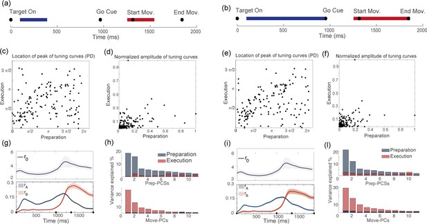
Results are independent on chosen duration of preparatory and movement-related epochs.
For two different definitions of the preparatory (blue segment) and movement-related (red segment) epochs: (a) vs (b), we show the corresponding distributions of : (c) vs (e); the distributions of : (d) vs (f); the dynamics of the order parameters: (g) vs (i); and the results of the PCA analysis: (h) vs (l).
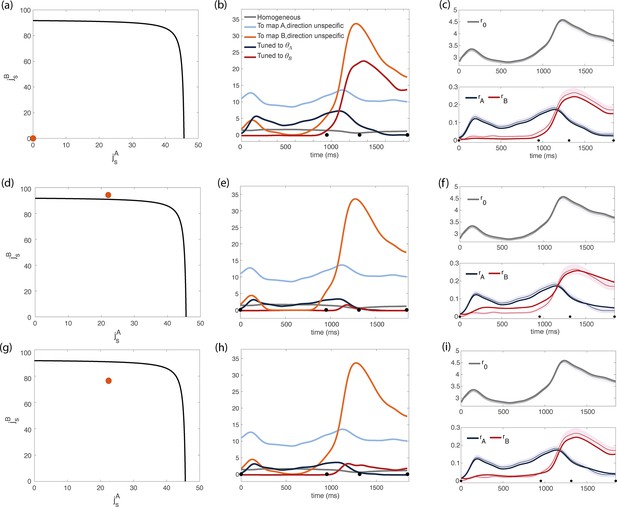
Inferred dynamics of the external currents required to sustain the observed dynamics of the order parameters for different sets of couplings parameters .
(a–c) Scenario where neurons are connected by uniform inhibitory connections, in the absence of direction-specific couplings. (a) Couplings parameters are set to zero (orange dot on the phase diagram). The black line represents the bifurcation surface in the space , at . (b) Dynamics of the external inputs inferred from the data. Gray line: homogeneous (untuned) input; light blue/red line: input that is specific to map A/B, but untuned to direction; input that is directionally tuned, and specific to map A/B. Black dots on the x-axes represent the trial-averaged time of: target onset, go cue, start of movement and end of movement. (c) Dynamics of the order parameters computed from data (thin line; shaded area: ± SEM across trials) and model (thick line). (d-i) Both couplings parameters and external inputs are inferred from data. (d) Solution where the coupling parameters are slightly above the bifurcation line (). (d) Dynamics of the external inputs inferred from the data. Note that tuned inputs are drastically lower than in b, especially during movement execution. (f) Dynamics of the order parameters computed from data (thin line) and model (thick line). (g) Solution where the coupling parameters are below but close to the bifurcation line (see Figure 4—figure supplement 1, ). (h) Dynamics of the external inputs inferred from the data. (i) Dynamics of the order parameters computed from data (thin line) and model (thick line).
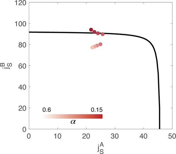
Value of the couplings parameters inferred from data, through minimization of a cost function composed of two terms: .
represents the reconstruction error of the order parameters, while is the magnitude of the external inputs required to sustain the activity. is an hyperparameter of the fitting algorithm. Different colors correspond to the result of using a different value of the hyperparameter in the cost function. The black line represents the bifurcation surface in the space , at .
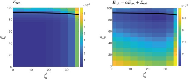
Reconstruction error vs cost function.
Left: Reconstruction error computed at different values of and , for . The reconstruction error quantifies the squared difference between the dynamics of the order parameters computed from data and the one predicted by the model for a given value of coupling parameters and . In a large region of the space, the reconstruction error has the same value. Right: Example of the cost function , for a given value of the hyperparameter , yielding one of the solutions of Figure 4—figure supplement 1.

Analysis based on data recorded from monkey Rj.
(a) Couplings parameters inferred from data; different points correspond to solutions for different values of the hyperparameter of the fitting procedure. The black line represents the bifurcation surface in the space , at . (b) Dynamics of the external inputs inferred from data. (c) Dynamics of the order parameters (solid line: data, shaded area: ± standard error across the population; dotted line: analytical prediction).
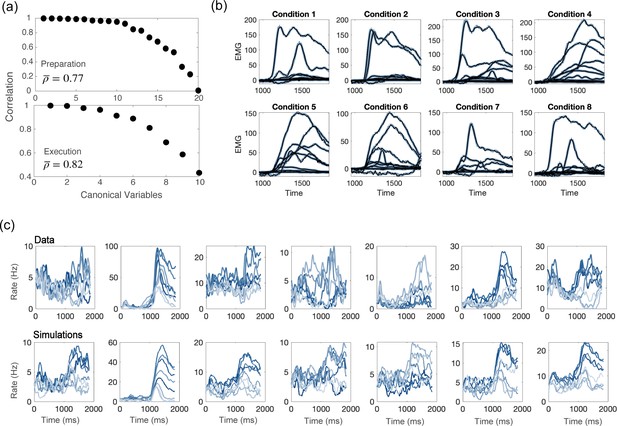
Comparisons between model and data, for parameters of Figure 4d.
(a) CCA analysis to compare the population activity from simulations and from recordings. First, we projected the activity onto the PCA dimensions that captured 90% of the activity variance, for both the data and the simulations; then, we applied CCA to look for common patterns in the activity matrices from data and simulations. Top: canonical correlations, activity during preparation. Bottom: canonical correlations, activity during execution. (b) Blue lines: electromyographic (EMG) signals from 13 muscles, recorded during a center-out reaching movement. Each panel corresponds to a different condition (location of the target on the screen). Black lines: patterns of muscle activity predicted by a linear readout of the activity of 1000 units drawn at random from the 16000 units in the network model (cross- validated NMSE = 0.0066). (c) For each neuron in the data, we chose the corresponding one from simulations with the closest value of parameters . Top row: examples of trial averaged activity from data; bottom row: corresponding neurons from simulations. Different shades of blue correspond to the 8 different conditions.
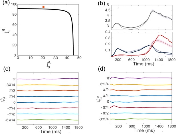
Dynamics of the order parameters from simulations, for the coupling parameters indicated in red in panel (a), above but close to the bifurcation line.
(b) Dynamics of the order parameters computed from data (thin line; shaded area: ± SEM across trials) and numerical simulations (thick line) of the dynamics of a finite-size network model with additive noise. (c) Location of the bump of activity in map from trial-averaged activity from simulations, for 8 conditions corresponding to different locations of the target on the screen. (d) Location of the bump of activity in map .
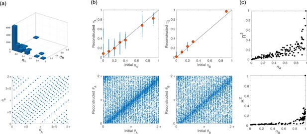
Network architecture for simulations.
(a) To build the network architecture, we assigned to 16,000 neurons coordinates (top) and (bottom) drawn from their respective empirical distribution. (b) Scatter plot of the coordinates initially assigned to the neurons (x-axes) vs the corresponding variables that we computed from simulations of the network activity during the preparatory and movement-related epochs (y-axes). Points clustered on the diagonal show self-consistency of the model. (c) coefficient of the cosine fit for tuning curves computed from simulation during preparation (top) and execution (bottom) as a function of and , respectively.
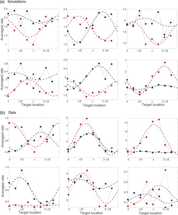
Examples of tuning curves during the preparatory (blue) and movement-related (red) epochs computed from simulations (a) and from data (b).
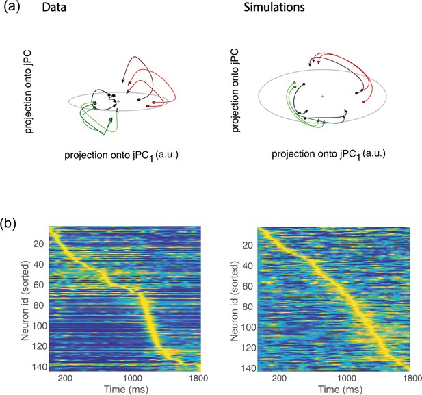
Rotational dynamics and sequential activity.
(a) Left. Trial-averaged activity rates during movement execution (from before the start of the movement, to after the start of the movement) projected onto the first two jPCA dimensions, defined as in Churchland et al., 2012. In order to compare the data to the theory, we averaged the activity of all trials corresponding to the same condition – defining 8 groups (each denoted in a different color) corresponding to the 8 different conditions. However, hand kinematics corresponding to the activity within the same group can differ quite substantially, even if they end up at the same target location. This is a major difference with respect to the analysis of Churchland et al., 2012, where many more groups were defined, each group containing the activity corresponding to very similar hand trajectories. Right. Same as in a, but for activity from simulations. (b) Activity rates averaged across trials for condition 1, and z-scored across time, from data (left) and simulations (right). Neurons are sorted according to the time of the peak of activity.
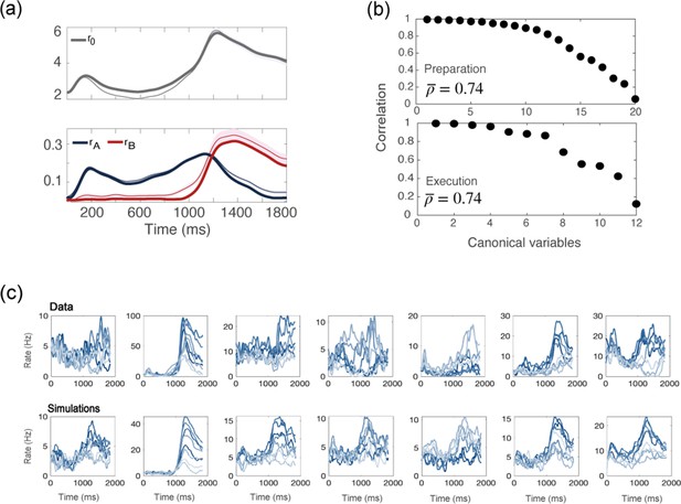
Simulations of a network with no recurrent connections.
(a) computed from data (thin line; shaded area: ± SEM of the population) and numerical simulations (thick line). (b) CCA analysis to compare the population activity from simulations and from recordings. Top: canonical correlations, activity during preparation. Bottom: canonical correlations, activity during execution. (c) For each neuron in the data, we chose the corresponding one from simulations with the closest value of parameters . Top row: examples of trial averaged activity from data; bottom row: their corresponding neurons from simulations. Different colors correspond to the 8 different conditions.

Orthogonality of the preparatory and movement-related subspaces.
(a) Percentage of variance of the preparatory (blue) and movement-related (red) activity from data explained by the first 11 principal components calculated from preparatory (top) and movement-related (bottom) trial-averaged activity. (b) As in a, activity from simulations. (c) The alignment index quantifies the degree of orthogonality between two subspaces. Top: alignment index between the preparatory and movement-related activities computed from data, compared to the randomized test (random alignment index, distribution in light gray and average in dark grey). Bottom: alignment index computed from simulations.
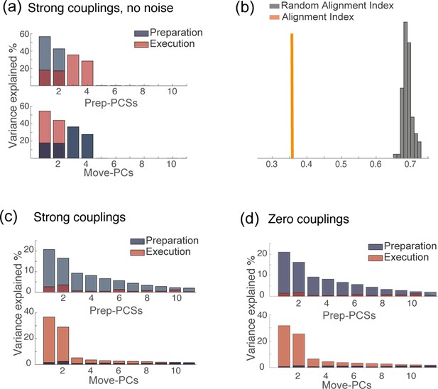
PCA analysis of network dynamics in various conditions.
(a) PCA analysis on the results of simulations for the solution of Figure 4d. (strong couplings) when no noise is added to the dynamics. (b) Alignment index quantifying the degree of orthogonality between the preparatory and movement-related subspaces from simulations, for the same solution as in a: strong couplings, no noise added to the dynamics. In absence of noise, the dynamics is confined onto a four-dimensional space; the random alignment index quantifies the alignment between two two-dimensional subspaces drawn at random within the four-dimensional space occupied by neural activity. Note that the alignment index is significantly smaller than the random test. (c) PCA analysis on the results of simulations for the solution of Figure 4d. (strong couplings) and (d) of Figure 4a (zero couplings).
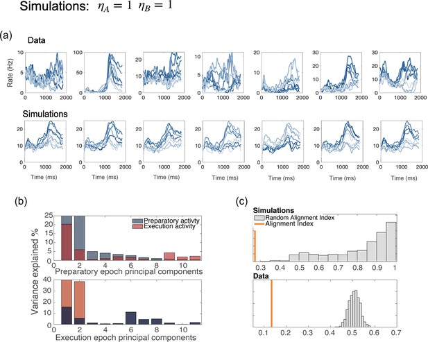
Network with uniform degrees of tuning, for all neurons.
(a) Examples of trial averaged activity from data (top panel) and simulations (bottom panel). Simulations of a model without generate dynamics that is identical for all neurons with the same preferred direction – a part from the noise terms; this also yields tuning curves that have the same shape for all neurons. (b) PCA analysis and (c) alignment index computed from the results of simulations with . The preparatory and movement-related subspace overlap more than in the data.


