Synthetic eco-evolutionary dynamics in simple molecular environment
- Dipartimento di Biotecnologie Mediche e Medicina Traslazionale, Università degli Studi di Milano, Via Fratelli Cervi, Italy
- Dipartimento di Fisica e Astronomia, Università degli Studi di Padova, Italy
- Department of Biomedical Sciences, Humanitas University, Via Rita Levi Montalcini, Italy
- IRCCS, Humanitas Clinical and Research Center, Italy
Figures
Figure 1 with 2 supplements
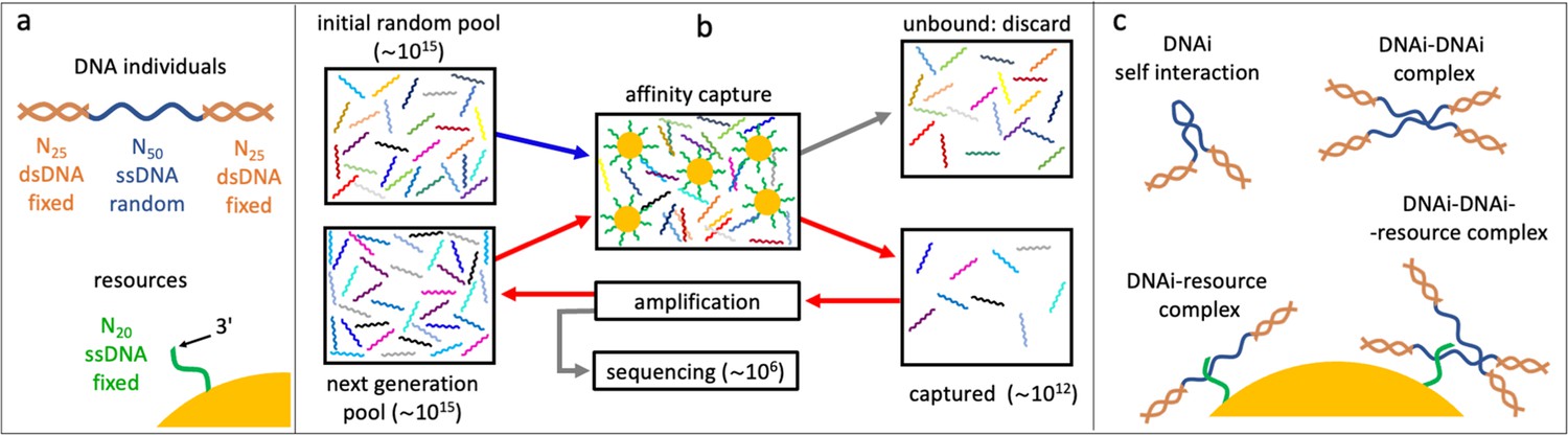
Affinity-based DNA synthetic evolution (ADSE).
(a) Structure of the DNA oligomers participating in ADSE as individuals (DNAi) and target resources. (b) Steps in the ADSE. The process starts with a random-sequence DNAi population. The capture by magnetic bead-conjugated resources provides the selection: bead-bound DNAi are amplified to form the new generation, a small fraction of which is sequenced by massive parallel sequencing. The rest of the original solution is discarded. Red arrows mark the steps of each ADSE cycle. (c) Possible interaction motifs involving DNAi. The online version of this article includes the following figure supplements.
Figure 1—figure supplement 1
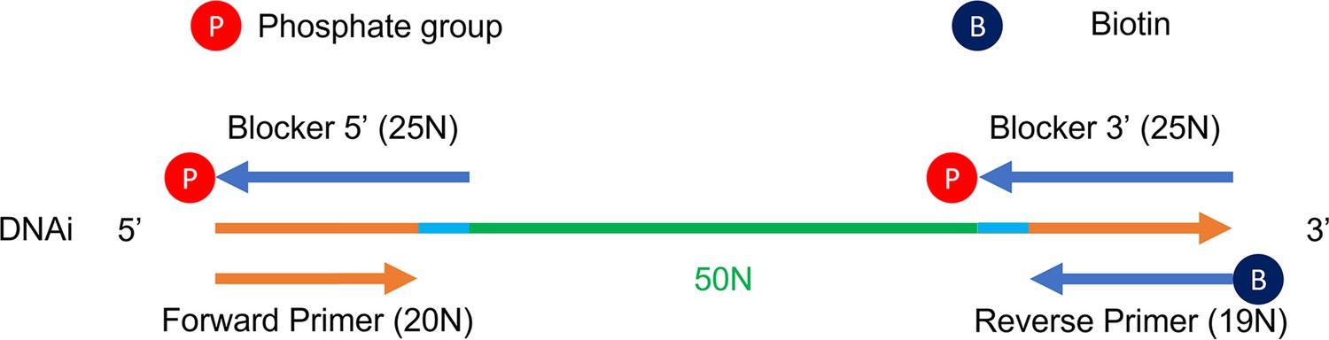
Detailed structure of DNA individuals.
Figure 1—figure supplement 2
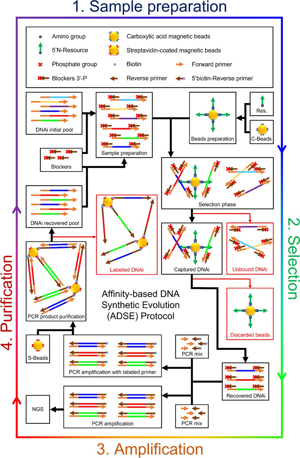
Detailed scheme of the affinity-based DNA synthetic evolution protocol.
Figure 2 with 9 supplements
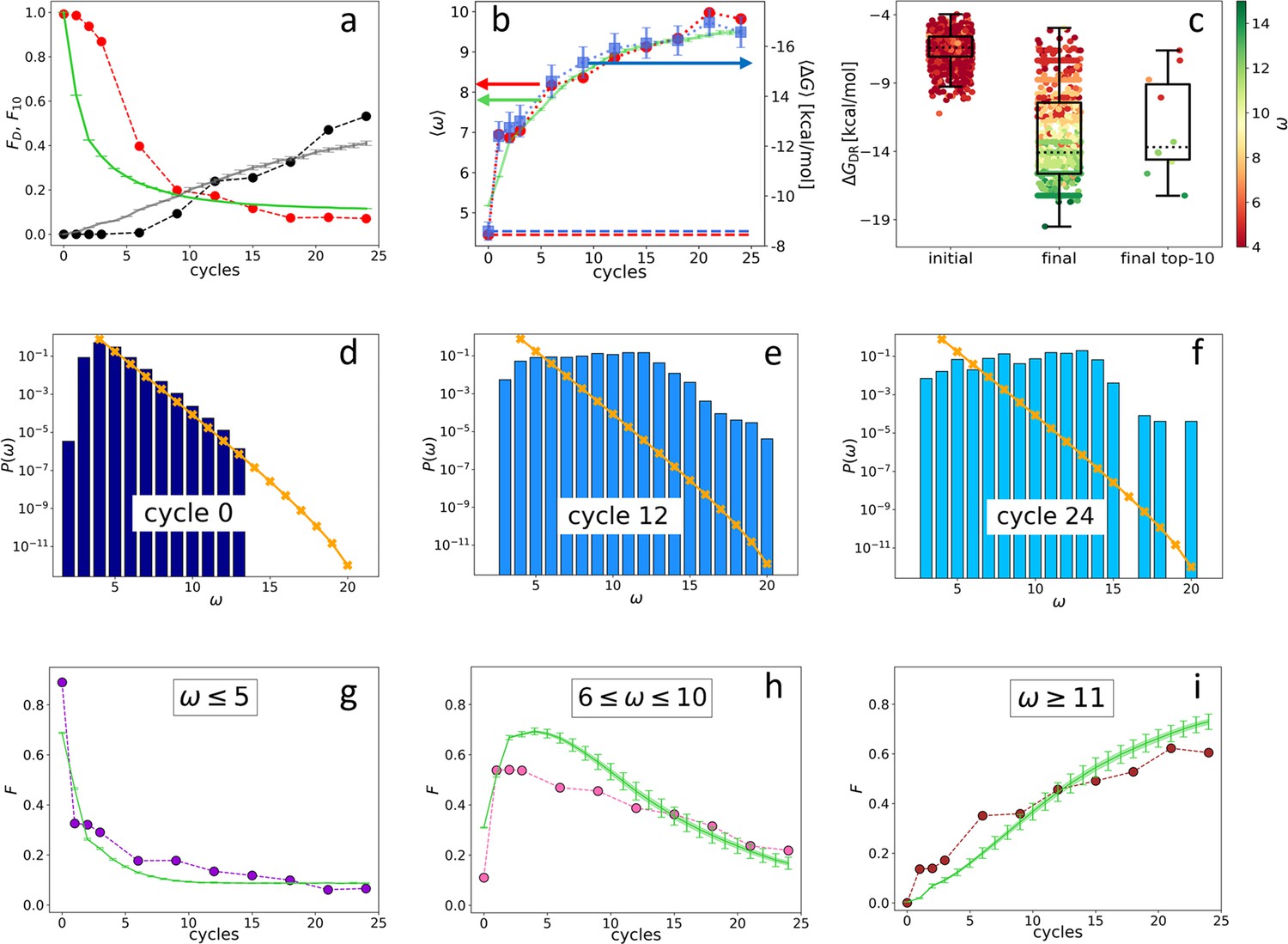
Evolution of the DNA individuals (DNAi) population (Oligo1 data).
Time is expressed in affinity-based DNA synthetic evolution (ADSE) cycles. (a) Fraction of the total population formed by different sequences obtained from the experiment (red dots) and computed with the individual-based eco-evolutionary (IBEE) model (green line), fraction of the total population formed by the 10 most abundant sequences (experimental: black dots, IBEE model: gray line). (b) computed on the whole population in each generation (red dots, left-hand side y-axis); computed on a sample of 1000 randomly chosen DNAi from the population in each generation (blue dots, right-hand side y-axis); data fitting with the IBEE model (green line, left-hand side y-axis). The left and right y-axes were scaled so that and computed on a pool of random-sequence DNAi would coincide (dashed blue and red lines, respectively). (c) Boxplots and scatter plots of in ensembles of 1000 random sequences (left), 1000 randomly chosen DNAi extracted from the experimental population at cycle 24 (middle) and from the top 10 most populous DNAi at the same cycle (right). The color code is assigned to each point based on its value (color bar). (d–f) Probability distributions for cycles 0 (d), 12 (e), and 24 (f). In the latter histogram, empty bins result from subsampling. Orange points and lines are the distributions evaluated with the null model. (g–i) Evolution of the abundance (expressed as fraction of the total population ) of sequences whose is small ( - panel g), medium ( - panel h) and large ( - panel i) as obtained from the experiments (dots) and with the IBEE model (green lines). The model results are averages over 20 simulations. The online version of this article includes the following figure supplements.
Figure 2—figure supplement 1
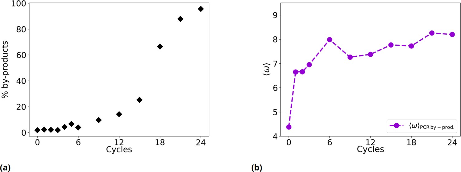
Time evolution of the fraction of PCR by-products and of their .
(a) % of by-products as a function of the evolutionary cycles in the Oligo1 experiment. (b) Evolution of considering only PCR by-products.
Figure 2—figure supplement 2
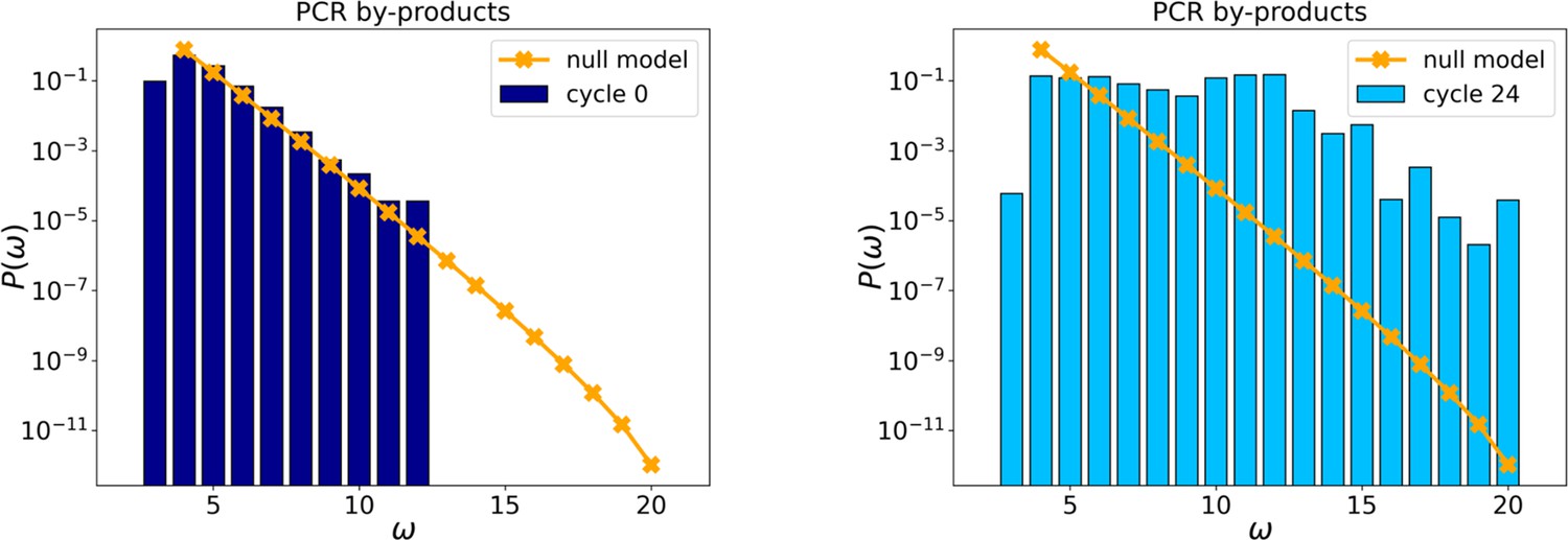
Probability distributions of PCR by-products at cycles 0 and 24.
The orange points and line are the distributions evaluated with the null model.
Figure 2—figure supplement 3
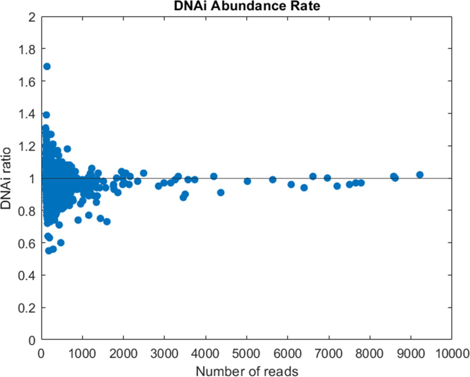
Compared abundance of DNA individual (DNAi) populations between two sequencing replicates of the same library (cycle 9 of Oligo1).
The ratio is computed between the number of reads of each DNA species shared by the two sequencing runs after normalization for the total number of reads.
Figure 2—figure supplement 4
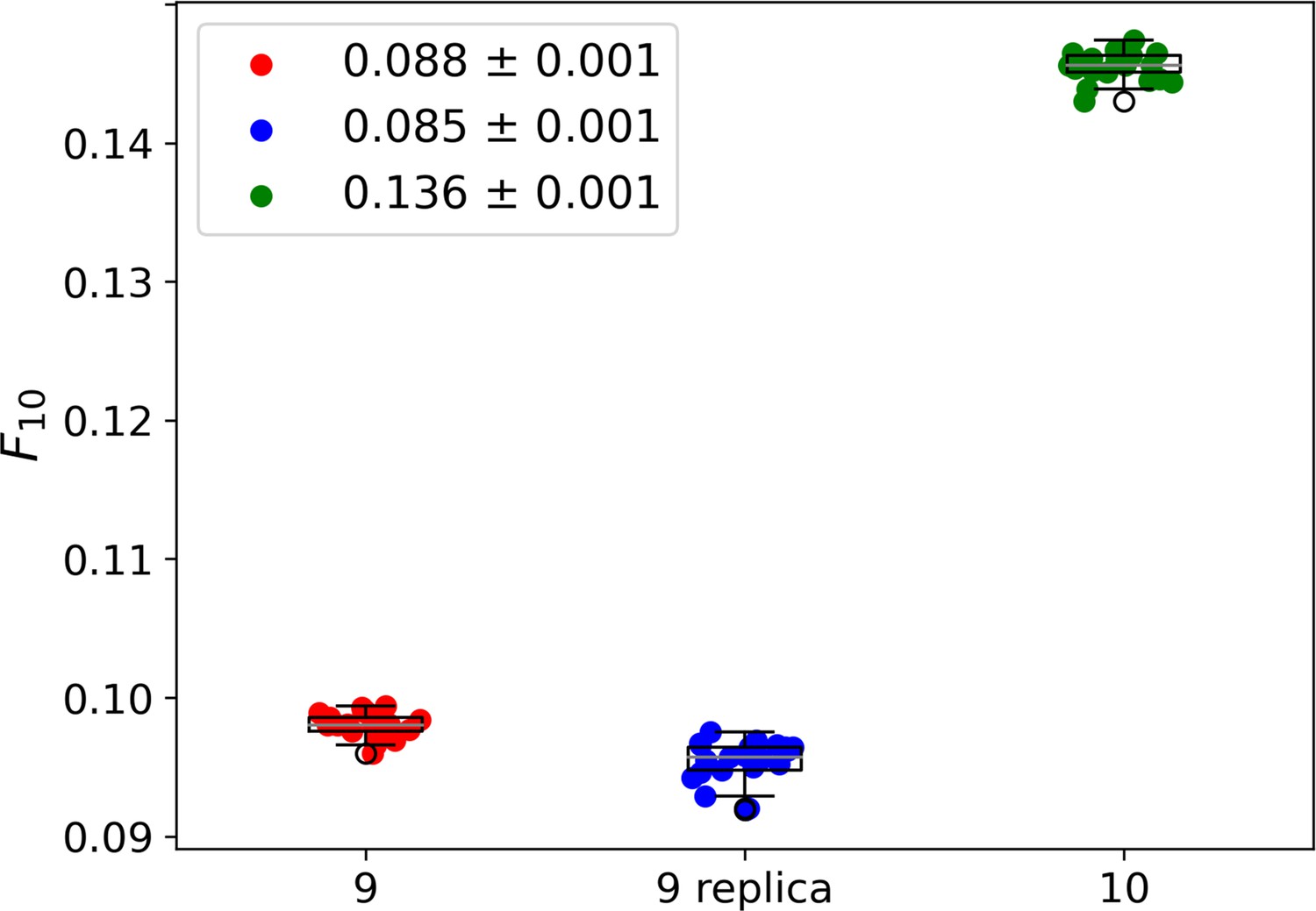
Whisker plots showing the fraction of 10 most abundant individuals for cycle 9 (red), cycle 9 replica (blue), and cycle 10 (green).
For each dataset, every data point represents 1 out of 20 samples of 4 × 10⁵ sequences. To compare the three systems we extracted from each the fraction of the population formed by the 10 most abundant species, . The legend reports the average the standard deviation σ (among the 20 subsamples) for each group of data points. This analysis leads to an average of 8.8–0.1% of the population for cycle 9 (red dots), of 8.5–0.1% for cycle 9 replica (blue dots), and of 13.6–0.1% for cycle 10 (green dots). Cycle 9 and cycle 9 replica are statistically compatible within 3σ. The similarity between cycle 9 and cycle 9 replica and the marked difference between cycle 9 replica and cycle 10 indicate that the relevant part of the selection is indeed performed by the resource-binding mechanism, while drifts induced by PCR play a secondary role. As a further check, we compared the specific sequences across the 20 samples in cycle 9 and cycle 9 replica datasets and found that the 10 most abundant sequences are almost always the same. In particular, the first 8/9 are always the same, possibly shuffled.
Figure 2—figure supplement 5
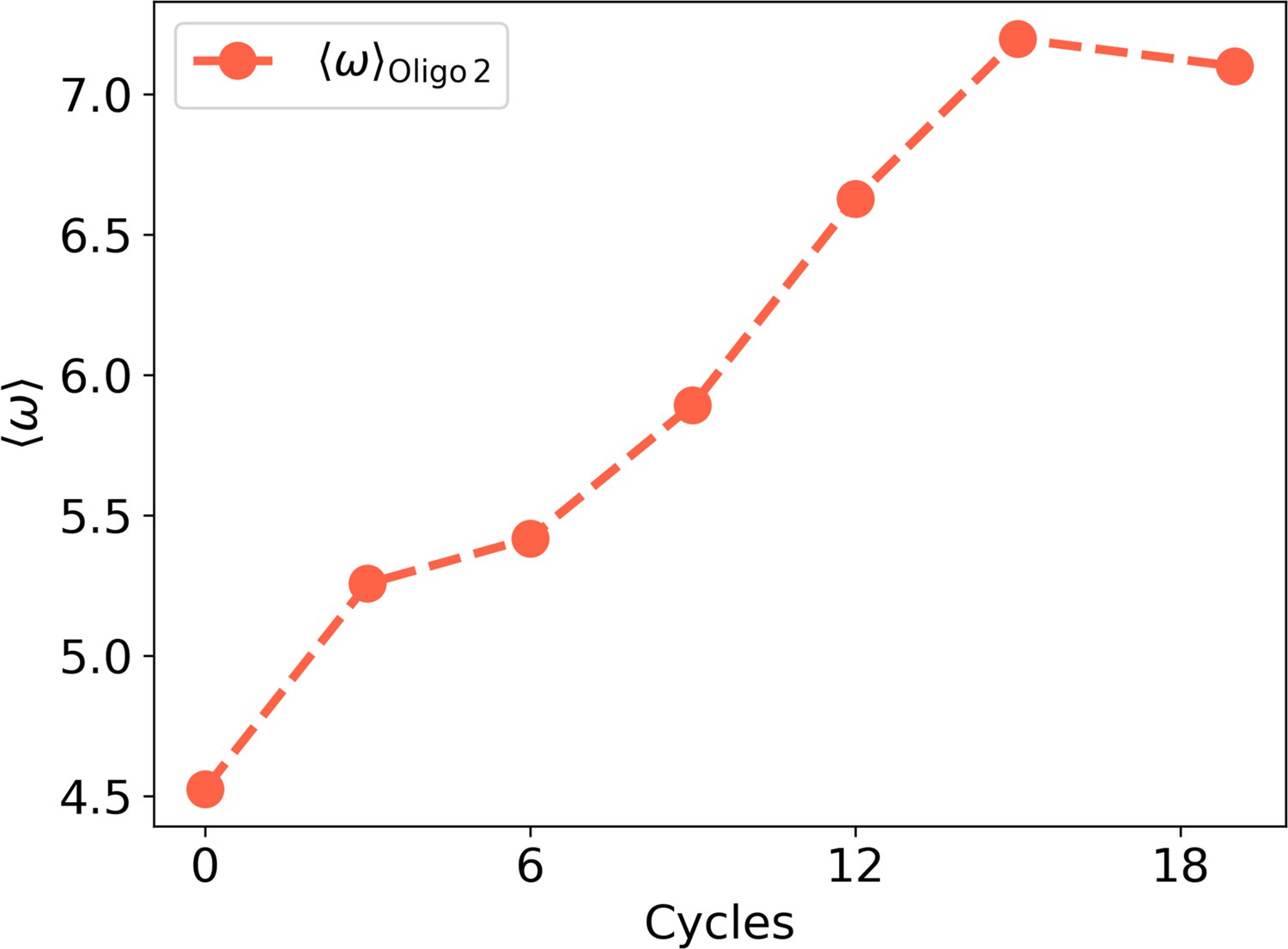
as a function of the experimental cycles for Oligo2.
Figure 2—figure supplement 6
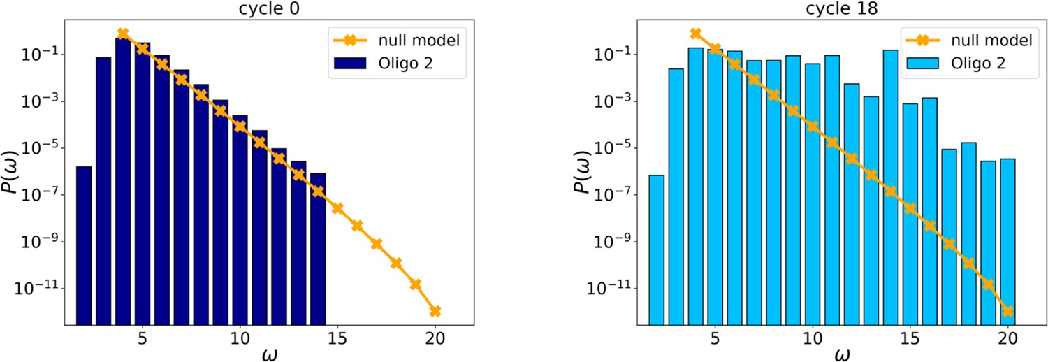
Initial (left, cycle 0) and final (right, cycle 18) distributions for Oligo2.
Figure 2—figure supplement 7
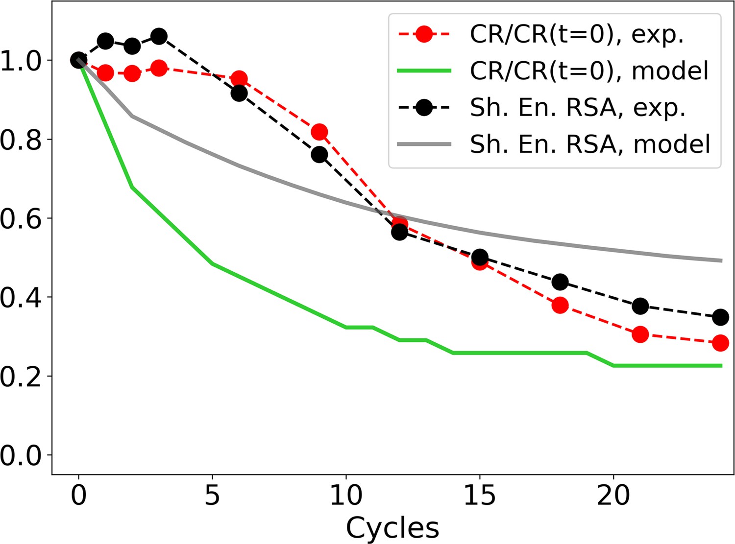
Evolution of the zip ratio CR for the file with the list of sequences (red dots), normalized by its value at time 0; the same for the individual-based eco-evolutionary (IBEE) model (green line); and of the Shannon entropy associated to the RSA distribution (experimental: black dots, IBEE: gray line).
The IBEE model has , , 106 individual and 104 resources and the data shown are the average of 20 statistically independent realizations.
Figure 2—figure supplement 8
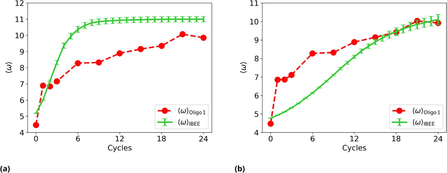
Experimental vs IBEE time evolution of , for two different IBEE hyperparameters choices.
(a) as a function of the experimental (red) and simulated (green) cycles.This individual-based eco-evolutionary (IBEE) model has a fitness , with and without any saturation at . (b) as a function of the experimental (red) and simulated (green) cycles. This IBEE model has a fitness , with and for the whole simulation.
Figure 2—figure supplement 9
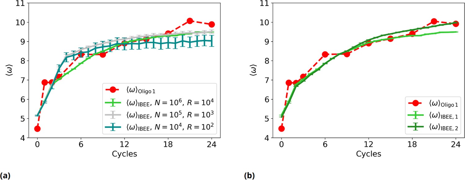
Experimental vs IBEE time evolution of , for different sizes and compositions of the starting population of IBEE model.
(a) as a function of the experimental (red) and simulated cycles. Green: ; silver: ; teal: . (b) as a function of the experimental (red) and simulated cycles (individual-based eco-evolutionary [IBEE] model shown in the main text, #1: green. IBEE model #2 with a different starting population, dark green).
Figure 3 with 4 supplements
Distribution and evolution of free energy quantifiers (Oligo1 data).
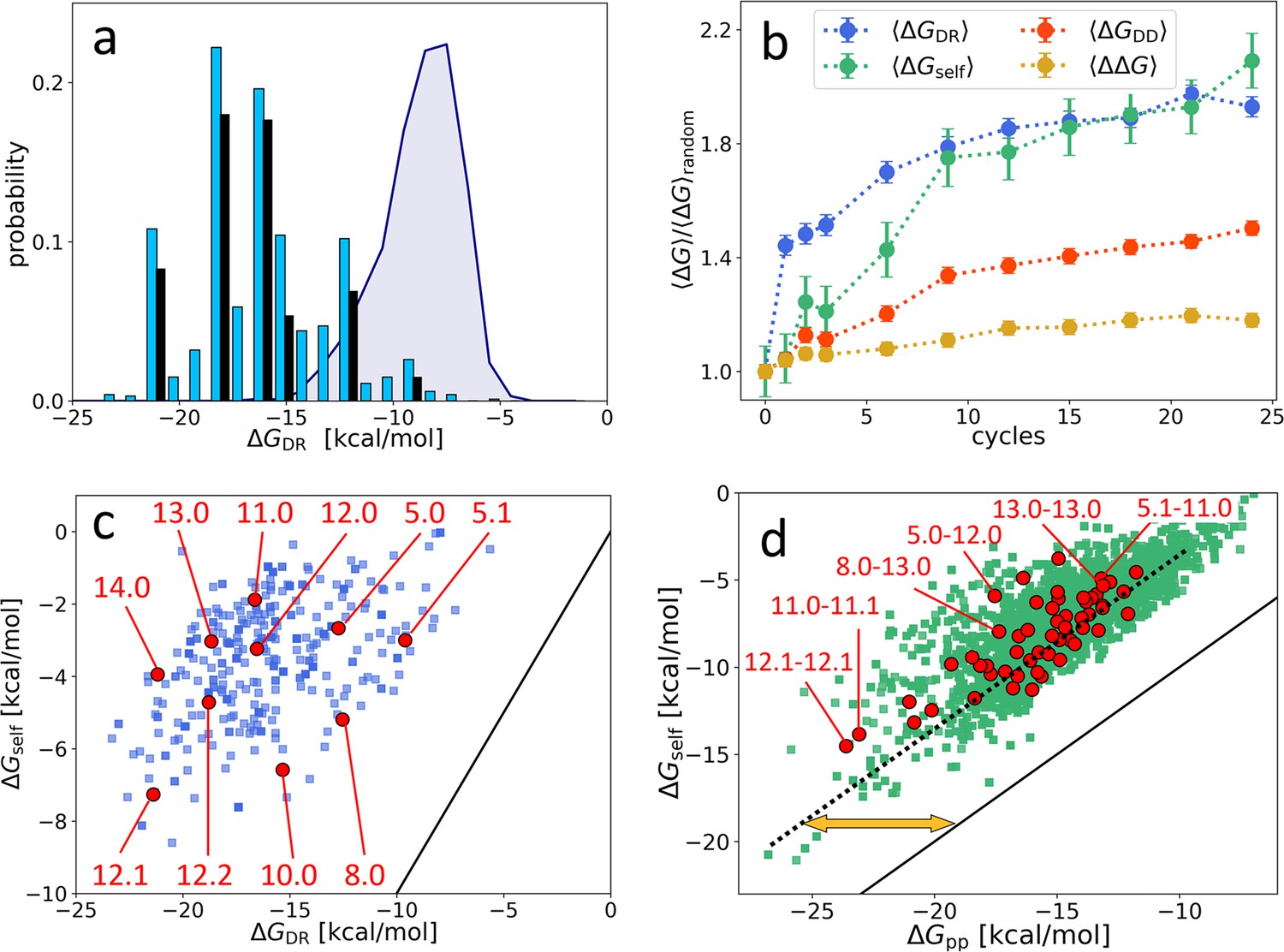
(a) Probability distribution for the DNA individuals (DNAi)-resource binding free energy computed by NUPACK, , for the initial population (gray shading), for the final population (random choice of 1000 DNAi - cyan columns, top 10 most populous sequences - black columns). (b) Time evolution, expressed in cycles, for various mean free energies , normalized to their value computed on pools of random sequences. All are computed by NUPACK on sets of 1000 individuals: (blue dots); unimolecular self-interaction (green dots); bimolecular mutual DNAi interaction (red dots); mutual, self-subtracted interaction (yellow dots). (c) Scatter plot of vs. computed for 1000 DNAi in the final population (blue squares). Red dots mark the point relative to the 10 most populous sequences, as identified by the labels. Note that the x-axis scale of panels a and c is the same, enabling identifying sequences. (d) Scatter plot computed on 104 DNAi pairs from the final population comparing and (green squares). Red dots mark the pair formed by the 10 most populous sequences, some of which identified by labels. With respect to the condition (black line), data are on average displaced by kcal/mol (yellow arrow). The online version of this article includes the following figure supplements.
Figure 3—figure supplement 1
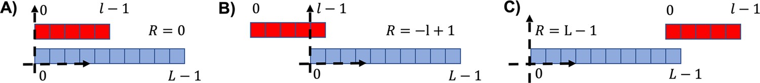
Three examples of different relative positions for the attachment.
(A) , i.e., the two sequences left ends are found in the same position. (B) Leftmost possible position for the red sequence (). (C) , corresponding to the rightmost position of the red sequence.
Figure 3—figure supplement 2
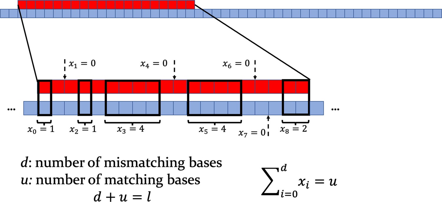
Top: scheme of the target strand (red) and of a longer consumer strand (blue).
Bottom: zoom on the interaction region, with mismatching nucleotides and matching ones. Note that one is computed between any pair of consecutive non-overlapping bases. When , a dashed arrow indicates the middle point between the two pairs of mismatching bases involved.
Figure 3—figure supplement 3
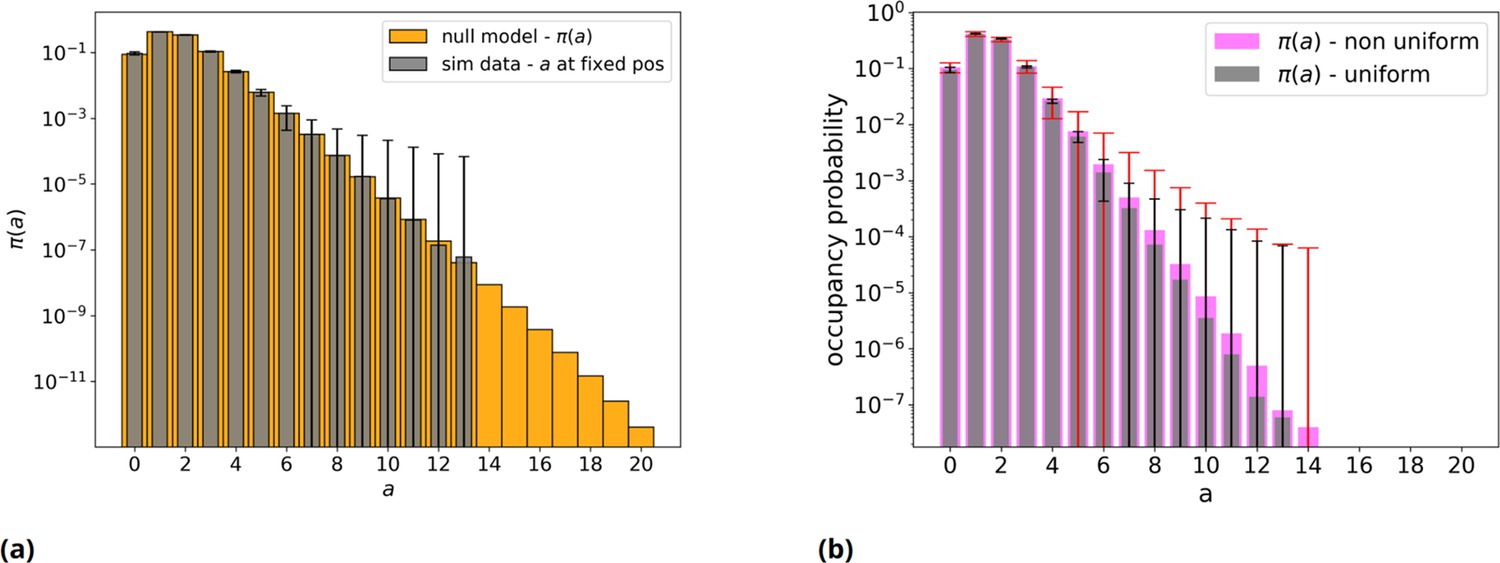
Null model without threshold, analytical and simulated, with an even and uneven nucleotides distribution.
(a) Orange: null model without threshold, analytic distribution . Gray: simulated null model, 50mers population sample = 106 individuals: mean over 50 repetitions and error bars are reported. Note the log scale on vertical axis. (b) Gray bars with black error bars have the same meaning as in panel a. Pink: the same but with a non-even distribution of the four nucleotides (A=23%, C=19%, G=29%, T=29%) in the initial population, with red relative error bars.
Figure 3—figure supplement 4
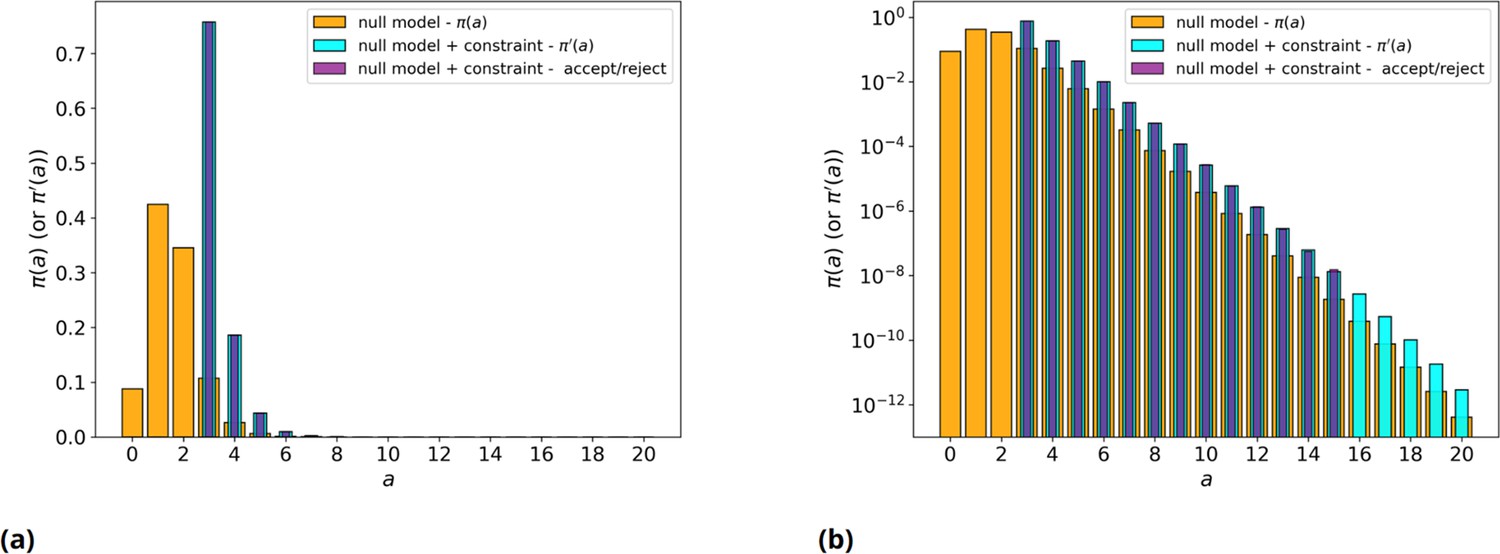
Null model with/without threshold, simulated and analytical.
(a) Orange: null model without threshold, analytic . Cyan: null model with threshold on values, , analytic . Purple: average over 200 runs of the null model with threshold on values, , simulated with explicit rejection of 106 values. (b) Same as panel a, but in log scale.
Figure 4 with 2 supplements
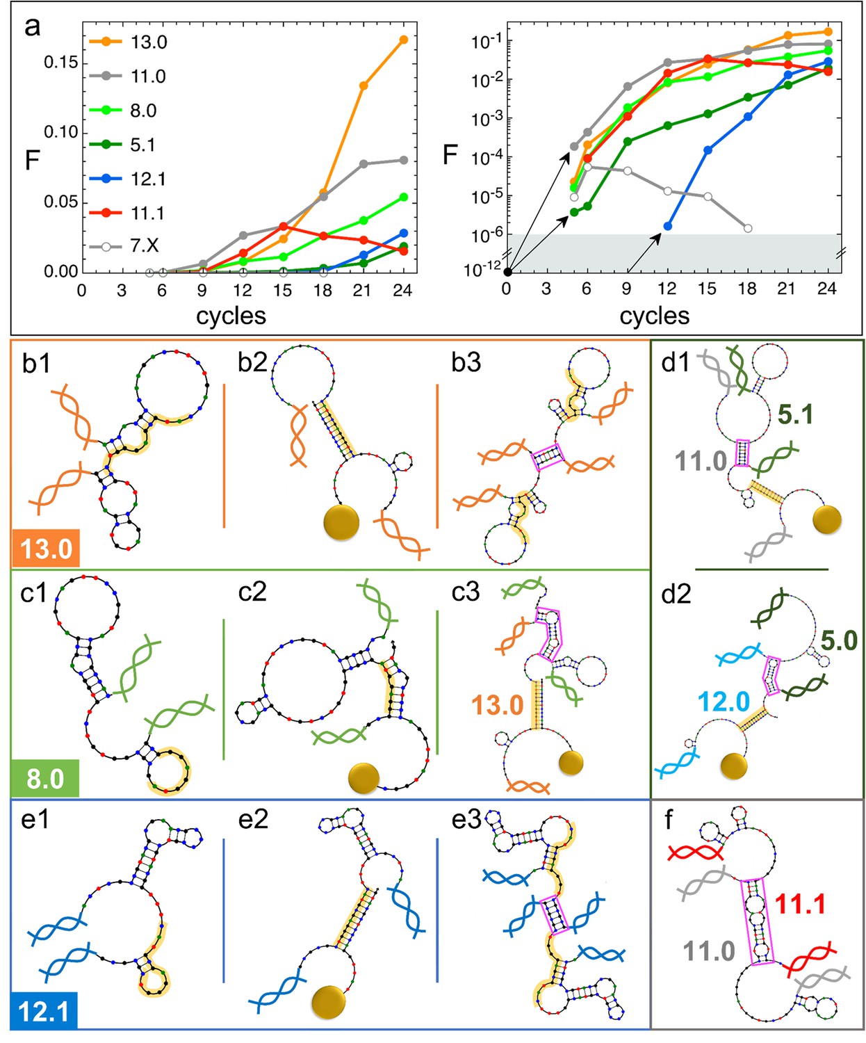
Natural history of DNA individuals (DNAi) species (Oligo1 data).
(a) Fraction of {DNAi} that belong to a choice of specific species as a function of the affinity-based DNA synthetic evolution (ADSE) cycles, in linear (left) and logarithmic (right) scale. Arrows connect the initial condition (one individual per species at cycle 0) to the earliest detection via sequencing, across the six orders of magnitudes gap (gray shading). The same growth is assumed for species 12.1, suggesting its appearance by mutation occurred at generation 9. (b–f) Self-interactions (b1, c1, e1), resource interactions (b2, c2, e2, d1, d2), and mutual interactions (b3, c3, e3, d1, d2, f) of selected species, sketched as per the NUPACK output. Nucleobases are color coded (G - black, C - blue, A - green, T - red). Paired bases are connected. Double and single stand regions are represented as straight and curved lines, respectively. As in Figure 1a, terminal blocks of DNAi are marked as graphic double helices colored according to the legend of panel a, and beads as sketched yellow spheres. Yellow shading: section of DNAi complementary to resources. Pink frames: regions of hybridization between DNAi. (b) Interactions involving species 13.0 including its homodimerization (b3). (c) Interactions involving species 8.0, including its binding to 13.0 (c3). (e) Interactions involving species 12.1, including its homodimerization (e3). (d and f) DNAi heterodimers interactions suggesting parasitism (d1), and possibly mutualism (d2) and mutual damage (f). The online version of this article includes the following figure supplements.
Figure 4—figure supplement 1
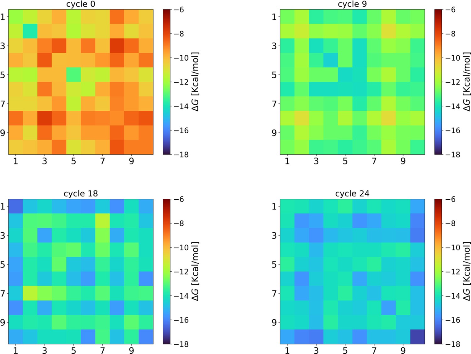
Evolution of the intra-species interaction strengths ().
At cycle 0, the interaction strengths are compatible with those obtained from completely random strings (–10.1±0.7 kcal/mol). However, during the eco-evolutionary dynamics, the interaction strengths among the surviving strings increase (cycle 9: −13.0±1.0 kcal/mol; cycle 18: −14.8±0.8 kcal/mol) reaching the maximum values (on average) at the last cycle (−14.8±0.9 kcal/mol). This result indicates that there is a selection favoring species that can interact among them. Hyperparameters used in these NUPACK calculations are the same described in the Materials and methods section of the main text.
Figure 4—figure supplement 2
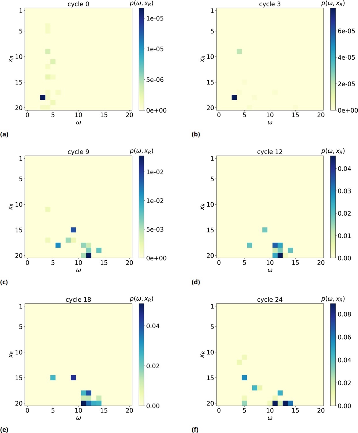
2D probability distribution , as a function of time (panels a-f).
We observe a significant shift of xR, the rightmost basis of the of the resource involved in the formation of such a maximum consecutive overlap (MCO), toward high values, meaning the MCO are preferably formed far away from the bead surface, near the free end of target strands.
Additional files
-
Supplementary file 1
content.
Sequence list 1: Sequences of the oligonucleotides used in this work for the Oligo1 and Oligo2 datasets. Sequence list 2: Oligo1 cycle 24 top 10 sequences. Sequence list 3: Oligo1 other relevant sequences.
- https://cdn.elifesciences.org/articles/90156/elife-90156-supp1-v1.tex
-
MDAR checklist
- https://cdn.elifesciences.org/articles/90156/elife-90156-mdarchecklist1-v1.pdf
Download links
A two-part list of links to download the article, or parts of the article, in various formats.
Downloads (link to download the article as PDF)
Open citations (links to open the citations from this article in various online reference manager services)
Cite this article (links to download the citations from this article in formats compatible with various reference manager tools)
Synthetic eco-evolutionary dynamics in simple molecular environment
eLife 12:RP90156.
https://doi.org/10.7554/eLife.90156.3


