A micro-epidemiological analysis of febrile malaria in Coastal Kenya showing hotspots within hotspots
- KEMRI-Wellcome Trust Research Programme, Kenya
- University of Oxford, United Kingdom
- Imperial College London, United Kingdom
- University of California, San Francisco, United States
- Radboud University Nijmegen Medical Centre, Netherlands
- London School of Hygiene and Tropical Medicine, United Kingdom
- John Hopkins Malaria Research Institute, United States
- Institute for Tropical Medicine, University of Tübingen, Germany
- German Centre for Infection Research, Germany
Figures
Figure 1 with 3 supplements
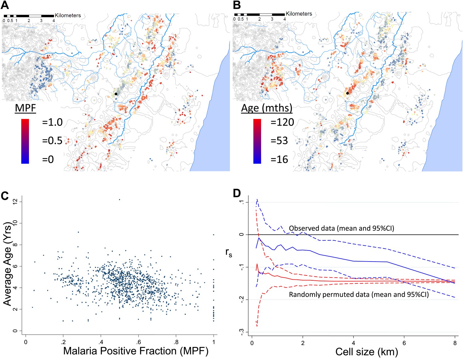
Geographical distribution of malaria positive fraction and average age of febrile malaria.
Each plotted point represents an individual homestead, where the colour shading indicates the malaria positive fraction (MPF) in panel A, or the average age of children who test positive for malaria in panel B. Panel C shows the scatter plot for MPF vs average age (Spearman's rank correlation coefficient (rs) = −0.16, p<0.0001). Panel D shows rs (y axis) plotted against scale of analysis (x axis), where a grid with varying cell size is imposed on the study area, rs is calculated within each cell and then the mean rs presented, with 95% confidence intervals produced by boot-strap (blue solid and dashed lines, respectively), and the results of analysis of spatially-random permutations of the data with equivalent cell size are shown for comparison (red solid and dashed lines, respectively). The analysis shown in panel D was compared on simulations with varying simulated characteristic scales, Signal:Noise ratios and with added gradients (Figure 1—figure supplements 1–3, respectively).
Figure 1—figure supplement 1
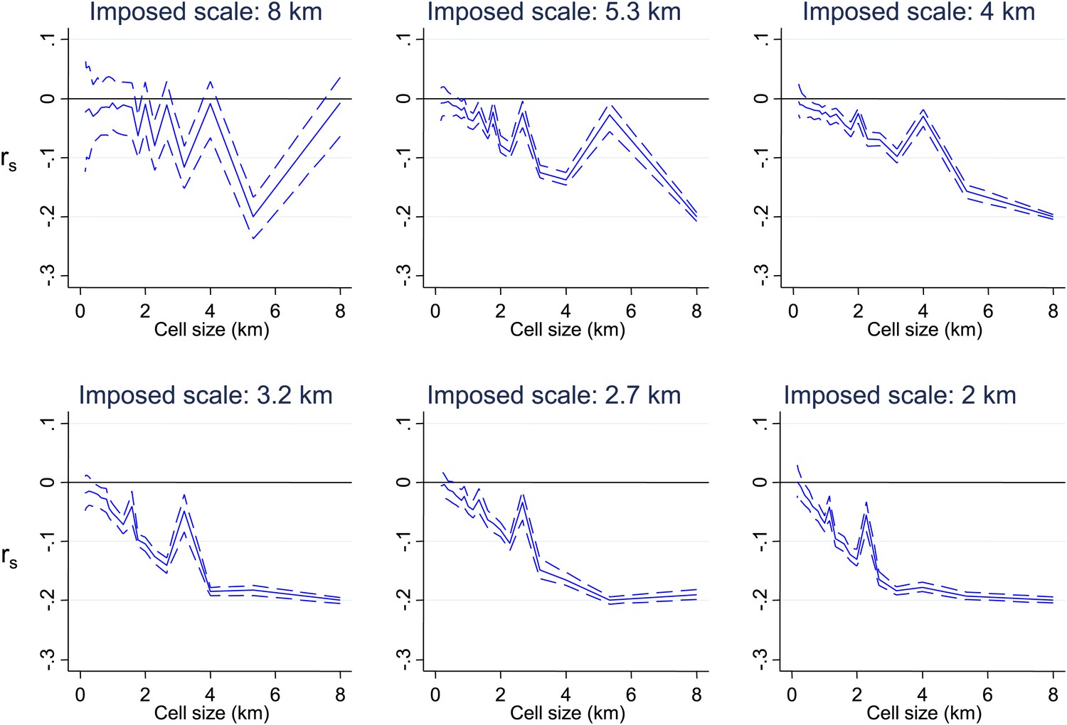
Simulated data with varying imposed scales of clustering.
Simulated data using imposed spatial clustering at specific scales are analysed to determine rs (y axis) plotted against scale of analysis (x axis), where a grid with varying cell size is imposed on the study area, rs is calculated within each cell and then the mean rs presented, with 95% confidence intervals produced by boot-strap (blue solid and dashed lines, respectively). The six panels show the appearances of different imposed scales as shown in the sub-titles.
Figure 1—figure supplement 2
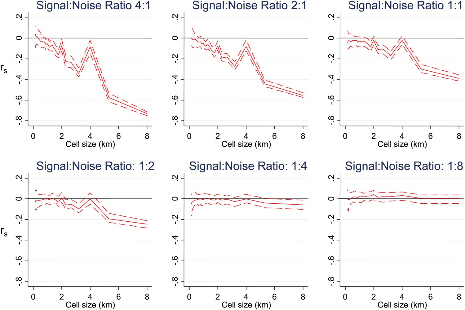
Simulated data with varying signal to noise ratios.
Simulated data using imposed spatial clustering at specific scales are analysed to determine rs (y axis) plotted against scale of analysis (x axis), where a grid with varying cell size is imposed on the study area, rs is calculated within each cell and then the mean rs presented, with 95% confidence intervals produced by boot-strap (blue solid and dashed lines, respectively). The six panels show the appearances using different Signal:Noise ratios.
Figure 1—figure supplement 3
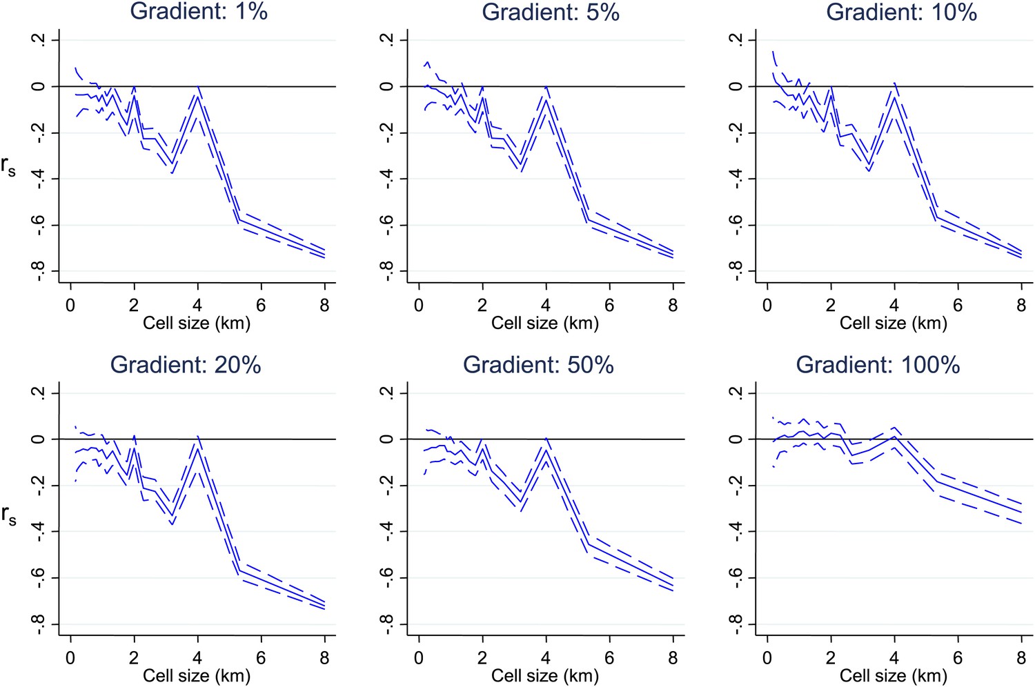
Simulated data with varying gradients around imposed scales of clustering.
Simulated data using imposed spatial clustering at specific scales are analysed to determine rs (y axis) plotted against scale of analysis (x axis), where a grid with varying cell size is imposed on the study area, rs is calculated within each cell and then the mean rs presented, with 95% confidence intervals produced by boot-strap (blue solid and dashed lines, respectively). The six panels show the appearances using gradients of varying spatial scales around the simulated clustering.
Figure 2 with 2 supplements
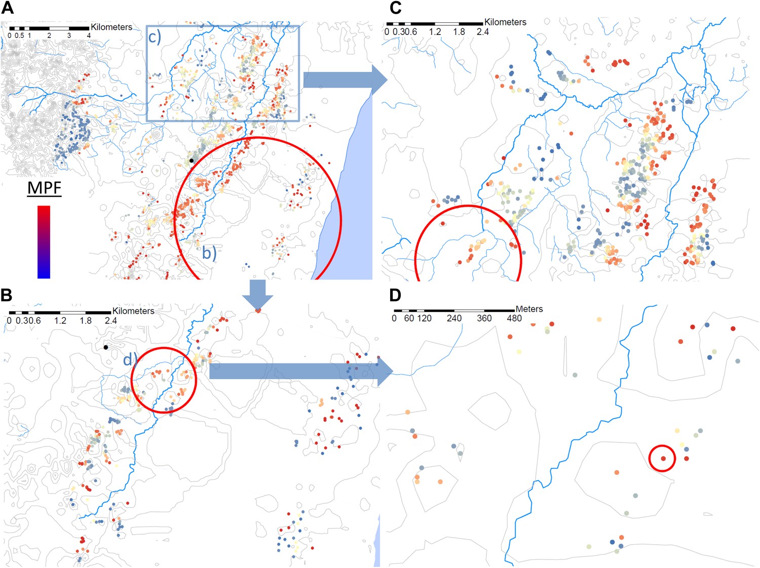
Hotspots within hotspots.
Each plotted point represents an individual homestead, where the colour shading indicates the malaria positive fraction (MPF). Hotspots are identified using SATScan, using the whole study area (panel A), then repeated within the hotspot (panel B), within the hotspot of panel B (panel D), and then within a randomly chosen area outside the hotspot (panel C). The semi-variogram and log–log semi-variogram plot are shown in Figure 2—figure supplements 1 and 2, respectively.
Figure 2—figure supplement 1

Semi-variogram.
The semi-variogram is shown for MPF. A lowess smoothed line is superimposed on the data points.
Figure 2—figure supplement 2
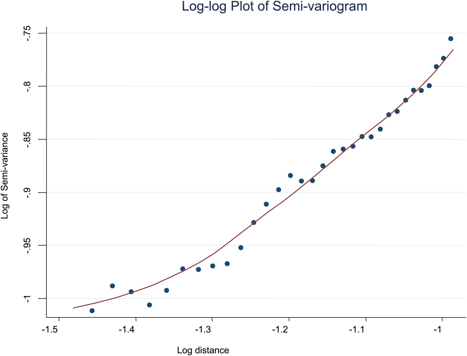
Log-log plot of semi-variogram.
The log–log plot of the semi-variogram is shown for MPF. A lowess smoothed line is superimposed on the data points.
Figure 3
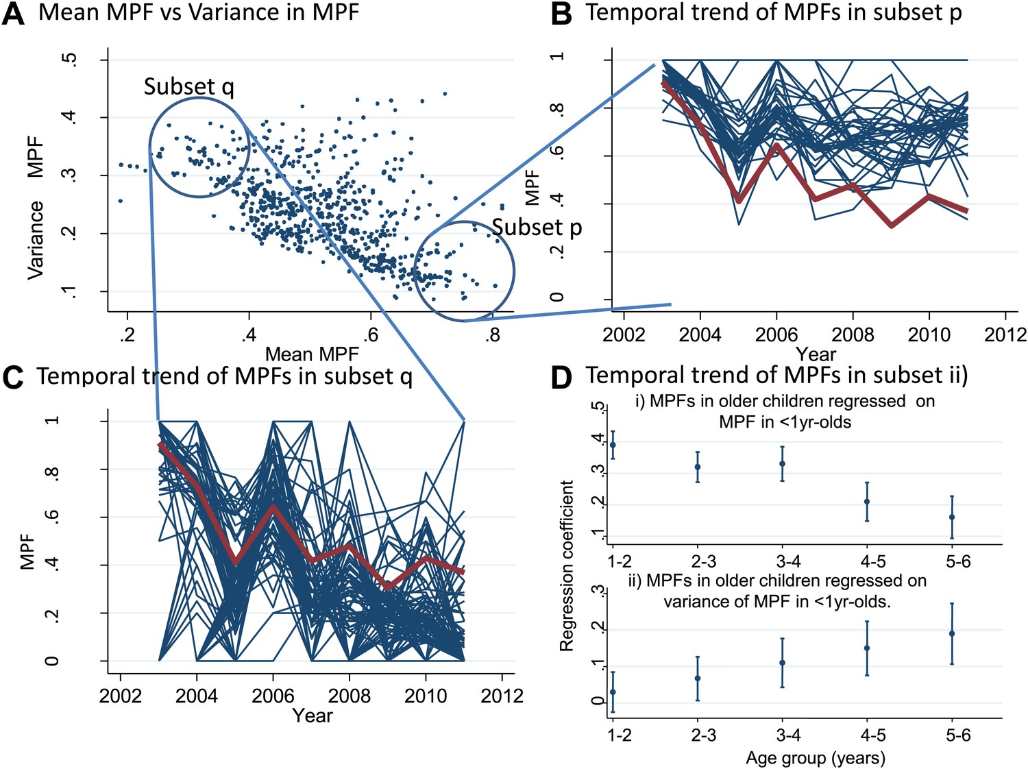
Temporal variations in malaria positive fraction.
(Panel A) shows the scatter plot of individual homesteads by mean malaria positive fraction (MPF) on the x axis vs variance in MPF on the y axis (rs = −0.61, p<0.0001). A labelled blue circle indicates subset q (homesteads with high variance but low mean MPF) and subset p (homesteads with low variance and high mean MPF). The temporal trends for these two subsets are shown on panels (B and C), respectively. The median trend for the study area is shown in red. (Panel D) shows the regression coefficients (y axis) for the malaria positive fractions (MPF) in older children when regressed on; (i) the mean MPF in children <1 year of age (MPF<1y) and (ii) MPF in older children when regressed on the variance in MPF<1y over the 9 years of the study. Separate multivariable regression models (i.e., with mean MPF<1y and variance in MPF<1y as explanatory variables) are fit for each age group as shown on the x axis (excluding children <1 year of age, whose data are used to calculate MPF<1y).
Figure 4
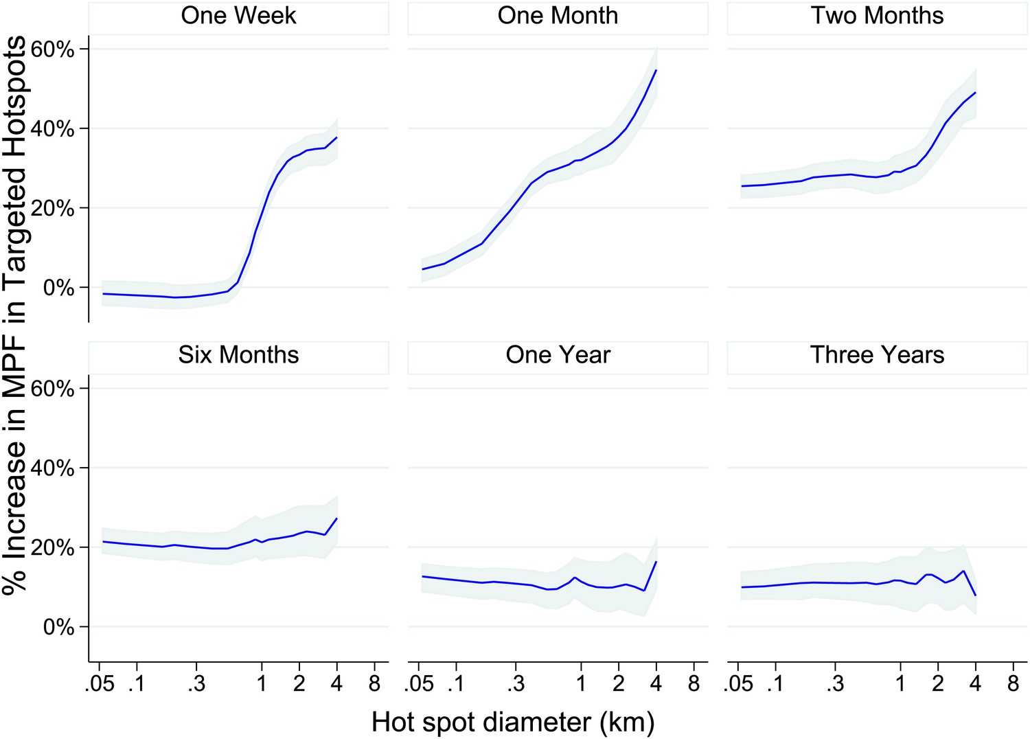
Theoretical accuracy of targeted control undertaken at varying temporal and spatial scales.
The accuracy of varying strategies of hotspot identification is shown. Each panel is labelled with the time period of surveillance data used. The x axis shows the diameter of hotspot defined. In each case hotspots were selected to account for 20% of the homesteads in the area. The y axis shows the increase that would have been present assuming that they were targeted in the time period following their identification.
Videos
Video 1
Each plotted point represents an individual homestead, where the colour shading indicates the malaria positive fraction (MPF), with red shading for high MPF and blue shading for low MPF.
Points change colour each year.
Video 2
Each plotted point represents an individual homestead, where the colour shading indicates the malaria positive fraction (MPF), with red shading for high MPF and blue shading for low MPF.
Points change color each year. The frames are identical to those in Video 1, but move more rapidly.
Download links
A two-part list of links to download the article, or parts of the article, in various formats.
Downloads (link to download the article as PDF)
Open citations (links to open the citations from this article in various online reference manager services)
Cite this article (links to download the citations from this article in formats compatible with various reference manager tools)
A micro-epidemiological analysis of febrile malaria in Coastal Kenya showing hotspots within hotspots
eLife 3:e02130.
https://doi.org/10.7554/eLife.02130


