Rare variants contribute disproportionately to quantitative trait variation in yeast
Figures
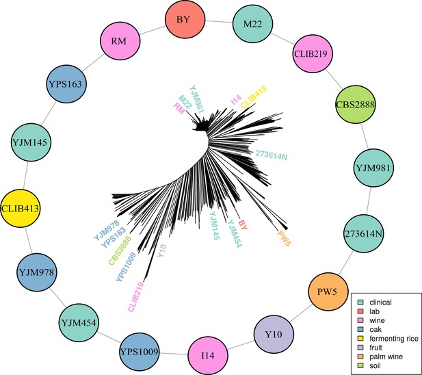
Multiparental cross design with 16 diverse progenitor yeast strains.
16 parental strains were chosen to represent the diversity of the S. cerevisiae population, as illustrated by their positions on a neighbor-joining tree based on 1011 sequenced isolates (Peter et al., 2018). These strains were crossed in a single round-robin design, with each strain crossed to two other strains, as depicted by lines connecting the colored circles. Colors indicate the ecological origins of the parental strains.
-
Figure 1—source data 1
Additional information on yeast crosses and phenotypes.
Strain information for the 16 haploid parents and 16 F1 hybrids between them is listed. Additional information about the conditions tested is indicated.
- https://doi.org/10.7554/eLife.49212.003
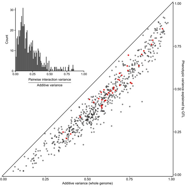
Most heritable variation is explained by detected QTLs.
Whole-genome estimates of additive genetic variance (X-axis) are plotted against cross-validated estimates of trait variance explained by detected QTLs (Y-axis) for each trait-cross combination. Red points show values for the BY-RM cross. The diagonal line corresponds to detected QTLs explaining all of the estimated additive genetic variance, and is shown as a visual guide. (Inset) A histogram of the ratio of non-additive to additive genetic variance for each trait-cross combination, based on estimates from a variance component model.
-
Figure 2—source data 1
Total variance explained by QTLs and within-cross variance component analyses.
Results from within-cross variance components models and total variance explained by the QTL models are listed.
- https://doi.org/10.7554/eLife.49212.005
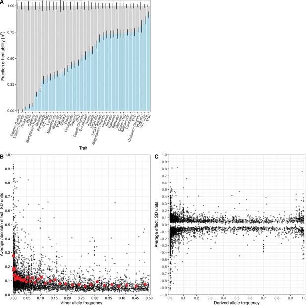
Effect size and contribution to trait variation of rare and common variants.
(A) Stacked bar plots of additive genetic variance explained by rare (blue) and common (gray) variants. Error bars show + /- s.e. (B) Minor allele frequency (X-axis) of the lead variant at each QTL (Peter et al., 2018) is plotted against QTL effect size (Y-axis). Red points show mean QTL effect sizes for groups of approximately 100 variants binned by allele frequency. Error bars show + /- s.e.m. (C) Frequency of the derived allele of each QTL lead variant (X-axis), based on comparison with S. paradoxus, is plotted against QTL effect size (Y-axis). Negative values on the Y-axis correspond to variants with effects that are detrimental for growth.
-
Figure 3—source data 1
Detected QTL.
QTL mapping results are listed for both the within-cross and the joint analysis.
- https://doi.org/10.7554/eLife.49212.012
-
Figure 3—source data 2
Joint variance component estimates.
Results for the joint variance component models are given. This includes results for a model with two allele frequency bins (Figure 3A, figure supplement 1A), seven allele frequency bins (Figure 3—figure supplement 1B), and seven allele frequency bins using only variants that are private to each of the 16 parents (Figure 3—figure supplement 1C).
- https://doi.org/10.7554/eLife.49212.013

Within-cross variance component analysis.
(A) Stacked bar plots of a variance component analysis for each trait are shown. Results are the same as in Figure 3A except that the fraction of phenotypic variance, instead of the fraction of total additive variance, is indicated. The variance component model splits the additive genetic variance into the fraction coming from variants with MAF <1% (blue) and MAF >1% (gray). Error bars show + /- s.e. (B) Same as in (A), except a seven allele-frequency bin variance component model was fit per trait. (C) Same as in (B), except only private variants (segregating in two crosses) were used in the analysis. This model makes no assumption about the relationship between allele-frequency in the mapping panel and effect sizes.
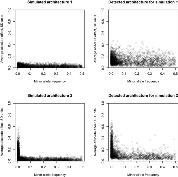
MAF vs effect size for two simulated architectures.
Simulated architectures and resulting inference based on lead variants. In the leftmost panels, the X-axis is the MAF of simulated causal variants, the Y-axis is the simulated average absolute effect of a simulated causal variant. In the rightmost panels, the X-axis is the MAF of the detected lead variants, and the Y-axis is the estimate of the average absolute effect of the detected lead variants. The top two panels correspond to a simulated architectures of 20 traits, where for each trait 200 causal variants were drawn at random from all variants, effects were sampled from a normal distribution N(0, 0.05), and total additive heritability was 60%. This is designated Simulation 1. The bottom two panels correspond to a simulated architectures of 20 traits, where for each trait 200 causal variants were drawn at random from all variants, effects were sampled from a normal distribution N(0, 0.05) for variants with MAF >= 1% and N(0,0.3) for variants with MAF <1%, and total additive heritability was 60%. This is designated Simulation 2.
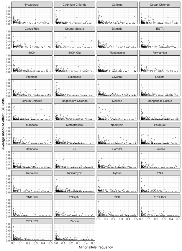
MAF vs effect size for each trait.
The minor allele frequency (X-axis) of the lead variant at each QTL is plotted against QTL effect size as in Figure 3B. Here results are shown separately for each phenotype.
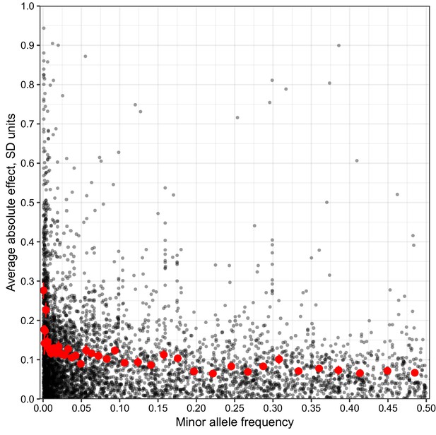
MAF vs unbiased estimate of effect size.
Minor allele frequency (X-axis) of the lead variant at each QTL (Peter et al., 2018) is plotted against an unbiased estimate of QTL effect size.
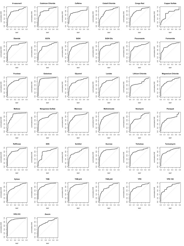
Cumulative genetic variance explained vs minor allele frequency of lead variants.
The cumulative genetic variance explained (GVE) in our mapping panel (Y-axis) is plotted against minor allele frequency (X-axis) of the lead variants. Under an evolutionarily neutral model, the cumulative genetic variance explained is linearly proportional to MAF (the identity line MAF = cumulative genetic variance explained). Deviations from the identity are indicative of the action of selective forces.
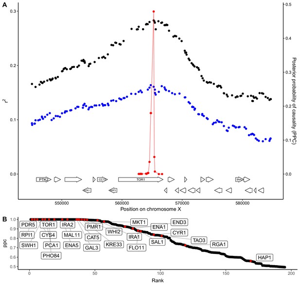
QTL fine-mapping at gene-level resolution.
(A) Statistical fine-mapping of a QTL for growth in the presence of caffeine. Genetic mapping signal, shown as the coefficient of determination between genotype and phenotype (Y-axis, left), is plotted against genome position (X-axis) for crosses between 273614N and YJM981 (black) and YJM981 and CBS2888 (blue). The posterior probability of causality (PPC), plotted in red (Y-axis, right), localizes the QTL to a portion of the gene TOR1. (B) PPC is shown as black dots for 195 genes identified as causal at an FDR of 20%, sorted by PPC. Genes containing natural variants that have been experimentally validated as causal for trait variation in prior studies (Fay, 2013; Jerison et al., 2017; Sadhu et al., 2016; Treusch et al., 2015; Wang and Kruglyak, 2014) are shown in red and labeled with gene names.
-
Figure 4—source data 1
Candidate causal genes and GO enrichments.
Candidate causal genes per QTL are listed. GO enrichments for causal genes are listed.
- https://doi.org/10.7554/eLife.49212.015
Additional files
-
Supplementary file 1
Key resources table.
- https://doi.org/10.7554/eLife.49212.016
-
Supplementary file 2
Barplots depicting results from within-cross variance component analyses.
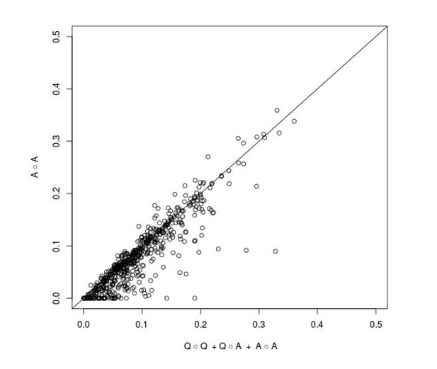
For each trait and cross, a stacked barplot is shown representing the results from a multiple variance component model. Phenotypic covariance was modeled as the sum of QTL effects (light blue, denoted as Q), additive genome effects (dark blue, denoted as A), interactions between additive QTLs (dark green, denoted as Q∘Q), interactions between additive QTLs and the rest of the genome (light green, denoted as Q∘A), interactions between all loci in the genome (sea green, denoted as A∘A), residual effect of strain (pink), and residual error (white).
- https://doi.org/10.7554/eLife.49212.017
-
Supplementary file 3
QTL mapping results for each trait and cross.
Results from QTL mapping are shown for each trait. Each subpanel represents the results for a cross. Along the Y-axis the two parental strains for each cross are shown. Position of QTL along the genome is represented on the X-axis. The arrows represent QTL effects from the within-cross mapping. The arrows point toward the strain that increases growth. The size of the arrow reflects the magnitude of the QTL effect. Full length arrows represent QTL that explain more than 25% of phenotypic variance, ¾ length arrows represent QTL that explain between 8% and 25% of phenotypic variance, ½ length arrows represent QTL that explain between 4% and 8% of phenotypic variance, and short arrows represent QTL that explain less than 4% of phenotypic variance. Large effect QTL (explaining more than 4% of phenotypic variance) are colored black, and small effect QTL (less than 4% of phenotypic variance) are colored gray. The green vertical lines correspond to QTL detected from the joint QTL mapping analysis (Materials and methods).
- https://doi.org/10.7554/eLife.49212.018
-
Transparent reporting form
- https://doi.org/10.7554/eLife.49212.019


