The structural connectome constrains fast brain dynamics
- Aix-Marseille University, Inserm, INS, Institut de Neurosciences des Systèmes, France
- Department of Motor Sciences and Wellness, Parthenope University of Naples, Italy
- Institute for Diagnosis and Cure Hermitage Capodimonte, Italy
- Institute of Applied Sciences and Intelligent Systems, National Research Council, Italy
- University of Melbourne, Australia
- University of Campania Luigi Vanvitelli, Italy
- Biostructure and Bioimaging Institute, National Research Council, Italy
Figures
Figure 1
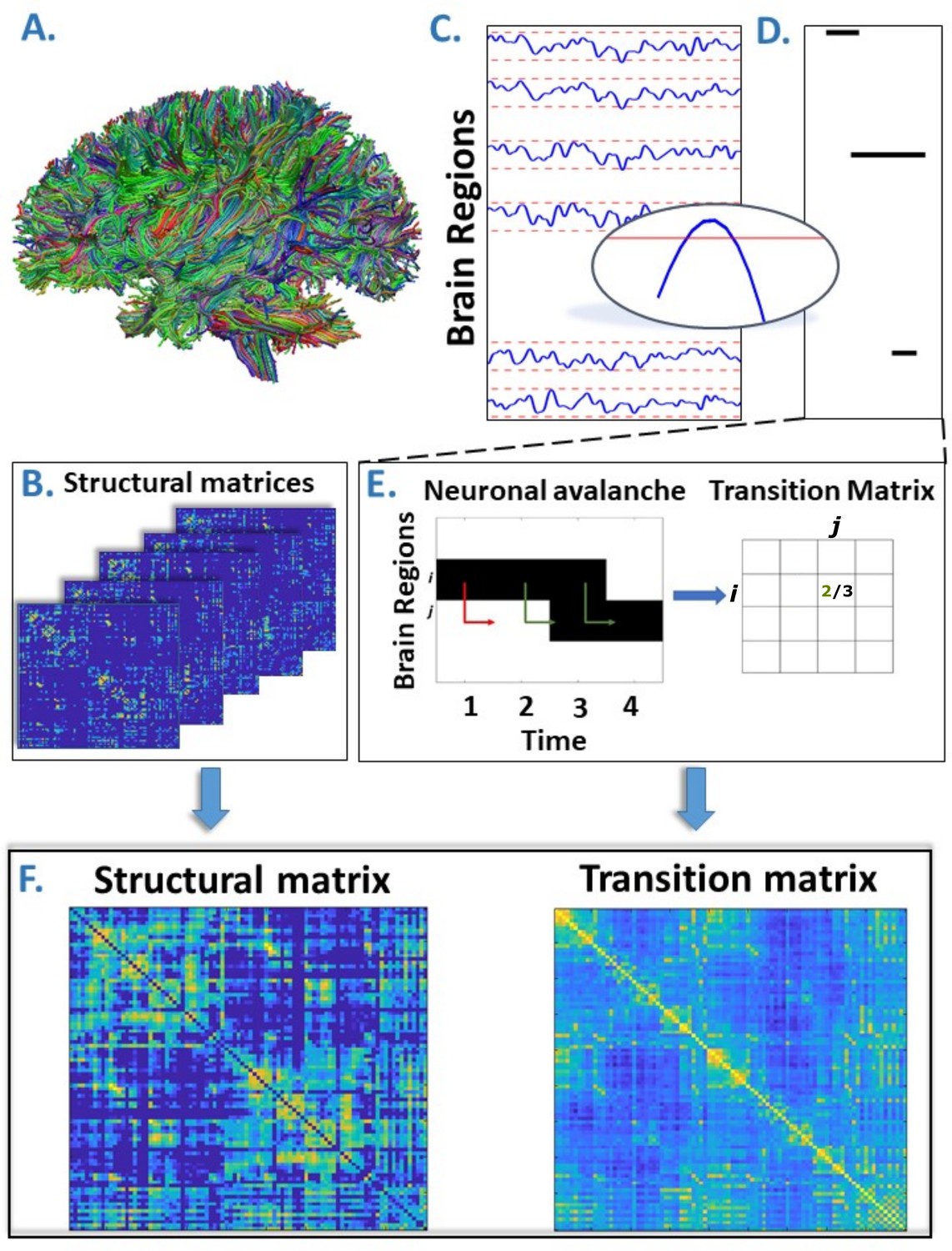
Overview of the pipeline.
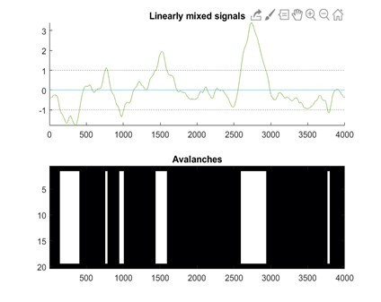
(A) Rendering of streamlines reconstructed using diffusion magnetic resonance imaging and tractography for an individual. (B) Structural connectivity matrix. Row/columns represent regions comprising a brain atlas. Matrix entries store the number of streamlines interconnecting each pair of regions. (C) Source-reconstructed magnetoencephalography series. Each blue line represents the z-scored activity of a region, and the red lines denote the threshold (z-score = ±3). The inset represents a magnified version of a time series exceeding the threshold. (D) Raster plot of an avalanche. For each region, the moments in time when the activity is above threshold are represented in black, while the other moments are indicated in white. The particular avalanche that is represented involved three regions. (E) Estimation of the transition matrix of a toy avalanche. Region i is active three times during the avalanche. In two instances, denoted by the green arrows, region j was active after region i. In one instance, denoted by the red arrow, region i is active but region j does not activate at the following time step. This situation would result, in the transition matrix, as a 2/3 probability. (F) Average structural matrix and average transition matrix (log scale).
Figure 2 with 1 supplement
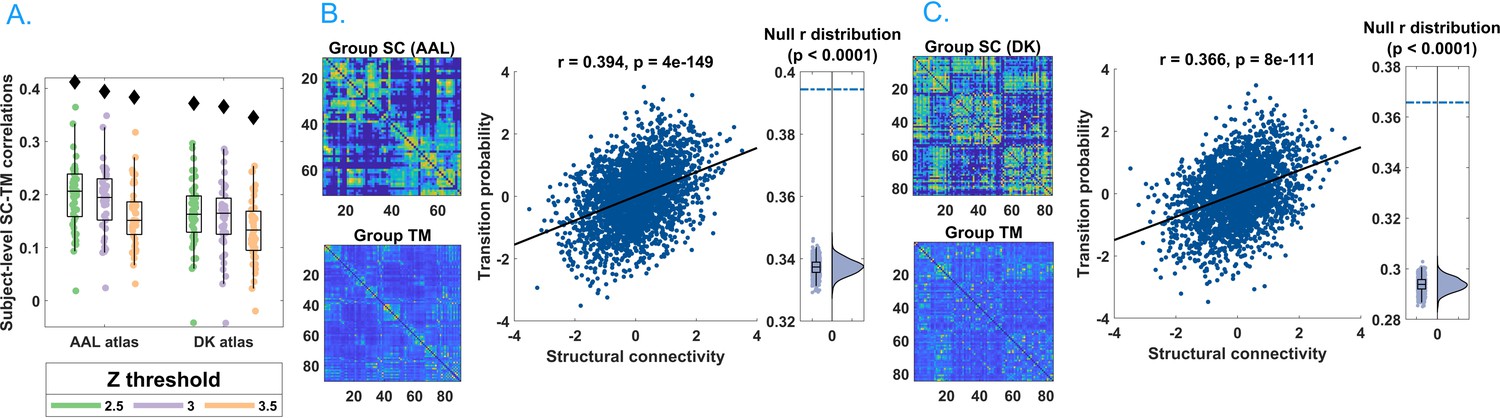
Main results.
(A) Distribution of the r’s of the Spearman’s correlation between the subject-specific transition matrices and structural connectomes. The black diamond represent the r’s of the group-averaged matrices. On the left, the results for the Automated Anatomical Labeling (AAL) atlas; on the right, the results for the Desikan–Killiany–Tourville (DKT) atlas. Green, purple, and orange dots represent results obtained with a z-score threshold of 2.5, 3, and 3.5, respectively. (B, C) Data referring to the AAL atlas in (B) and DKT atlas in (C). On the top left, the average structural matrix; on the bottom left, the average transition matrix. The scatterplot shows the correlation between the values of the structural edges and the transition probabilities for the corresponding edge. The black line represents the best fit line in the least-square sense. On the right, the distribution shows the r’s derived from the null distribution. The dotted blue line represents the observed r. Please note that, for visualization purposes, the connectivity weights and the transition probabilities were resampled to normal distributions. Figure 2—figure supplement 1 shows the comparison between the structural connectome and the transition matrix computed by taking into account longer delays. In Supplementary file 1, we report a table with an overview of the results of the frequency-specific analysis.
-
Figure 2—source data 1
This source data file contains the code to generate the transition matrices starting from neuronal avalanches and to compare them to null surrogates.
- https://cdn.elifesciences.org/articles/67400/elife-67400-fig2-data1-v3.zip
Figure 2—figure supplement 1

On the left, the average structural matrix.
On the right, the average transition matrix.
Author response image 1
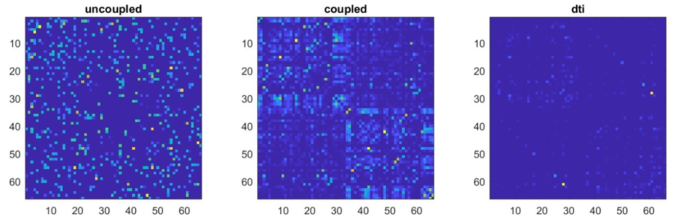
Author response image 2

Author response image 3
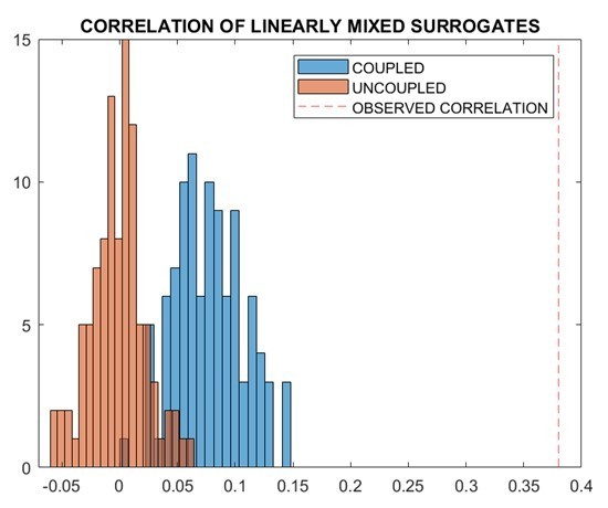
Author response image 4
Author response image 5

Author response image 6

Additional files
-
Supplementary file 1
Correlations between the structural connectome and frequency-specific transition matrices.
- https://cdn.elifesciences.org/articles/67400/elife-67400-supp1-v3.docx
-
Transparent reporting form
- https://cdn.elifesciences.org/articles/67400/elife-67400-transrepform-v3.docx
Download links
A two-part list of links to download the article, or parts of the article, in various formats.
Downloads (link to download the article as PDF)
Open citations (links to open the citations from this article in various online reference manager services)
Cite this article (links to download the citations from this article in formats compatible with various reference manager tools)
The structural connectome constrains fast brain dynamics
eLife 10:e67400.
https://doi.org/10.7554/eLife.67400


