Data-driven causal analysis of observational biological time series
Figures
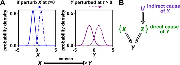
Causality.
(A) Definition. If a perturbation in can result in a change in future values of , then causes . This definition does not require that any perturbation in will perturb . For example, if the effect of on has saturated, then a further increase in will not affect . In this article, causality is represented by a hollow arrow. To embody probabilistic thinking (e.g. drunk driving increases the chance of car accidents; Pearl, 2000), and are depicted as histograms. Sometimes, perturbations in one variable can change the current value of another variable if, for example, the two variables are linked by a conservation law (e.g. conservation of energy). Some have argued that these are also causal relationships (Woodward, 2016). (B) Direct versus indirect causality. The direct causers of are given by the minimal set of variables such that once the entire set is fixed, no other variables can cause . Here, three variables , , and activate . The set constitutes the direct causers of (or ’s ‘parents‘ [Hausman and Woodward, 1999; Pearl, 2000]), since if we fix both and , then becomes independent of . If a causer is not direct, we say that it is indirect. Whether a causer is direct or indirect can depend on the scope of included variables. For example, suppose that yeast releases acetate, and acetate inhibits the growth of bacteria. If acetate is not in our scope, then yeast density has a direct causal effect on bacterial density. Conversely, if acetate is included in our scope, then acetate (but not yeast) is the direct causer of bacterial density (since fixing acetate concentration would fix bacterial growth regardless of yeast density). When we draw interaction networks with more than two variables, hollow arrows between variables denote direct causation.
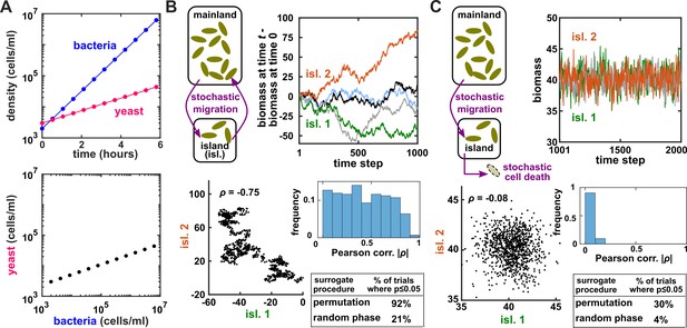
Two independent temporal processes can appear significantly correlated when compared to an inappropriate null model.
(A) Densities of independent yeast and bacteria cultures growing exponentially are correlated. (B, C) Correlation between time series of two independent island populations can appear significant if inappropriate tests are used. (B) In an island (“isl”), individuals stochastically migrate to and from the mainland in roughly equal numbers so that total island biomass follows a random walk. At each time step, the net change in island biomass is drawn from a standard normal distribution (mean = 0; standard deviation = 1 biomass unit). (C) An island population receives cells through migration and loses cells via death. Observations are made after 1000 steps, so that the population size has reached an equilibrium. For both (B) and (C), we performed 1000 simulations in which we calculated the Pearson correlation coefficient of a pair of independent islands populations. Both panels contain: example time series (upper right), a scatterplot comparing two independent islands (lower left), the distribution of Pearson correlation coefficient strength (blue shading), and the proportion of simulations in which the correlation was deemed significant () by surrogate data tests using either permutation or phase randomization (see main text). Ideally, the proportion of correlations that are significant (false positives) should not exceed 5%. The strength of correlation is weaker in (C) compared to (B), yet still often significant according to the permutation test. See Appendix 5 for more details.
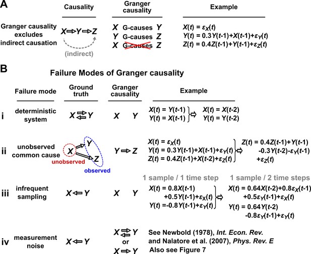
Causality versus Granger causality.
(A) Granger causality is designed to reveal direct causes, not indirect causes. Although causes , does not Granger-cause because with the history of available, the history of no longer adds value for predicting . This also shows that Granger causality is not transitive: Granger-causes and Granger-causes , but does not Granger-cause . (B) Failure modes of Granger causality when inferring direct causality. (i) False negative due to lack of stochasticity. and mutually and deterministically cause one another through a copy operation (Ay and Polani, 2011; Peters et al., 2017): copies and vice versa. Since already contains sufficient information to know exactly, the history of cannot improve prediction of , and so does not Granger-cause . By symmetry, does not Granger-cause . (ii) False positive due to unobserved common cause. causes with a delay of 1, and causes with a delay of 2. We only observe and . Since receives the same “information” before , the history of helps to predict , and thus Granger-causes , resulting in a false positive. (iii) Infrequent sampling can induce false negatives. Although there is a Granger causality signal when we sample once per time step, the signal is lost when we sample only once per two steps (Gong et al., 2015). (iv) Measurement noise can lead Granger causality to suffer both false positives and false negatives. , , and represent process noise and are normal random variables with mean of 0 and variance of 1. All process noise terms are independent of one another.
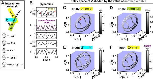
SSR causal methods look for a continuous map from the delay space of a causee to the causer, and this approach becomes more difficult in the presence of noise.
(A) A toy 5-variable linear system. (B) Time series. The delay vector (shown as three red dots) can be represented as a single point in the 3-dimensional delay space (C, red dot). (C) We then shade each point of the delay space trajectory by its corresponding contemporaneous value of (without measurement noise). The shading is continuous (with gradual transitions in shade), which the SSR approach interprets as indicating that causes (correctly in this case). (D) When we repeat this procedure, but now shade the delay space trajectory by , the shading is bumpy, which the SSR approach correctly interprets to indicate that does not cause . (E) Shading the delay space trajectory of by the causally unrelated also gives a bumpy result. (F) Dynamics as in (C), but now with noisy measurements of (purple in B). The shading is no longer gradual. Thus with noisy data, inferring causal relationships becomes more difficult.
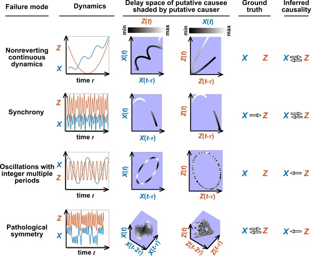
Failure modes associated with SSR-based causal discovery.
Top row: Nonreverting continuous dynamics may lead SSR to infer causality where there is none. This example consists of two time series: a wavy linear increase and a parabolic trajectory. Although they are causally unrelated, we can find continuous delay maps between them. This is because there is (i) a continuous map from the delay vector to ( is ‘nonreverting’), and (ii) a continuous map from to ( is ‘continuous’), and thus there is a continuous delay map from to (‘nonreverting continuous dynamics’; Appendix 4—figure 3). Thus, one falsely infers that causes , and with similar reasoning that causes . Second row: drives such that their dynamics are ‘synchronized’, and consequently, we find a continuous delay map also from to even though does not drive . Note that the extent of synchronization is not always apparent from inspecting equations (e.g. Figure 12 of Mønster et al., 2017) or dynamics (row 5 of Appendix 4—figure 5). Third row: oscillates at a period that is five times the oscillatory period of . There is a continuous delay map from to even through and are causally unrelated. Note that true causality sometimes also induces oscillations where the period of one variable is an integer multiple of the period of another (e.g. in Figure 4, the period of is three times the period of ). Bottom row: In the classic chaotic Lorenz attractor, and cause one another, but we do not see a continuous map from the delay space of to . This is because, as mentioned earlier, satisfying the conditions in Takens’ theorem makes a continuous mapping likely but not guaranteed (Appendix 4). Here, is an example of this lack of guarantee (Deyle and Sugihara, 2011) due to a symmetry in the system (see ‘Background definitions for causation in dynamic systems’ in the supplementary information of Sugihara et al., 2012).
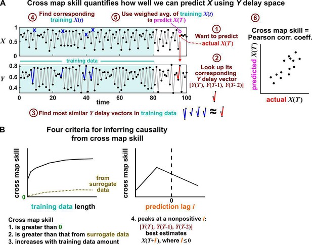
Illustration of the convergent cross mapping (CCM) procedure for testing whether causes .
(A) Computing cross map skill. Consider the point denoted by the red dot (“actual ” in ①), which we want to predict from delay vectors. We first look up the contemporaneous delay vector (②, red dynamics), and identify times within our training data when delay vectors of were the most similar (i.e. least Euclidean distance) to our red delay vector (③, blue segments). We then look up their contemporaneous values of (④, blue crosses), and use their weighted average to predict (⑤, open magenta circle; weights are given as equations S2 and S3 in the supplement of Sugihara et al., 2012). We repeat this procedure for many choices of and calculate the Pearson correlation coefficient between the actual and predicted (⑥). This correlation is called the “cross map skill”. While other measures of cross map skill, such as mean squared error, may also be used (Sugihara et al., 2012), here we follow the convention of Sugihara et al., 2012. (B) Four criteria for inferring causality from the cross map skill. Data points in (A) are marked by dots and connecting lines are visual aids.
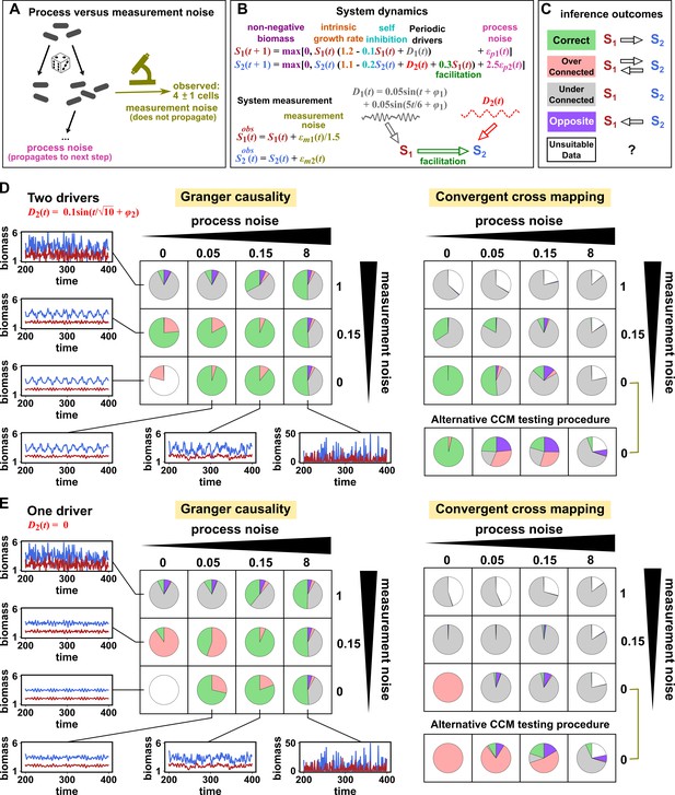
Performance of Granger causality and convergent cross mapping in a toy model with noise.
(A) The effect of a time points’s process noise, but not its measurement noise, propagates to subsequent time points. (B) We simulated a two-species community. The process noise terms and , as well as the measurement noise terms and , are IID normal random variables with a mean of zero and a standard deviation whose value we vary. (C) Five possible outcomes of the causal analysis. (D, E) Community dynamics and causal analysis outcomes. We varied the level (i.e. standard deviation) of process noise and measurement noise. For Granger causality, we used the MVGC package (Appendix 5). For convergent cross mapping, we used the rEDM package to calculate cross map skill and to construct surrogate data, and custom codes for other tasks (Appendix 5). Each pie chart shows the distribution of inference outcomes from 1,000 independent replicates. Note that the MVGC package does not necessarily flag data corrupted by a problematic level of measurement noise (Lusch et al., 2016). In both the main and alternative CCM procedures, criterion 1 (positive ρ) was checked directly and random phase surrogate data were used to test criterion 2 (significance of ρ). Criterion 4 (prediction lag test) was not used, because the test is difficult to interpret for periodic dynamics where cross map skill can oscillate as a function of prediction lag length (Appendix 4—figure 5). The two procedures differ only in how they test criterion 3 (ρ increases with more training data): the main procedure uses bootstrap testing following Cobey and Baskerville, 2016 while the alternative procedure uses a Kendall’s τ as suggested by Chang et al., 2017.

Joint distribution, marginal distributions, and dependence between two random variables.
(A) A scatterplot of data associated with random variables and represents a ‘joint distribution’ (black). Histograms for data associated with and for data associated with represent ‘marginal distributions’ (green). Strictly speaking, joint and marginal distributions must be normalized so that probabilities (here represented as ‘counts’) sum to 1. Graphically, marginal distributions are projections of the joint distribution on the axes. Two random variables are identically distributed if their marginal distributions are identical. (B) Independence between two random variables. Gray box: a mathematical definition of independence, where ‘‘ means probability. Two random variables are dependent if and only if they are not independent. Visually, if two random variables are independent, then different values of one random variable will not change our knowledge about another random variable. In (i), increases as increases (so that different values imply different expectations about ), and thus, and are not independent (i.e. they are dependent). In (ii), and are independent. One might argue that when values become extreme, values tend to land in the middle. However, this is a visual artifact caused by fewer data points at the more extreme values. If we had plotted histograms of at various values, we would see that is always normally distributed with the same mean and variance. (iii) Indeed, when we plotted the difference between the observed probability and the probability expected from and being independent , (ii) showed a near-zero difference (blue), while (i) showed deviation from zero (red). This is consistent with and being independent in (ii) but not in (i).
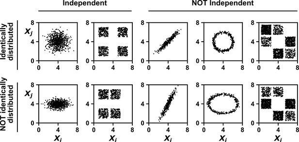
Examples of random variables that are identically distributed or not identically distributed, and independent or not independent.
In the top row, and are identically distributed (projections of the scatter plot on both axes would have the same shape, as in Appendix 1—figure 1A). Note that in the top row of the rightmost column, the scatter plot is not symmetric along the diagonal line, yet projections on both axes yield identical marginal distributions: three segments of equal densities. Thus, the two random variables are identically distributed. In the bottom row, and are not identically distributed. In the leftmost two columns, the two random variables are independent (for more details about independence, see Appendix 1—figure 1B). In the last three columns, the two random variables are dependent: different values alter our knowledge of .
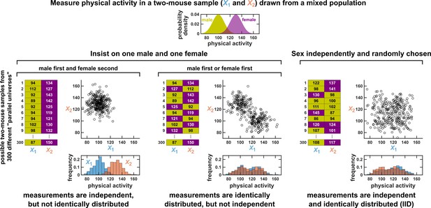
Measurements taken from a mixed population may still be IID, as long as sampling is independent and random.
Consider a study in which physical activity is measured from a mixed population of low-activity male mice and high-activity female mice. For simplicity, suppose that the study uses only two mice. To see whether this could be an IID dataset, we imagine drawing many possible versions of that sample, and ask whether our first measurement and second measurement are identically distributed and independent. We could collect this sample in three different ways (3 sets of charts). On the left, we take our first measurement from a male and second measurement from a female. In this case, our two measurements are independent, but not identically distributed, and thus not IID. In the middle, we choose one male and one female per sample, but choose the first measurement randomly from a male or female. Now, our measurements are identically distributed but not independent (so also not IID). On the right, the sex of each measurement is randomly and independently chosen so that, for example, a sample might have two measurements from the same sex. In this case our sample is an IID dataset.
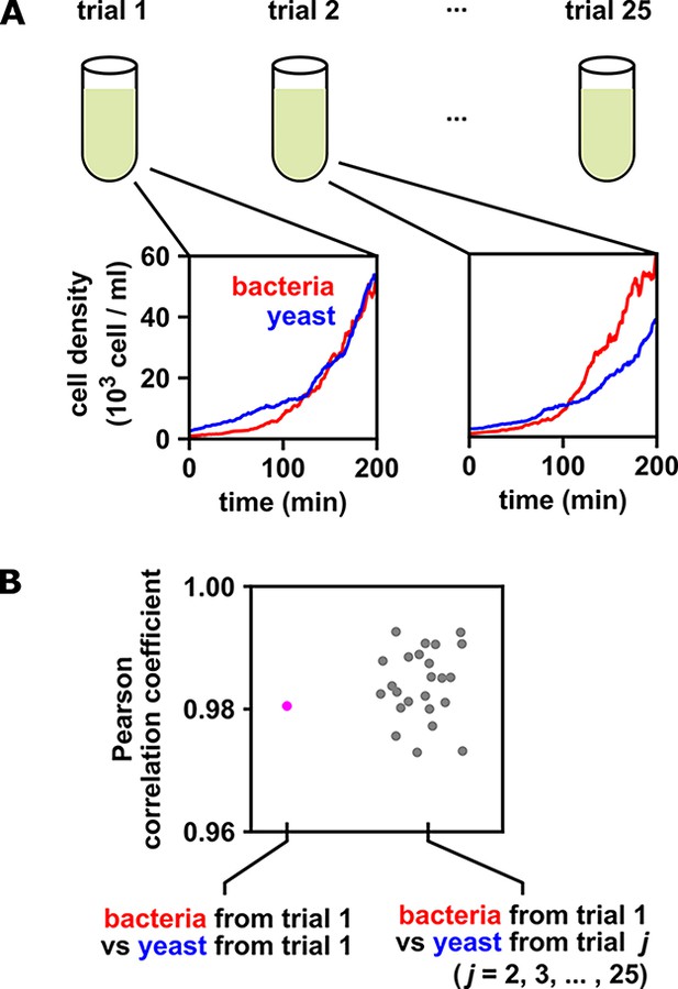
When multiple identical and independent trials are available, the significance of a correlation between time series within a trial can be assessed by comparing it to correlations between trials.
(A) A thought experiment in which yeast and bacteria are grown in the same test tube, but follow independent dynamics. We imagine collecting growth curves from 25 independent replicate trials. (B) Correlations within and between trials. The Pearson correlation coefficient between yeast and bacteria growth curves from trial one is a seemingly impressive ∼0.98 (pink dot). But does this result really indicate that the two growth curves are dependent? To answer this question, notice that the yeast curves from other trials are similarly highly correlated to the bacteria curve from trial 1, even though they all come from independent trials (grey dots). Therefore, the pink dot cannot be used as evidence that the yeast and bacteria growth are dependent. If the within-trial correlation (pink dot) were stronger than, for instance, 95% of the between-trial correlations (grey dots), we would have evidence of dependence.
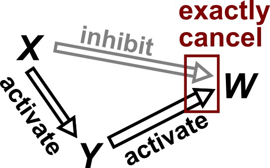
Violation of faithfulness condition due to precise cancellation of causal effects.
Although has a direct causal effect on , we assume here that this is exactly canceled out by an opposing influence via the indirect path of . Thus, although the Markov condition does not require that and be independent, and are actually independent. We thus say that the joint probability distribution of the variables is not faithful to the graph.
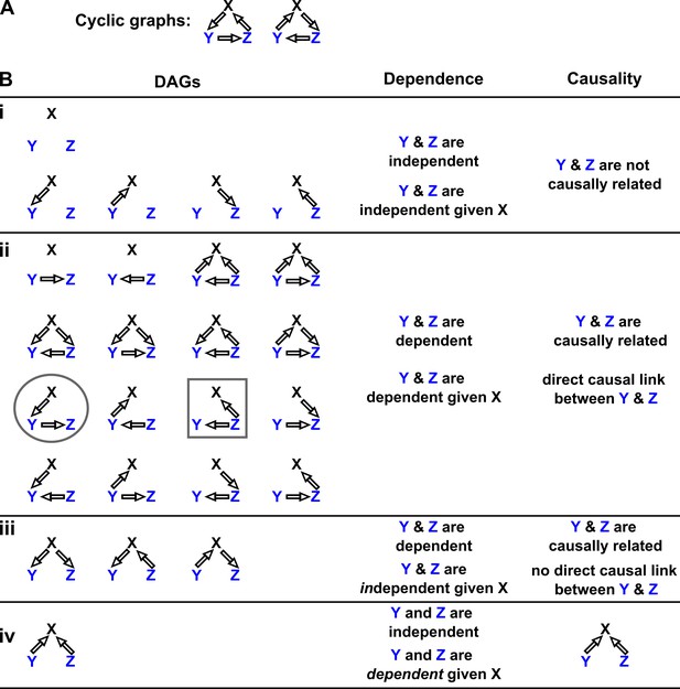
Probability distributions alone can specify causal structure to varying degrees of resolution.
Consider a system of three and only three random variables , and . Between each pair of variables, there are three possible unidirectional relationships: causation in one direction, causation in the opposite direction, and no causation. With three pairs of variables and three types of relationships, there are 33 = 27 possible graphs. (A) Two of these graphs are cyclic, while the rest are DAGs. (B) If our system is described by a Markovian and causally faithful SEM, we can infer some aspects of causal structure from probability distributions alone. We demonstrate this by using the dependence relationships between and (blue) to infer causal relationships. (Bi): and are always independent. and are not causally related. (Bii): and are dependent, implying that they are causally related. (Recall that in this article, two variables are “causally related” if one causes the other, or they share a common cause.) Furthermore, and are conditionally dependent given . For example, in the circled graph, variation in will affect , resulting in dependence between and , even if we control for . (Biii): and are dependent, but are conditionally independent given . There is no direct link between and , but they are causally related. Note that all three graphs are consistent with the following observations: and are dependent and conditionally independent given ; and are dependent and conditionally dependent given ; and are dependent and conditionally dependent given . Thus, we cannot uniquely identify the causal structure from dependence relationships alone. (Biv): and are independent, but are conditionally dependent given ; see Appendix 2—figure 3 for an example of this scenario. This case corresponds to one and only one possible DAG.
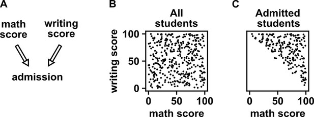
Selection bias creates the false impression of dependence.
(A) DAG depicting the assumed causal relationship between math scores, writing scores, and admission to a certain college. (B) Math and writing scores in a fictitious student population are independent of each other, and take on random values distributed uniformly between 0 and 100. (C) A college admits a student if and only if their combined score exceeds 100. It is apparent that when we condition on college admission (by plotting only the scores of admitted students), math and writing scores show a negative association, indicating that they are dependent.
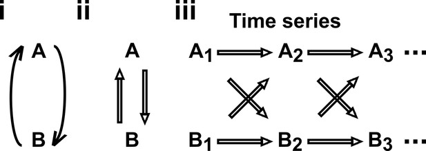
Causal discovery approaches designed for directed acyclic graphs (DAGs) can be applied to time series from systems with feedback.
(i) Consider a mutualistic system where and represent the population sizes of two species that mutually facilitate each other’s growth. (ii) When the role of time is ignored, the causal graph is cyclic and thus not a DAG. (iii) For time series data where , … represent the population size of at times , the causal graph is no longer cyclic since causes and causes and so on. Note that causes (and similarly causes ). This framework (Peters et al., 2017) has helped one of the authors classify mutations in ecological communities with feedback interactions (Hart et al., 2019; Hart et al., 2021).
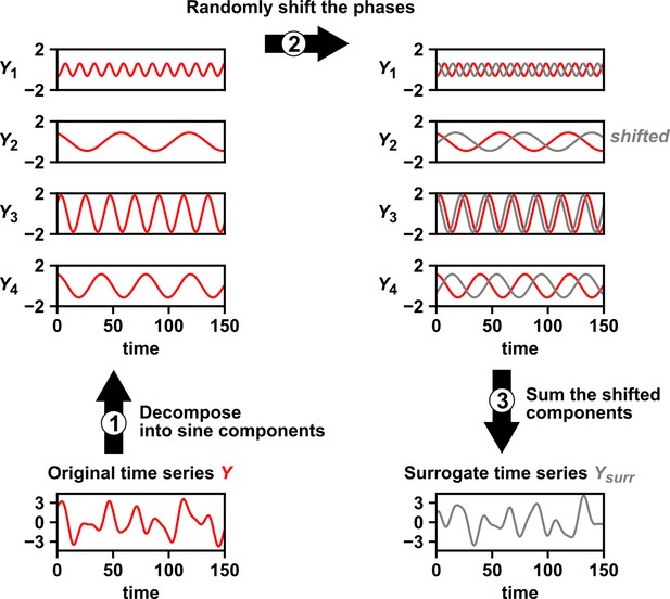
Intuition for random phase surrogate data methods.
Random phase surrogate data methods generate by representing as a sum of sine waves (1), randomly shifting the phases of the component sine waves (2), and summing up the shifted sine waves (3).
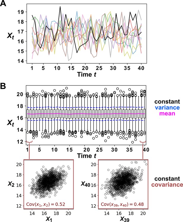
Example of a covariance-stationary process.
(A) Ten replicate runs of the stochastic process described in Equation 4 with parameter choices and . The noise term is a normal random variable with mean of zero and standard deviation of 1. To illustrate the behavior of a single replicate, we highlight one representative trajectory in black. (B) The distribution of values is shown for 1200 replicate runs of the same stochastic process as in (A). The mean of is given as a solid red line and the mean ± the standard deviation of is given by dashed blue lines. Bottom: is plotted against for two values of .
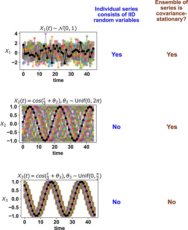
Whether a stochastic process is stationary depends on its entire ensemble of time series.
The top panel shows IID standard normal noise. The middle and bottom panels both show sinusoidal curves. Although an individual time series from the middle panel looks similar to that from the bottom panel, only the middle panel shows a covariance-stationary process.
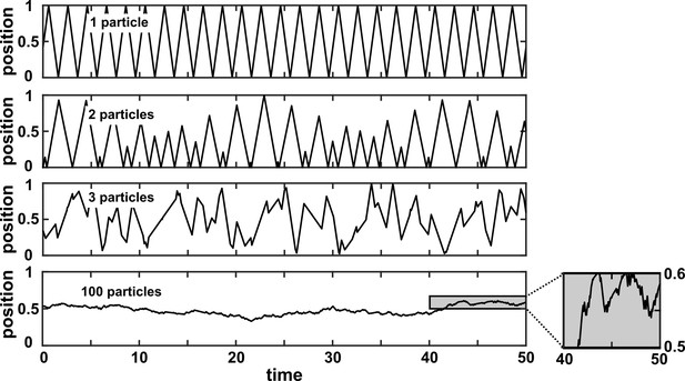
A many-variable deterministic system can be approximated as a stochastic system.
The position of a particle in a system of particles bouncing in a one-dimensional box is plotted over time. In each simulation, particles with radius 0 bounce around in a box with walls of infinite mass placed at positions 0 and 1. Each particle has a mass of 1 and is initialized at a random position between 0 and 1 according to a uniform distribution. Initial velocities are chosen in the following way: The initial velocity of each particle in a box is first randomly chosen from between –1 and 1 according to a uniform distribution. Then, all initial velocities in a given box are multiplied by the same constant to ensure that the total kinetic energy of each box is 0.5. Kinetic energy is conserved throughout the simulation. The simulation then follows the particles as they experience momentum-conserving collisions with one another and with the walls.

Continuity, smoothness, and the difficulty of evaluating the continuity or smoothness of a function with finite or noisy data.
(A) is not a function of because a single value can correspond to more than one value. Here, when we shade with the value of , we randomly choose the upper or the lower value, leading to bumpy shading. (B) is a discontinuous function of . This is because at any “breakpoint” (circle) between two adjacent segments, the limit taken from the left side is different from the limit taken from the right side. Shading with generates a ‘bumpy’ pattern. (C) is a continuous function of , and shading with generates a gradual pattern. (D) is a continuous and smooth function of . Consider any point on the curve (call it ). We can draw a line between and a neighboring point to the left (pL). We can also draw a line between and a neighbor to the right (pR). If the slopes of these two lines become equal as pL and pR become infinitesimally close to , then the function is smooth. Although the function in (C) is continuous, it is not smooth since at the maximum point, the slope taken from the left-hand side is different from the slope taken from the right-hand side. A smooth function is always continuous. (E) With finite and noisy data, shading with often generates a bumpy pattern. It is unclear whether is a function of , and if yes, whether the function is continuous and/or smooth.
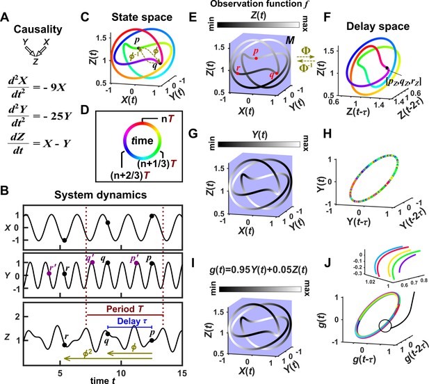
Illustration of Takens’ theorem.
(A) We consider a 3-variable toy system in which and causally influence , but does not influence or . (B) Time series of the three variables. (C) We can represent the time series as the state space manifold . Takens’ theorem requires that (a function that maps a point at current time to the point at a previous time ) and its inverse (from past to current time) are both smooth (: the first and second derivatives of the function exist and are continuous everywhere on the manifold). (D) To mark time progression, we color each point along the trajectory with its corresponding time value where time is represented as a color ring similar to a clock to reflect the periodic nature of system dynamics. (E, G, I) Shading the state space manifold with three different observation functions ( in Takens’ theorem) as indicated above each plot. (F, H, J) Delay space based on the observation function, colored with time. The map in Takens’ theorem maps, for example, point in panel E to point in panel F. The theorem tells us that for ‘generic’ choices of and , the function and its inverse provide a continuous mapping from the state space manifold to the delay space manifold, and vice versa. In this example . In panel J, multiple colors in a region are due to one period wrapping around the delay space multiple times (inset), but the color shading transition is continuous (similar to panel F).
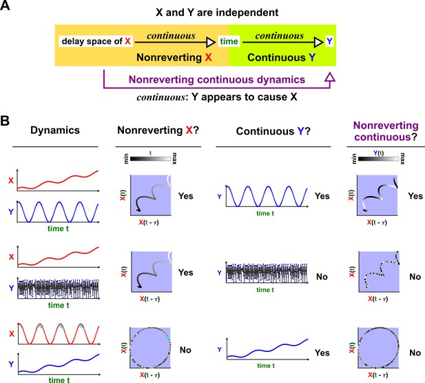
Nonreverting continuous dynamics.
(A) Definition of nonreverting continuous dynamics. We call nonreverting if the delay space of maps continuously to (time). We call ‘continuous‘ if is a continuous function of . If is nonreverting and is continuous then we say that the pair of time series has nonreverting continuous dynamics. (B) Examples. In each row, and are causally independent. Leftmost column: Dynamics. Each red or blue dot (visible upon zooming in on some of the charts) represents a single time point. Second column: Looking for a continuous map from the delay vectors of (the delay space) to , i.e. nonreverting dynamics. Third column: Looking for a continuous map from to by assessing whether at nearby times share similar values. Since the data occur at discrete times, the standard definition of continuity does not naturally apply, so ‘continuous ’ really means ‘highly autocorrelated’. Fourth and final column: the presence or absence of ‘nonreverting continuous dynamics’. With nonreverting continuous dynamics, there is a continuous map from the delay space to , and thus appears to cause even though and are causally independent.
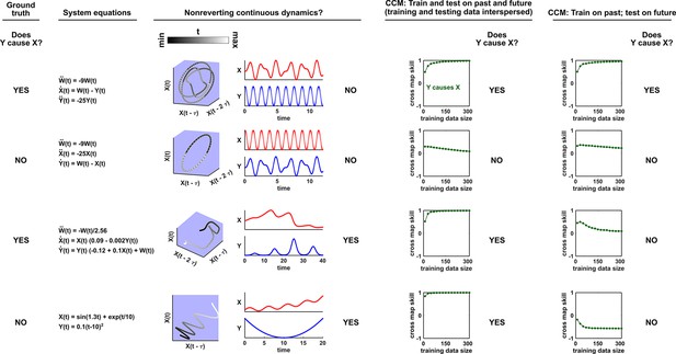
Nonreverting continuous dynamics impair the ability of CCM to correctly infer causality.
Each row represents a system where does or does not causally influence (Column 1). Column 2: Governing equations. Column 3: Checking for nonreverting continuous dynamics as in Appendix 4—figure 3. The top two rows do not have nonreverting continuous dynamics since there is no continuous map from the delay space of to time. The bottom two rows have nonreverting continuous dynamics. Columns 4 and 5: Results of CCM where training and testing data are interspersed or when we train on the past and test on future. In the bottom two rows, CCM suffers false negative or false positive errors depending on the analysis details (e.g. whether training and testing data are interspersed).
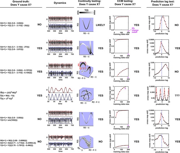
Comparison of visual continuity testing, cross map skill testing, and prediction lag testing in causal discovery.
Each row represents a two-variable or three-variable system where does or does not causally influence . The leftmost column shows the equations and ground truth causality. The second column shows a sample of and dynamics. Red and blue dots represent and values, respectively; black lines connecting the dots serve as a visual aid. The third column shows visual continuity testing and causal interpretation. We write ‘likely’ in the top row because the map from delay space to appears to have some small bumps on the right side of the plot. The fourth column shows cross map skill testing (without the prediction lag test) and causal interpretation. Black dots show cross map skill. Open purple dots show the 5% chance cutoff at the maximum library size according to random phase surrogate data testing (see Appendix 5), or are placed below the horizontal axis if the 5% chance cutoff is below the plot. In all systems appears to cause according to cross map skill testing since cross map skill is positive, increases with training data size, and is significant according to the surrogate data test. The rightmost column shows the prediction lag test and causal interpretation.
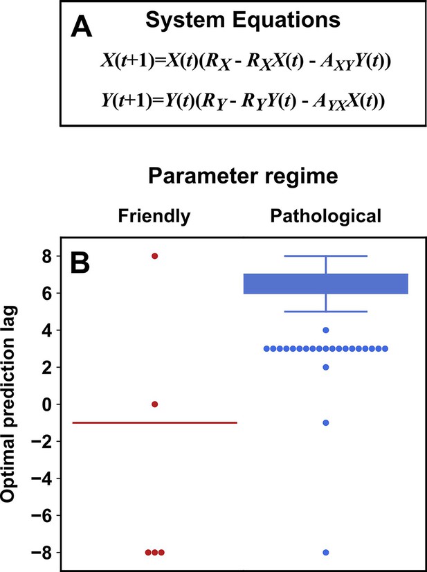
Parameters within a ‘pathological’ regime almost always cause the prediction lag test to erroneously reject a true causal link.
(A) System equations. For both ‘friendly’ and ‘pathological’ regimes, initial conditions and were independently and randomly drawn from the uniform distribution between 0.01 and 0.99 (“”), and RX was drawn from . RY was drawn from (‘friendly’) or (‘pathological’). and were independently drawn from (‘friendly’) or (‘pathological’). (B) Box plots show the optimal prediction lag when using delay vectors made from to predict values of in 250 systems with parameters selected randomly as described just now. In the ground truth model for this system, exerts a causal influence on . In the ‘friendly’ parameter regime, the optimal prediction horizon is negative, correctly indicating that does indeed cause . In the ‘pathological’ regime, the optimal prediction horizon is positive, and so the prediction lag test would wrongly conclude that does not cause . In the friendly regime the ‘box’ is shown as a line because the vast majority of trials had the same optimal prediction lag of -1.
Videos
Video walkthrough.
Tables
A comparison of three statistical causal discovery approaches.
| What does it mean if the method detects a link? | Implied causal statement | What are some possible failure modes? | |
|---|---|---|---|
| Correlation | X and Y are statistically dependent. | X causes Y, Y causes X, or Z causes both. | Surrogate null model may make incorrect assumptions about the data-generating process. |
| Granger causality | The history of X contains unique information that is useful for predicting the future of Y. | X directly causes Y. | Hidden common cause; infrequent sampling; deterministic system (no process noise); excessive process noise; measurement noise |
| State space reconstruction | The delay space of X can be used to estimate Y. | Y causes X. | Nonreverting continuous dynamics; synchrony; integer multiple periods; pathological symmetry; measurement or process noise |
Additional files
-
Source code 1
Code for simulations.
- https://cdn.elifesciences.org/articles/72518/elife-72518-code1-v1.zip


