DGRPool, a web tool leveraging harmonized Drosophila Genetic Reference Panel phenotyping data for the study of complex traits
Figures
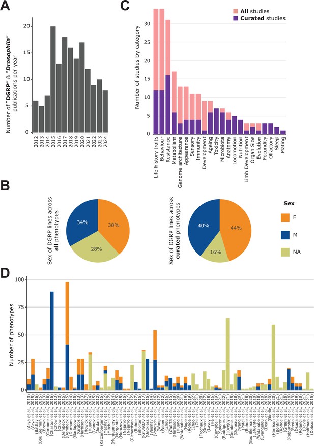
General content of the DGRPool web tool.
(A) Pubmed search on ‘Drosophila DGRP’ terms unveiled 155 results from 2012–2024 (search made in July 2024). (B) Sex of the DGRP lines used across all 135 studies (left) and 43 curated studies (right), for each phenotype. (C) Number of studies per phenotype category. Studies can be assigned to multiple categories. (D) Number of phenotypes per study and per sex. Studies without attached phenotypes were not plotted. Of note, a given phenotype can be measured for different sexes and thus counted multiple times.
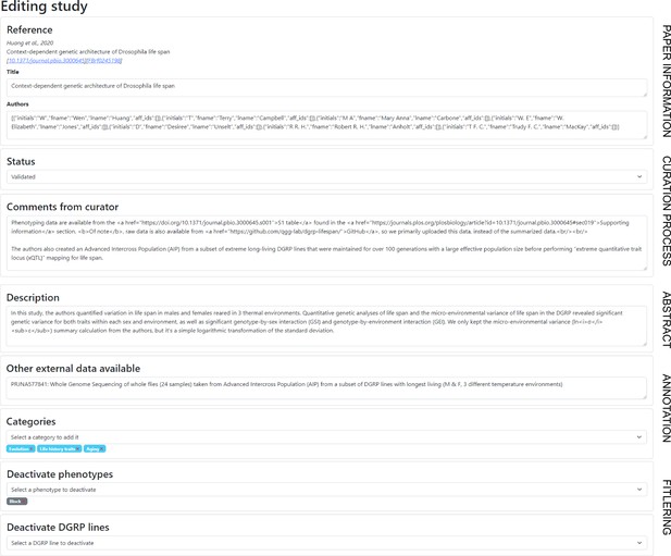
Screenshot from the curator’s view for a given study - Metadata section.
This screenshot shows the metadata section of the editing page for a study, where the curator can edit any of the fields. We expect the curator to set a description (short abstract) for the study, and associate some categories. The curator can also deactivate a phenotype if they consider that it is not a proper phenotype (like the number of replicates). Once the curation is done, the ‘Status’ field can be changed to ‘Validated’, which signifies that the curation process is finished, allowing the study to be widely visible to the users.
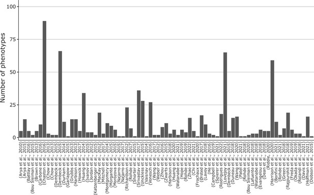
Number of phenotypes per study.
Studies have only been curated up to study 43 at the time of writing. Studies without attached phenotypes were not plotted. Here, we disregard the sex and thus count the unique phenotypes irrespective of the available sex linked to them. The 43 curated studies have 505 different phenotypes (~60%), while the remaining studies provide another 333 phenotypes (~40%).
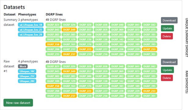
Screenshot from the curator’s view for a given study - Phenotype section.
This screenshot shows the phenotype section of the editing page for a study, where the curator can create or update the phenotyping data associated with the study. Here, the data is from Huang et al., 2014; Huang et al., 2020, taken as an example study. It is divided into four columns (from left to right): (1) dataset type (raw or summary), (2) phenotypes, (3) DGRP lines, and (4) actions. If the curator submits or updates a phenotype, a parsing script is then run to check the data format, and then the data is updated in the DGRPool database. For each study, the curator can submit, update or delete a unique summary dataset, containing summary data for each DGRP line (e.g. for mean or median values). The curator can also submit multiple raw datasets, if the raw data is available for this study. Raw data means that the phenotyping data is not summarized, that is, there are multiple values for the same DGRP line (e.g. because of replicate flies). Note: Gray phenotypes are deactivated phenotypes, that is, data that are present in the imported dataset, but not treated as ‘real’ phenotypes (here, it is a block number for each fly).
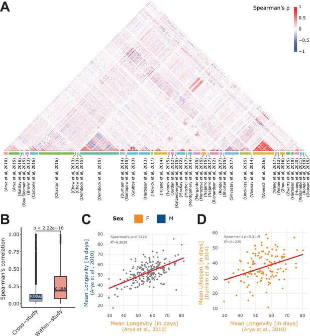
Within- and cross-study phenotype correlations.
(A) Spearman’s correlation of all phenotypes available in the 43 curated studies. Of note, we separately computed the phenotype correlations when data per sex were available (M, F, or NA), and we restricted the computation to quantitative (non-categorical) phenotypes. Phenotypes are grouped by study (colored box at the bottom of the plot). (B) Absolute value of the Spearman’s correlation of pairs of phenotypes that originated from the same study (within-study) and those that originated from two different studies (cross-study). Of note, displayed values are median. Mean values are 0.099 for cross-study, and 0.259 for within-study. Again, we restricted the calculation to the 43 curated studies. (C) Correlation of two longevity phenotypes from the same study (Arya et al., 2010), revealing a strong correlation between Female (F) and Male (M) longevity. (D) Correlation of two phenotypes from different studies: mean lifespan (Durham et al., 2014) and mean longevity (Arya et al., 2010). Of note, both the C and D plots were generated using the ‘phenotype correlation’ tool in DGRPool.
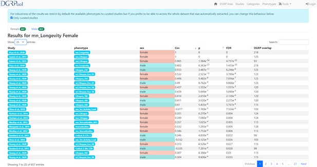
Screenshot from the phenotype correlation tool result page.
This screenshot shows the results obtained after running the phenotype vs phenotype correlation tool, available directly from a phenotype page, by clicking the ‘Compute Correlation’ button. Of note, there is also the possibility to run this tool from the ‘Tool’ section displayed on the banner of the DGRPool website on any user-submitted phenotype file.
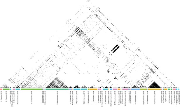
Spearman’s correlation of all phenotypes available in the 43 curated studies.
Here, we applied a binary coloring using a fixed threshold to better visualize the correlations. All correlations above abs(Spearman’s ⍴)>0.3 are shown in black (therefore anti-correlated phenotypes are also in black), the others are in white.
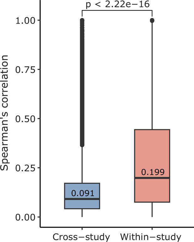
Comparison of correlation within and cross-study.
We calculated the absolute value of the Spearman’s correlation of pairs of phenotypes that originated from the same study (within-study) and those that originated from two different studies (cross-study). Of note, displayed values are median. Mean values are 0.138 for cross-study, and 0.281 for within-study. These values are calculated across all phenotypes (135 studies).
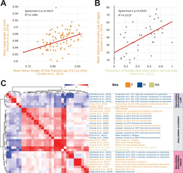
Phenotype correlations contribute new biological insights.
(A) Correlation of mean femur length Grubbs et al., 2013 vs. mean head width Vonesch et al., 2016 showing the significant cross-study association of organismal size traits. (B) Correlation of remating proportion Chow et al., 2013 vs. mean fecundity Durham et al., 2014. (C) 33 phenotypes correlated with longevity Arya et al., 2010 at a 5% FDR threshold (Spearman’s correlation), revealing three main groups of phenotypes: lifespan phenotypes (middle rows), other correlated phenotypes (bottom rows) and anti-correlated phenotypes (top rows). Of note, both the A and B plots were generated using the ‘phenotype correlation’ tool in DGRPool.
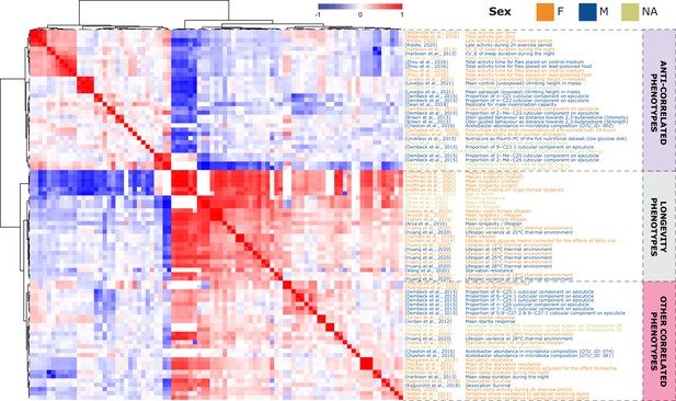
Phenotype correlations contribute new biological insights.
87 phenotypes correlated with longevity Arya et al., 2010 at a 25% FDR threshold (Pearson’s correlation), revealing three main groups of phenotypes: lifespan phenotypes (middle rows), other correlated phenotypes (bottom rows) and anti-correlated phenotypes (top rows).
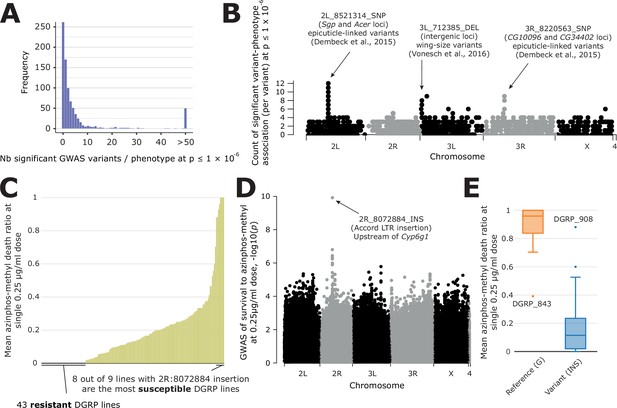
Overview of GWAS results across phenotypes and one case study.
(A) Distribution of the number of significant variants after a GWAS, for each phenotype available in DGRPool. Of note, all values > 50 have been set to 50, for easier visualization. (B) For each variant, we plotted the number of times it was significantly associated with a phenotype (y-axis=number of occurrences). It is worth noting that we chose a Manhattan plot for representing this information, but this is not a ‘real’ GWAS Manhattan plot. (C) Case study on survival to azinphos-methyl exposure Battlay et al., 2016, here to a 0.25 µg/ml dose. This plot was extracted from the phenotype’s page on DGRPool at https://dgrpool.epfl.ch/phenotypes/20. (D) Manhattan plot (taken from DGRPool’s result page https://dgrpool.epfl.ch/phenotypes/20/gwas_analysis) showing the association of variants to the ‘survival at 0.25 µg/ml dose’ phenotype. (E) Boxplot (taken from DGRPool’s result page https://dgrpool.epfl.ch/phenotypes/20/gwas_analysis), showing the effect of the top variant, 2 R:8072884, which is a long insertion.
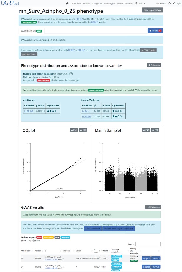
Screenshot from the GWAS result page.
This screenshot shows the results obtained after running the GWAS analysis, available directly from a phenotype page, by clicking the ‘GWAS’ button. Of note, there is also the possibility to run this tool from the ‘Tool’ section displayed on the banner of the DGRPool website on any user-submitted phenotype file. There is a ‘Filter’ button on top, allowing users to filter the GWAS results by genomic coordinates or variant impact. Then, the first section compares the phenotype to the six known covariates (Wolbachia status, and ive known insertions), to check for any association through both an ANOVA and a Kruskal-Wallis test. The next section shows the conventional QQplot and Manhattan plots. And the last section displays the top 1000 significant variants, filtered at nominal p-value ≤ 0.001. Of note, there are two buttons in the GWAS result section, showing the enrichment of the variant-associated genes into two gene set databases: the Gene Ontology, and the FlyBase phenotypes.
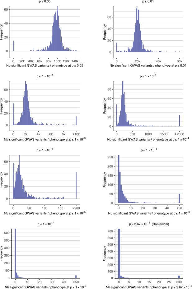
Distribution of the number of GWAS hits per phenotype depending on the significance threshold.
These plots show the distribution of the number of significant variants after a GWAS, for each phenotype available in DGRPool. Each of the eight plots are the results for different p-value thresholds, ranging from p≤0.05 (the less stringent) to p≤2.67 x 10⁻⁸ (the Bonferroni threshold, i.e. the more stringent). Of note, for better visualization, all values > X have been set to X, with different limit values X for each plot (as depicted in the x-axis legend).
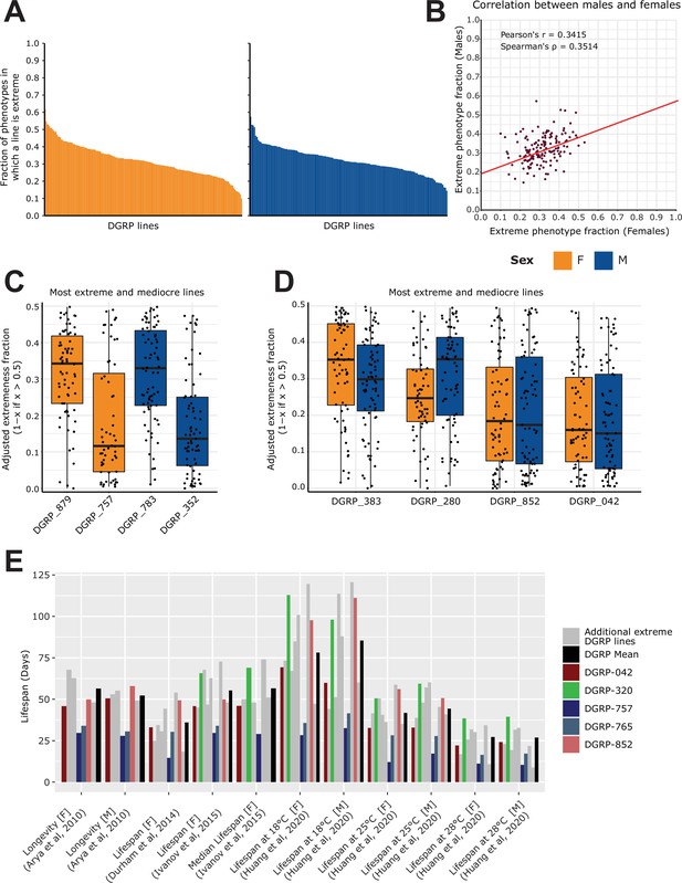
Analysis of extremeness among DGRP lines across 40 phenotypes.
(A) Fraction of extremeness of a given DGRP line. DGRP lines are assigned as ‘extreme’ in a phenotype when they are in the top or bottom 15% of the phenotypic spectrum. Phenotypes were selected based on the curated studies which had the following categories assigned to them: Life history traits, Immunity, Toxicity, Resistance, Fecundity, Aging. DGRP lines were included if they had at least 50 phenotypic measures. (B) Scatter plot for the fraction of extremeness of DGRP lines. On the x-axis, the fraction of extremeness is plotted for females, whereas males are plotted on the y-axis. (C) Most extreme and moderate DGRP lines per sex. On the x-axis, the adjusted fraction of extremeness is provided. Individual fractions of extremeness per phenotype were retrieved for each DGRP line. The fraction was adjusted by 1 minus the fraction of extremeness if the fraction of extremeness was above 0.5. Because extremeness can range from 0 to 0.15 or 0.85–1, we adjusted the fraction of extremeness for plotting purposes. DGRP lines with a low adjusted fraction of extremeness are therefore more extreme, whereas a high adjusted fraction of extremeness is representative of more moderate DGRP lines. (D) Extreme and moderate DGRP line pairings. On the x-axis, the adjusted fraction of extremeness is provided. Extreme and moderate line pairings were retrieved by searching for DGRP lines for which the fraction of extremeness between females and males was not greater than 0.05 while still having the highest and lowest average fraction of extremeness (across sex). (E) Looking at phenotypes from Figure 2D marked as longevity/lifespan, for DGRP lines which are in the top 5 of fraction of extremeness for each respective sex, including DGRP_852 and DGRP_042 (red shades) from 5D. We specifically highlight DGRP_757, DGRP_765 in blue shades to show that they are across multiple studies in the lower end of the lifespan as is expected given that the lifespan trait is robust across studies. Similarly, DGRP_320 shows a trend in which it displays above average lifespan. Other extreme DGRP lines which were in each respective top 5 are displayed in gray.
Tables
Comparison of the two currently available web portals organizing DGRP phenotyping data.
This table compares different features available in DGRPool, with DGRP2 being the main current resource for DGRP data. DGRPool separates the features into (1) Data, which summarizes the available phenotyping data, (2) Tools, which lists the available tools and options, mainly GWAS, PheWAS and phenotype correlation, (3) Web, which describes the website itself, and (4) Additional features that are available in DGRPool, such as the curation system, the possibility to publish new studies and the interactive plots. Of note, the 838 phenotypes are counted regardless of the linked sex (M, F and/or NA), while the ‘sex-specific’ value is calculated by counting the same phenotype separately for each available sex.
| DGRPool | DGRP2 | |||
|---|---|---|---|---|
| REFERENCE | This study | Mackay, 2012; Huang et al., 2014 | ||
| DATA | DGRP lines | 342 | 205 | |
| DGRP studies | 135 (43 fully curated) | 12 | ||
| Phenotypes | 1034 (840 unique) | 31 | ||
| Gene Expression data | External links | ✓ | ||
| TOOLS | GWAS | Calculated on all phenotypes | ✓ | |
| User upload | ✓ | ✓ | ||
| Method | Plink2 | FastLMM | ||
| Covariates | Wolbachia + 5 Insertions | Wolbachia + 5 Insertions | ||
| Boxplot of REF vs ALT | ✓ | |||
| PheWAS of top variants | ✓ | |||
| Phenotype correlation | Calculated on all phenotypes | ✓ | ||
| User upload | ✓ | |||
| WEB | URL | https://dgrpool.epfl.ch/ | http://dgrp2.gnets.ncsu.edu/ | |
| Backend | Ruby-on-rails+PostgreSQL | NA | ||
| Frontend | Javascript, Plotly | NA | ||
| FEAT. | Curation system & tools | ✓ | ||
| Publish new studies | ✓ | |||
| Interactive plots | ✓ | |||
Additional files
-
Supplementary file 1
Spreadsheet containing all 135 studies.
This table was created from the ‘studies.tsv’ file, which is downloadable from the front page of DGRPool. It contains all studies and publication references used in the online tool and in this manuscript.
- https://cdn.elifesciences.org/articles/88981/elife-88981-supp1-v1.xlsx
-
MDAR checklist
- https://cdn.elifesciences.org/articles/88981/elife-88981-mdarchecklist1-v1.docx


