A multiplexed, single-cell sequencing screen identifies compounds that increase neurogenic reprogramming of murine Muller glia
Figures

sci-Plex captures the in vitro temporal dynamics of neurogenic reprogramming from Muller glia (MG).
(A) Schematic of the sci-Plex experimental design for assaying reprogramming MG isolated from P11 mice. (B) Combined UMAP of cells from the Timecourse and Pulse experiments. Cells are colored by cell type. (C) UMAP displaying the pseudotime scores that were calculated for the MG to Bipolar trajectory. (D) Schematic depicting the timing and duration of Ascl1 OE in the Timecourse (n = 2 wells per condition) and Pulse (n = 3 wells per condition) experiments. (E) Histograms displaying the frequency of cells with each pseudotime score across Ascl1 OE conditions. The vertical black lines are at pseudotime score 16. The yellow region corresponds to the MG, the green region corresponds to the ProL cells, and the purple region reflects cells from the Transition to BP cell state. (F) Stacked bar plot of the cell type composition across all Ascl1 OE conditions. The colors represent the cell types as indicated. Only the MG and MG-derived cell types are included. (G) Gene expression plots along pseudotime for genes of interest. Each point represents an individual cell’s expression of the indicated gene. The cells are colored by cell type as in F. (H) Gene expression heatmap for the top 250 DEGs as assessed across a pseudotime score of 10–20. The dashed line is at pseudotime score 16. All cells with a non-infinite pseudotime score are ordered by pseudotime score along the x-axis. Genes were clustered by k-means into three clusters. Figure 1A was created with BioRender.com and Figure 1D was also created with BioRender.com.
-
Figure 1—source data 1
Genes differentially expressed across pseudotime.
- https://cdn.elifesciences.org/articles/92091/elife-92091-fig1-data1-v1.xlsx
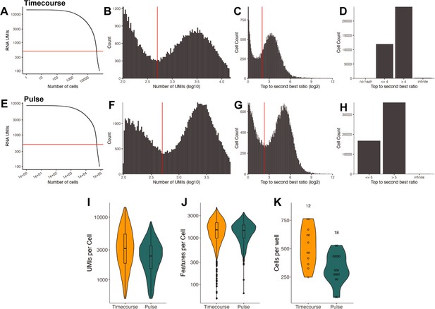
Sequencing quality control for the Timecourse and Pulse experiments.
(A) Knee plot comparing the number of RNA UMIs recovered to the total number of cells captured for the Timecourse experiment. The red horizontal line is at 500 and indicates the UMI cutoff used in filtering steps. (B) Histogram of the number of RNA UMIs (log10) for the Timecourse experiment. The red vertical line is at 500 and indicates the UMI cutoff used in filtering steps. (C) Histogram of the hash top_to_second_best_ratio (log2) for the Timecourse experiment. The red vertical line is at 5 and indicates the ratio cutoff used in filtering steps to determine whether a cell was confidently assigned to a condition. (D) Bar plot indicating the portion of cells above and below the hash ratio cutoffs for the Timecourse experiment. (E) Same as A but for the Pulse experiment. (F) Same as B but for the Pulse experiment. (G) Same as C but for the Pulse experiment. (H) Same as d but for the Pulse experiment. (I) Violin plot with a boxplot overlay indicating the number of RNA UMIs recovered per cell for each experiment. (J) Violin plot indicating the number of genes/features recovered per cell for each experiment. (K) Violin plot with a boxplot overlay quantifying the number of cells recovered per well. The numbers above the plots indicate the number of samples within each experiment.
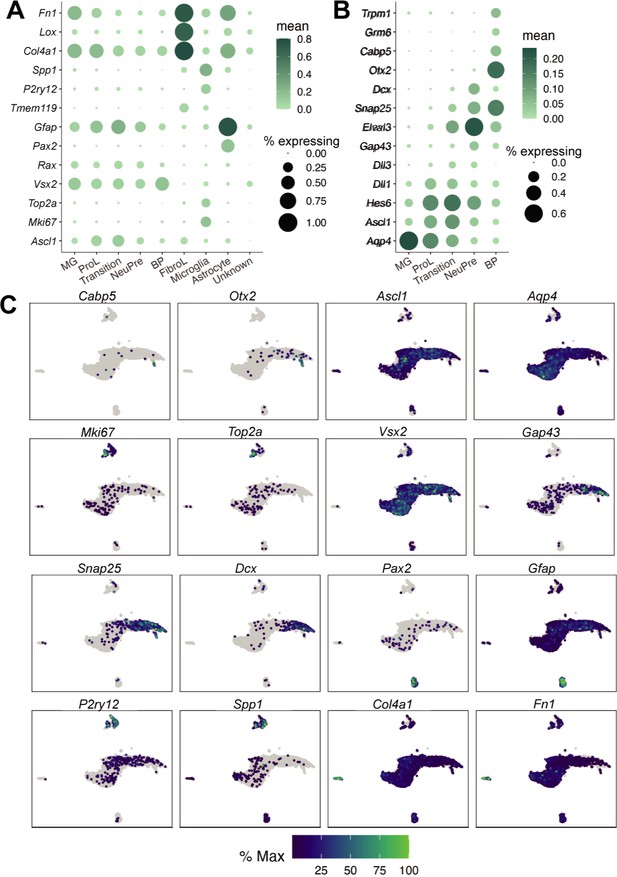
Cell type annotation for the Timecourse and Pulse experiments.
(A) Dot plot of the genes used to define the major cell types found in the reprogramming cultures. Dot size indicates the percent of cells that express the gene of interest. The color indicates the log10 mean UMIs per cell. (B) Same as A but for the genes used to define cell types derived from Muller glia (MG). (C) Gene expression plots of the genes used to annotate cell types. The color for each individual plot is scaled to the maximum expression of that gene.
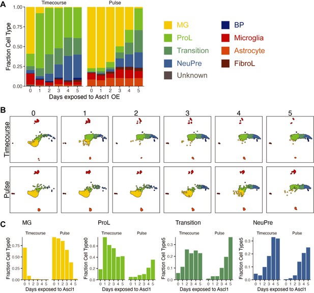
Visualization of cell composition changes across time in the Timecourse and Pulse experiments.
(A) Stacked bar plot of the cell type composition across all Ascl1 OE conditions. The colors reflect the cell types. (B) UMAP from Figure 1B, but faceted by Ascl1 OE condition. The cells are colored by cell type as in A. (C) The fraction of each cell type at each day of each experiment when considering only the Muller glia (MG), ProL, Transition, and NeuPre cells.

Retention of late pseudotime cells in the Pulse experiment matches loss of Ascl1 expression.
(A) Cell density plots across pseudotime for the Timecourse and Pulse experiments. The blue vertical line is at 16, the local minimum for pseudotime values >10 and <20 in the Pulse experiment. (B) Gene expression plots along pseudotime for Ascl1 from the Timecourse experiment only. Each point represents an individual cell’s expression of the indicated gene. The cells are colored by cell type as in Figure 1—figure supplement 3A.
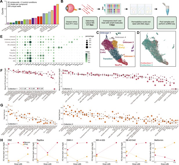
sci-Plex as a screen to identify small molecules that affect Ascl1-dependent Muller glia (MG) reprogramming.
(A) Bar plot representing the distribution of targets for the 92 compounds included in the screen. (B) Schematic of the experimental design for the small molecule screen. (C) UMAP of the MG and MG-derived cell types. Cells are colored by cell type. (D) UMAP from C with cells colored by collection. (E) Dot plot of the genes used to define the MG-derived cell types from the screen. Dot size indicates the percent of cells that express the gene of interest. The color indicates the log10 mean UMIs per cell. (F) Quantification of the fold change in Neuron cell counts between each indicated condition and the Ascl1 only control. The plots from Collections 1 and 2 used only the control wells collected on their respective days. The dose of each compound is indicated by the size of the dot. (G) Quantification of the total cell counts for each treatment. The compound’s dose is indicated by the size of the dot. (H) Plots displaying the fold change of Neuron (red) and ProL (orange) cell counts compared to Ascl1 only across all doses for the top hits from the screen. All conditions in which at least 20 cells were recovered are displayed. Figure 2B is created with BioRender.com.
-
Figure 2—source data 1
Small molecules used from Tocriscreen Stem Cell Library.
- https://cdn.elifesciences.org/articles/92091/elife-92091-fig2-data1-v1.xlsx
-
Figure 2—source data 2
Genes used and GO annotations in unknown clusters.
- https://cdn.elifesciences.org/articles/92091/elife-92091-fig2-data2-v1.xlsx
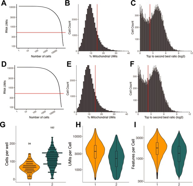
Sequencing quality control of small molecule sci-Plex screen.
(A) Knee plot comparing the number of RNA UMIs recovered to the total number of cells captured for the Collection 1 experiment. The red horizontal line is at 500 and indicates the UMI cutoff used in filtering steps. (B) Histogram of the % mitochondrial UMIs for the Collection 1 experiment. The red vertical line at 15% indicates the cutoff used in determining high-quality cells. (C) Histogram of the hash top_to_second_best_ratio (log2) for Collection 1. The red vertical line is at 5 and indicates the ratio above which a cell was determined to be confidently assigned to a single input well. (D) Same as A but for Collection 2. (E) Same as B but for Collection 2. (F) Same as C but for Collection 2. (G) Violin plot quantifying the number of cells recovered per well. The numbers above the plots indicate the number of samples within each experiment. Each point indicates a treatment well. (H) Violin plot with a boxplot overlay indicating the number of RNA UMIs recovered per cell for each collection. (I) Violin plot with a boxplot overlay indicating the number of genes/features recovered per cell for each collection.
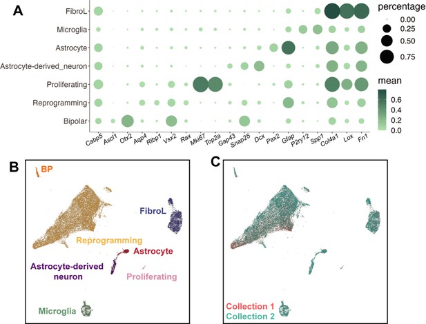
Cell type annotation of small molecule sci-Plex screen.
(A) Dotplot of the expression patterns of genes used to define cell types from all cells in the screen experiment. Dot size indicates the percent of cells that express the gene of interest. The color indicates the log10 mean UMIs per cell. (B) Combined UMAP of all the cells captured in Collections 1 and 2. Cells are colored by cell type. (C) Same UMAP as in B but colored by collection.
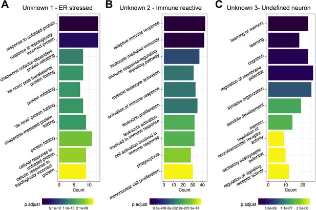
Gene Ontology (GO) term enrichment of Unknown cell clusters from the sci-Plex screen.
(A) GO term enrichment of the genes expressed with high specificity to Unknown 1 in Figure 2C. The color of the bar reflects the adjusted p-value for each specific GO term. The height of the bar indicates the number of genes in the inputted list of genes that fall into each GO term. (B) Same as A but for the genes expressed with high specificity to Unknown 2 in Figure 2C. (C) Same as A but for the genes expressed with high specificity to Unknown 3 in Figure 2C.
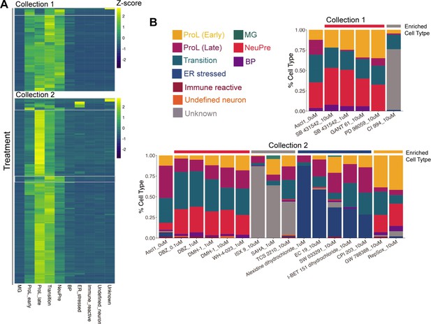
Cell type distributions across treatment conditions.
(A) Heatmap of the cell type abundances across all treatments. Z-scores were calculated by rows. The white boxes indicate treatments that are enriched for Unknown, ER stressed, ProL early, or NeuPre cell types. (B) Stacked bar plots representing cell type compositions of each of the treatments highlighted in A.
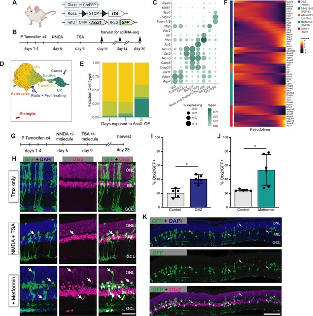
Validation of sci-Plex hits in an in vivo neuronal regeneration paradigm.
(A) Schematic of the transgenic mouse used to induce Ascl1 and GFP specifically in Muller glia (MG). (B) Experimental paradigm for testing the in vivo dynamics of Ascl1-dependent MG reprogramming. (C) Dot plot of the genes used to define the major cell types found in the reprogramming cells in vivo across all time points. The size of the dot indicates the percent of cells that express the gene of interest. The color indicates the log10 mean UMIs per cell. (D) An integrated UMAP of the cells recovered from in vivo reprogramming 5, 9, or 21 days after NMDA treatment. Cells are colored by cell type. (E) Stacked bar plot of the cell type composition across in vivo Ascl1 OE durations. The colors represent the cell types as in D. Only the MG and MG-derived cell types are included. (F) Heatmap of the in vivo expression of genes related to the pathways regulated by the top small molecules hits from the in vitro screen. Reprogramming cells are ordered along pseudotime. The row normalized z-score was calculated from size factor normalized gene expression counts. (G) Experimental paradigm for testing the in vivo effect of hit compounds on reprogramming. (H) Representative sections of retina after Ascl1 only, Ascl1/NMDA/TSA or Ascl1/NMDA/TSA/Metformin treatment. Immunostaining for GFP (green) and Otx2 (purple) show MG-derived cells (GFP+) expressing the neuronal marker Otx2. Scale bar = 50 μm. (I) Quantification of the percentage of GFP+ MG-derived cells that express the neuronal marker in Ascl1/NMDA/TSA (control) versus the addition of Metformin (p = 0.017). Statistical significance (p < 0.05) as denoted by * was determined using an unpaired t-test. Height of the bar indicates the mean, and the error bars indicate the standard deviation. Each individual is plotted as a dot. (J) Quantification of the percentage of GFP+/Otx2+ cells in control versus DBZ treatment (p = 0.0009). Statistical significance (p < 0.05) as denote by * was determined using an unpaired t-test. Height of the bar indicates the mean, and the error bars indicate the standard deviation. Each individual is plotted as a dot. (K) Representative widefield image of GFP+ MG-derived neurons (GFP+/Otx2+) showing the widespread stimulation of neurogenesis in metformin treated retinas. Scale bar is 100 μm. Figure 3A was created with BioRender.com.
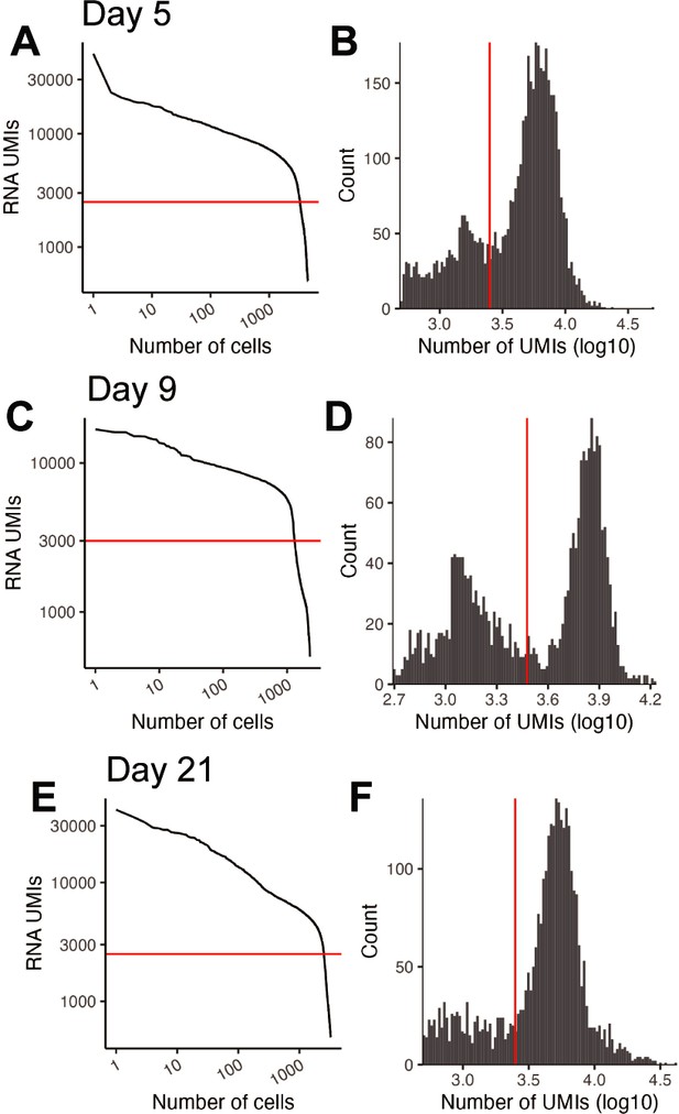
Quality control of in vivo reprogramming 10× RNA-seq libraries.
(A) Knee plot comparing the number of RNA UMIs recovered to the total number of cells captured for the Day 5 in vivo experiment. The red horizontal line is at 2500 and indicates the UMI cutoff used in filtering steps. (B) Histogram of the UMIs for the Day 5 in vivo experiment. The red vertical line is at 2500 and indicates the UMI cutoff used in filtering steps. (C) Same as a but for Day 9. The line is at 3000. (D) Same as B but for Day 9. The line is at 3000. (E) Same as a but for Day 21. The line is at 2500. (F) Same as B but for Day 21. The line is at 2500.
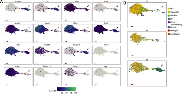
Cell type annotation of in vivo reprogramming 10× RNA-seq libraries.
(A) UMAP gene expression plots of the genes used to annotate cell types in the reprogramming cells in vivo across all timepoints. The color for each individual plot is scaled to the maximum expression of that gene. (B) UMAP of the cells recovered from the in vivo reprogramming faceted by collection day. Cells are colored by cell type.
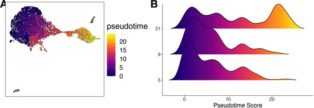
Pseudotime of in vivo reprogramming 10× RNA-seq libraires.
(A) UMAP of the in vivo reprogramming cells colored by pseudotime. (B) Histograms displaying the frequency of each pseudotime score across in vivo Ascl1 OE durations.
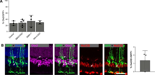
Immunostaining of in vivo reprogrammed neurons.
(A) Quantification of the percentage of GFP+ cells that express the bipolar marker Otx2+ in control versus SB431542, DMH-1, or WH-4-023 treatments. None of the treatments showed a significant increase compared to control using an unpaired t-test. Height of the bar indicates the mean, and the error bars indicate the standard deviation. Each individual is plotted as a dot. (B) Immunostaining and quantifications of the percentage of GFP+ Muller glia (MG)-derived cells that express the HuC/D+ neuronal marker after Metformin treatment. The scale bar is 50 μm. Height of the bar indicates the mean, and the error bars indicate the standard deviation. Each individual is plotted as a dot.
Additional files
-
MDAR checklist
- https://cdn.elifesciences.org/articles/92091/elife-92091-mdarchecklist1-v1.docx
-
Supplementary file 1
Marker genes used for cell type annotation.
- https://cdn.elifesciences.org/articles/92091/elife-92091-supp1-v1.docx


