High-density sampling reveals volume growth in human tumours
Figures

Multi-region sampling of a hepatocellular tumour and cell-based simulations.
A shows the spatially resolved sequencing data of 285 samples of a hepatocellular carcinoma analyzed by Ling et al., 2015. Each sample is indicated by a small pie chart in which colors indicate specific mutations, and slice sizes indicate the mutation frequencies within each sample. The 23 samples highlighted by a black outline were also subjected to whole-exome sequencing. The samples form a honey-comb structure, because the tumour slice had been cut into four quadrants, see Fig S1 in Ling et al., 2015. (B and C) Results of a cell-based simulation in the surface growth mode (B) and the volume growth mode (C). In each case, 280 evenly spaced samples were taken from the population of 10000 cells of a 2D simulation, see text. The most frequent mutations are shown as in (A), superimposed on the structure of the simulated tumour.
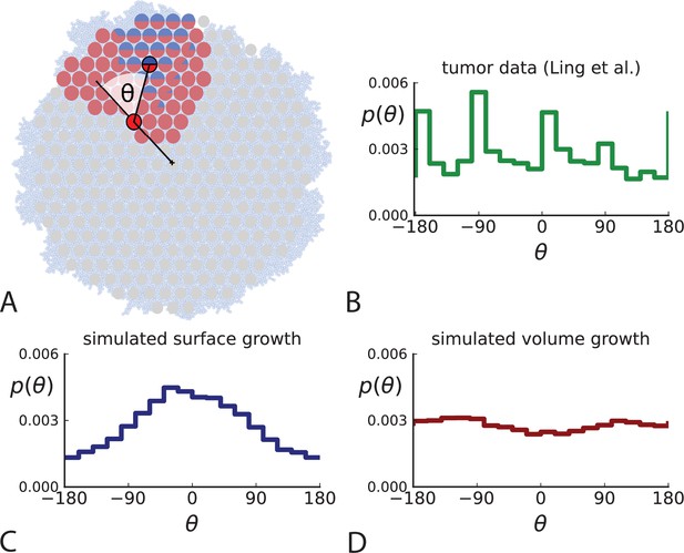
Relative position of mutants under different growth modes.
(A) The direction angle θ quantifies the direction of a new mutant clone relative to its parent clone. In this illustration, a new mutant clone indicated in blue appears and grows radially outward on a red parental background, resulting in an angle θ near zero. Each pair of cells indicated in red and blue contributes to the distribution of θ, with the statistical weight of each mutant clone adding to one (see Appendix 2). (B) The distribution of angles θ for different mutant clones found in the spatially-resolved data of Ling et al., 2015. The peaks at come from individual clones. The contributions from different clones to the distribution of angles is shown in Appendix 2—figure 1. (C and D) show the corresponding distribution of angles for numerical simulations. Subfigure C shows simulations of surface growth, resulting in a distribution of direction angles with a pronounced maximum near zero. Under volume growth (D) a nearly flat distribution is seen. For C and D, simulations were run in three dimensions with a maximum population size of 40,000 cells grown at division rate , a rate of cell death and for surface and volume growth respectively, and a whole-exome mutation rate before taking a two-dimensional cross-section of 280 samples mimicking the sampling procedure in Ling et al., 2015. (The different death rates were chosen to make the extinction probabilities of the populations comparable for the two cases. Changing these rates did not affect the distributions of angles.).
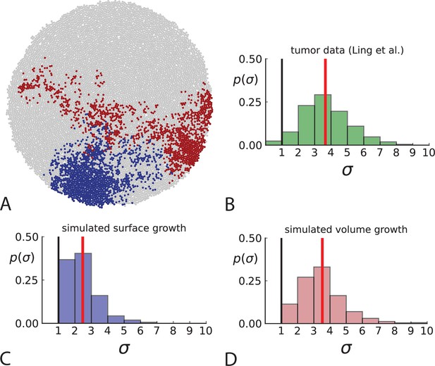
Dispersion of mutations within the tumour.
(A) Cells with a particular mutation can form tight spatial clusters within a tumour (simulated example here: mutant shown in blue), or they can be more widely dispersed (mutant shown in red). We quantify the dispersion of a mutation using the dispersion parameter σ, see text and Appendix 4. In this illustrative example, the blue mutation has a small dispersion parameter , the red one has . (B) Histogram of the dispersion parameters σ across 217 mutations in the whole-exome data of Ling et al., 2015. The red line indicates the mean of the histogram. (C) and (D) show the corresponding histograms for simulations of surface growth and volume growth, respectively. The simulations were run in 3D with populations grown up to 40,000 cells before taking 23 evenly spaced samples from a 2D cross-section. Only mutations with a whole-tumour frequency larger than 1/40 were considered, mimicking the limited sequencing resolution in the Ling et al. data. Simulation parameters were division rate , mutation rate , and death rates and for surface growth and bulk growth, respectively.
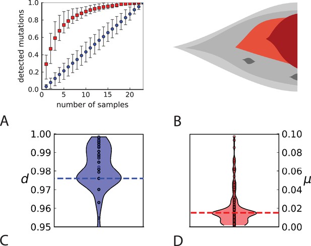
Rate of cell death and the mutation rate.
(A) We ask how a limited number of samples identify mutations. We pick a subset of the whole-exome sequenced samples of Ling et al., 2015 and plot the fraction of mutations present at least in one of these samples against the number of samples in the subset (red symbols, fractions are relative to the number of mutations present in at least one of the 23 samples. Mutations must be supported by at least 5 reads at a coverage of at least 150). The procedure is repeated (blue symbols) with those mutations removed that occur in some other sample with a higher frequency than the frequencies with which the mutation occurs in the subset of samples. Error bars indicate the range of the 95-percentile. (B) The schematic Muller plot shows how cell death leads to the loss of clones, some of which have extant offspring. Time runs on the horizontal axis, the vertical shows a number of different clones indicated by different colours. In the example shown here, the clone shown in light red becomes extinct, leaving behind its darker-shaded offspring clone with no parental clone. The rate of this loss of parental clones depends on the rate of cell death, and can be used for inference, see text. (C) shows the inferred rate of cell death and (D) the inferred rate of mutation per generation. The violin plots show how the inferred values vary when subsampling different fractions of all mutations and scaling the inferred mutation rate correspondingly, with the dashed lines indicating the mean inferred values. (The fraction of mutations sampled ranges from 0.5 to 0.9, with the results shown separately in Appendix 9).
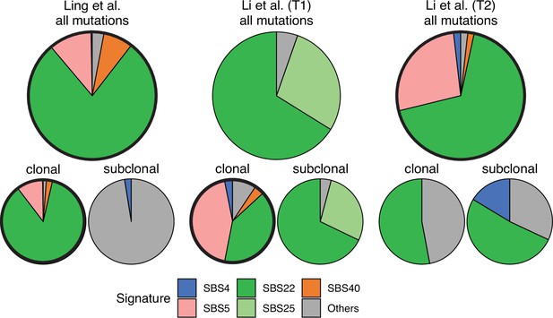
Mutational signature decomposition.
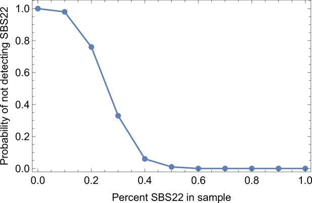
Relative weights of single-base substitution (SBS) mutational signatures Brody et al., 2018 in all three tumours were derived with SigNet Refitter where possible (highlighted pie charts), otherwise with non-negative least squares (Alexandrov et al., 2020) (Methods). (left) Ling et al., (centre) tumour T1 of Li et al., (right) tumour T2 of Li et al. Top: all mutations, bottom: mutations stratified by their clonality. Signature SBS22 is associated with exposure to aristolochic acid. In the Ling et al. data, this signature is prominent among clonal mutations, but absent in subclonal mutations. Also shown are signatures with relative weight larger than 1% and attributed to endogenous mutational processes (SBS5 and SBS40), tobacco smoking (SBS4) and a signature that resembles SBS22 (SBS25). All other signatures were combined into a single category (‘Others").
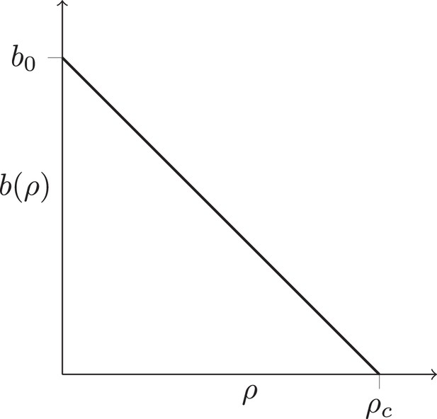
Density-dependent birth rate.
A schematic plot of the birth rate decreasing with the local density of cells ρ, see text.
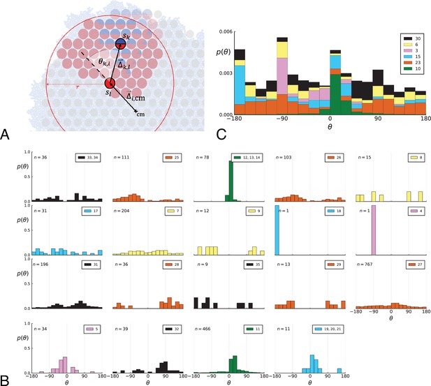
Parent-offspring direction angle algorithm illustration and contributions of different clones.
(A) This cutout of Figure 2A showcases the different variables used in step 2 of the algorithm to calculate the angles θ. A new mutant clone with mutations indicated in blue appears and grows radially outward on a red parental background with mutations . For a given parental sample belonging to the parental background, we consider every sample belonging to the offspring clone within a distance from , where is the distance between and the tumour surface. for the pair and is the angle between the arrow pointing from the center of mass cm to and connecting to as calculated in step 2c. A weight is assigned to such that the total weight of all pairs where the blue clone is the offspring is 1; this way each clone contributes equally to the distribution of θ. (B) The distribution of angles θ in the Ling et al. data shown Figure 2B of the main text comprises contributions from different clones. These contributions are shown here separately for each clone. On each subplot, the top-right label gives the private mutations of the clone and on the top-left label gives the number of parent-offspring pairs contributing to the histogram. The color indicates which of 6 distinct clades the clone belongs to. Crucially, there is no bias for a particular value of θ across clones. An artefact of giving equal weights to clones are the sharp peaks when there are few parent-offspring pairs. In particular clones 4 and 18 (panel 9 and 10) each have only 1 parent-offspring angle. (C) This figure shows the contribution of the 6 distinct clades (clade colours as in Subfigure B) to the total angle distribution in Figure 2B of the main text. Histograms of subfigure B of clones belonging to the same clade are added and the resulting clade histograms are stacked (weights of the stacked histogram are divided by the total number of clones for normalisation).
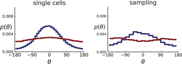
Distributions of parent-offspring direction angles θ for 3D simulations under volume and surface growth.
Direction angles are taken from single cells (left) and the 2D spatial sampling scheme (right, Appendix 1). Distributions of parent-offspring direction angles θ for cross-sections of 3D simulations of 40,000 cells at constant division rate , mutation rate , as well as cell death rate and under volume growth (red, ) and surface growth (blue, ), respectively. On the left, direction angles are determined for single cells (these curves are shown in Figure 2 of the main text), whereas on the right, we additionally apply a spatial sampling with 285 samples. The cell death rate is set lower in surface growth simulations because also the rate at which cell divisions take place is much lower under surface growth due to the reduced growth in the tumour bulk. This leads to frequent population extinctions at higher rates of cell death .
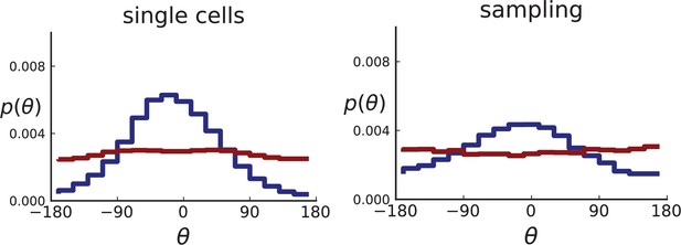
Distributions of parent-offspring direction angles θ for 2D simulations under volume growth (red) and surface growth (blue).
Direction angles are taken from single cells (left) and the spatial sampling scheme (right). Parameters are as in Appendix 2—figure 2 except that populations are grown to 10,000 cells, no cross section is taken, and individual samples consist of 20 cells.
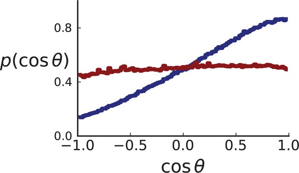
Distributions of parent-offspring direction cosines for single cells in 3D simulations under volume (red) and surface (blue) growth.
Direction angles θ are taken from single cells in the spherical tumour. Simulation parameters are as in Appendix 2—figure 2 except that no cross section is taken.

Distributions of parent-offspring direction cosines for the Li et al. 3D sequencing data.
Direction angles are computed from high-spatial-resolution (genotyped) samples of the tumours T1 (left) and T2 (right), after having applied the clustering scheme of 11 to obtain clones from the list of sample genotypes.

Distributions of parent-offspring direction cosines for sampling mimicking the spatial sampling of Li et al., 2022 of 3D simulations under volume (red) and surface (blue) growth.
Direction cosines are taken from samples in layers of 3D tumour hemispheres following the sample coordinates of Li et al. for tumour T1 (left) and T2 (right) for direct comparison with Appendix 2—figure 5. Simulation parameters are as in Appendix 2—figure 2, but no cross-section is taken. Volume growth shows a small downward trend, corresponding to a small radially inward bias. This may be due to the geometric effect discussed in Appendix 2.1 (Step 2).
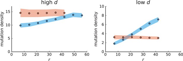
Mutation density curves for sampling in 3D simulations.
We show the mean mutation density within a ring of radius and width (see text). Each curve is averaged over 20 simulations, coloured ribbons indicate the standard deviations from the mean. For each simulation under volume growth (red, ) and surface growth (blue, ), we take a cross-section and apply a spatial sampling with 285 samples (high spatial resolution) as described in the text. The right hand side shows simulations with zero death rate . On the left, (relative) death rates are high, for volume growth and for surface growth (see also Appendix 2—figure 3).
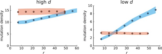
Mutation density curves for single cells in 3D simulations.
Same as in Appendix 3—figure 1 but for single cells under volume (red) and surface growth (blue) at high (left) and low (right) death rates.
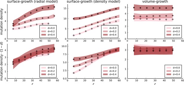
Mutation density profiles under different growth models.
The mutation density is shown as a function of the ring radius for the model of position-dependent surface growth (with a division rate Equation 2 nearly zero below the surface), for the density-dependent surface growth model, and under volume growth. Rescaling mutation densities by collapses the radial model and the volume growth model to a single curve. Settings for 3D simulations under all models are as in Appendix 3—figure 2: , , .
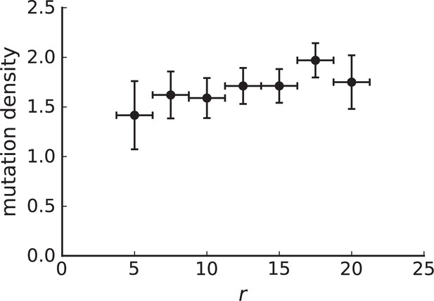
Mutation density curve of genotyped samples.
The 285 samples from Ling et al. that have been genotyped have a mean nearest neighbour distance of about 1.5mm. Choosing a ring width of 2.5mm allows us to define 8 rings around the samples' centre of mass. The horizontal error bars indicate that samples can fall anywhere in this 2.5mm window. Vertical error bars were estimated using the standard deviation of the mutation density under volume growth derived in the text , where we use the measured value of in place of to estimate the error. We found in numerical simulations that this yields a lower bound on the error in 3D simulations with sampling. The curve can be considered flat if the change in value is of the same scale as the error. Our null model is volume growth, therefore, a lower-bound of the error estimate favors rejecting flatness of the curve (the signature of volume growth), thus making the estimate conservative. The flat shape of the mutation density curve is again consistent with volume growth rather than surface growth. Rings at radius 50 (centre) and 450 (edge) contain only 2 samples each and were thus dropped.

Mutation density curve of tumour T1 (left) and T1-like sampling in simulations (centre and right).
The plots show mutation density for spherical shells at different distances from the tumour center. The left plot is based on the 153 genotyped samples from 9 slices of T1 that report the presence or absence of mutations found by whole-genome sequencing of 16 samples. The other two plots show mutation density as a function of shell radius in simulations of 3D spherical tumours under T1-like sampling. Within each simulation 16 samples are taken from 3 slices for sequencing and 153 samples from 9 slices to check for the presence of the detected mutations. The positions of slices and samples are specified by T1. Parameters of the 3D simulations are as in Appendix 3—figure 1.

Mutation density curve of tumour T2 (left) and T2-like sampling in simulations (centre and right).
The plots show mutation density for spherical shells at different distances from the tumour center. The left plot is based on the 151 genotyped samples from 6 slices of T2 that report the presence or absence of mutations found by whole-genome sequencing of 9 samples. The two plots for simulations (middle and right) are analogous to Appendix 3—figure 5 but with T2-like sampling.
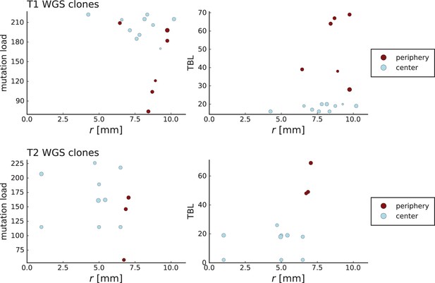
Clone sizes and terminal branch lengths (TBL) for genotyped mutations in Li et al. WGS samples.
The plots on the left (right) show the number of mutations (terminal branch length) of clones in the WGS samples of tumour T1 (top) and T2 (bottom) against the radial position relative to the tumour center of mass in mm on the x-axis. The size of markers indicates abundance of the clone within the sample and colors are determined by the classification of samples by Li et al. into “periphery” and “center”. Samples marked as peripheral have higher terminal branch lengths but in the case of T1 are not located closer to the tumour boundary than those marked as central.
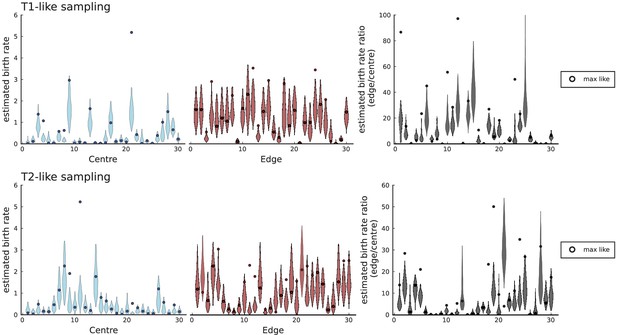
Birth rates for periphery and center inferred with SDevo from simulations of volume growth with spatial sampling.
We run 30 simulations in 3D to a population size at rates , , and take punch samples for deep sequencing at positions specified in Li et al., 2022 for tumours T1 and T2. We only call mutations exceeding a 0.3 cellular fraction threshold within a sample as specified in Lewinsohn et al., 2023 and use the template xml file provided by Lewinsohn et al. to generate inputs for the SDevo algorithm. Each simulation shows a violin plot of inferred birth rates (95% interval of last 500 sampled states of the MCMC-chain in SDevo) for samples labeled as ‘centre', samples labeled as ‘edge', and the ratios of the two rates, as in Figure 5 of Lewinsohn et al., 2023. A circle marker for each violin plot indicates the values at the maximum likelihood, which often falls outside the 95% interval of the last 500 sampled states.
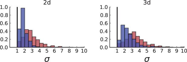
Dispersion distributions in simulations including spatial sampling — 2D (left) and 3D (right).
Histograms of the dispersion parameters under spatial sampling with 23 samples with a sequencing model mimicking the whole-exome sequencing of Ling et al. Samples are taken from populations grown to 10,000 cells in 2D (left) and cross-sections of 3D simulations of populations grown up to 40,000 cells (right). As in Appendix 2, we use the cell division rate , mutation rate , as well as cell death rates and for volume growth (red) and and for surface growth (blue), respectively (see also Appendix 2—figure 3).
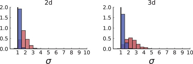
Dispersion distributions in simulations with sampling of single cells — 2D (left) and 3D (right).
Same as in Appendix 2—figure 2 but for single cells under volume (red) and surface growth (blue) at the same parameters .
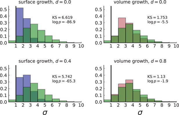
Normalized Kolmogorov-Smirnov distance between dispersion distributions of Ling et al. data and simulations.
Each frame compares the histogram of the dispersion values σ of subclonal mutations in the WES data (in green) to that of simulations in 3D with spatial sampling under volume (red) and surface (blue) growth at low and high turnover rates . Simulation settings are as in Appendix 4—figure 1, right. The KS statistic serves as a measure of distance between the two distributions with smaller values indicating that the data is more likely to match the model. The dispersion observed in the data fits with simulations of volume growth at a high rate of turnover (, bottom right).

Dispersion distribution of tumour T1 and T1-like sampling in simulations.
The left plot shows dispersion values of 308 mutations with frequencies larger than the frequency resolution based on the 16 WGS samples of T1. The plots on the right show dispersion in simulations of 3D spherical tumours under T1-like sampling, meaning that, from each simulation 16 samples are taken from 3 slices, where the positions of slices and samples are specified by T1. Parameters of the 3D simulations are as in Appendix 4—figure 1. The normalized KS statistic and log-p-value between the data and simulations are 7.272 / 7.267 and -105.1 / -104.9 for surface growth (low/high ) and 1.652 / 2.189 and -4.8 / -8.9 for volume growth (low/high ).
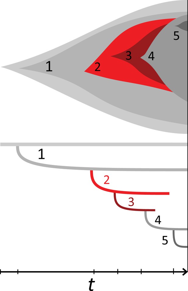
Example phylogeny and turnover.
This illustration shows a growing population of cells that accumulates 5 mutations, on the top showing the muller plot of the 5 clones’ sizes and below the corresponding phylogeny against time t. The growth rate is positive but under stochastic dynamics clones and clades may become extinct. The clones carrying mutations {1, 2} and {1, 2, 3} went extinct and their offspring clones/clades add to the clone/clade turnover, see text. Specifically,the clone {1, 2, 3, 4} lost its parental clone,similarly the clade defined by mutation 3 coincides with clade 2 and clade 4 in turn replaced both clades 2 and 3.
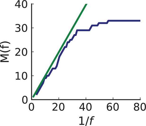
Cumulative SFS of WES data compared to prediction using inferred rates and .
The number of mutations with frequency larger than in the entire tumour against in genomically-resolved sequencing data (solid blue line). flattens below the allele frequency corresponding to the sequencing resolution, . The green line indicates the expected curve under neutral evolution for the inferred rates of mutation and cell death (Durrett, 2013) and provides a consistency check on our inference. Its slope is the scaled mutation rate .
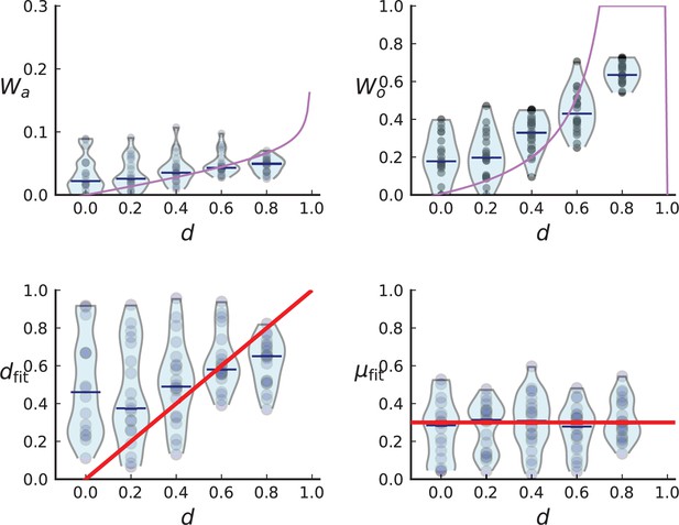
Turnover inference for simulated sampling from cross-sections in 3D over a range of death rates.
For each choice of death rate we simulate 20 populations under volume growth in 3D to 40,000 cells each and take a cross-section. Mutations detected in a first set of 3 samples are then probed for in a set of 285 samples and used to infer and .
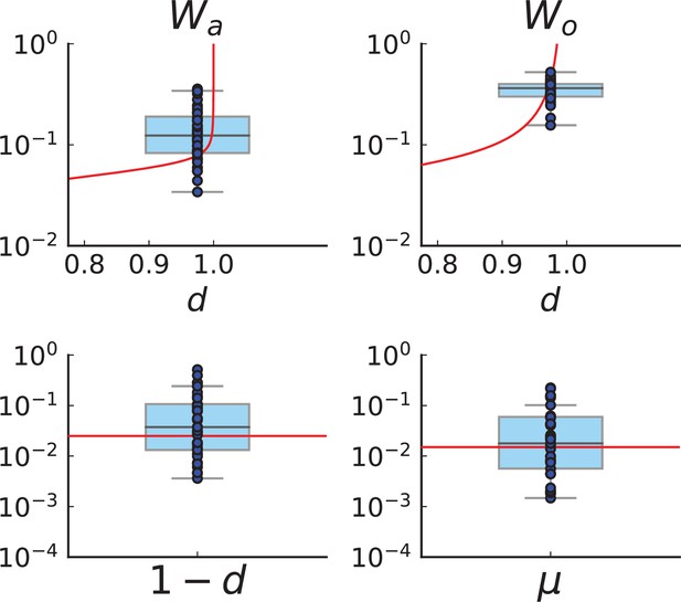
Turnover inference for simulated sampling in 3D at the rates and compatible with those inferred from the Ling et al. data.
We run 40 simulations in 3D to 40,000 cells at the rates inferred for the Ling et al. tumour, and . Spatial sampling is performed as explained in Appendix 1.2 and Appendix 5—figure 3. We plot the measured clade and clone turnover, (top left) and (top right), with the theoretically expected value as a function of d in red, and the inferred rates, (bottom left) and (bottom right), with the true value of the respective rate in red. The median of inferred rates is and , but there are substantial fluctuations around these median rates.
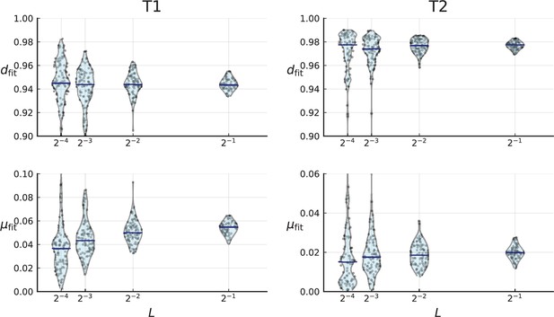
Cell death and mutation rates inferred from the clade and clone turnover measured on the clones of T1 (left) and T2 (right).
For a given we repeatedly subsample a fraction of the mutations, calculate clade and clone turnover and infer and for each subsampled set of clones (violinplots, individual samples are shown as blue dots). Blue bars indicate the median. Clones of T1 and T2 were determined using the LICHeE tool for clone inference in multi-region sequencing data, see Appendix 8.
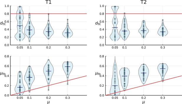
Turnover-based inference of cell death and mutation rates under 3D sampling of spatial simulations.
3D simulations are artificially sampled in a way that mimics spatial sampling, sequencing and genotyping in the tumours T1 (left) and T2 (right) by Li et al., as in Appendix 2—figure 6, explained in Appendix 2.2. Red lines indicate the true simulation rates. Under this sampling scheme, the inference of mutation and death rate fails, see text.
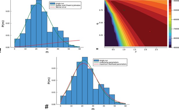
Inference on artificial data using the likelihood Equation 18 based on mutational distances.
For a concrete example, in a single run, a population is grown at rate of birth and rate of death with a genomic mutation rate from a single cell until the population size has reached cells. (A) The histogram of the mutational distances from the single population is shown in blue. The green solid line shows the corresponding distribution Equation 19, the red solid line indicates the distribution of mutational distances derived in equation (7) in Werner et al., 2020, see text. (B) The log-likelihood landscape defined by Equation 18 with the mutation rate on the -axis and the relative death rate on the -axis. The underlying parameters and are indicated with a green dot, the maximum of the likelihood landscape is indicated by the red dot. The likelihood landscape shows a pronounced ridge of high likelihoods. The ridge-like shape of the likelihood landscape means that there are many different parameter values compatible with the data that yield nearly the same distribution of mutational distances Equation 18. (C) The last point is illustrated by the distribution of the mutational distances: As in (A), the histogram of mutational distances is shown in blue, and the green solid line again shows the distribution Equation 19 at the underlying parameters and . The red line shows the the distribution Equation 19 at the maximum-likelihood parameters (near and ).

Inference using the likelihood Equation 18 on the the empirical data of Ling et al.
(A) The log-likelihood landscape defined by Equation 18 with the mutation rate on the -axis and the relative death rate on the -axis, on the basis of mutational distances between samples in the data of Ling et al., 2015. The maximum of the likelihood landscape is indicated by the red dot ( and ), the parameters previously inferred using the turnover of Appendix 5 () are indicated with a green dot (top edge left). As in the artificial data of in Appendix 6—figure 1, the likelihood landscape shows a pronounced ridge of high likelihood. (B) The histogram of the mutational distances from samples of Ling et al. is shown in blue. The green line shows the distribution Equation 19 at the parameters inferred using the turnover of Appendix 5. The red line shows the the distribution Equation 19 at the maximum-likelihood parameters.
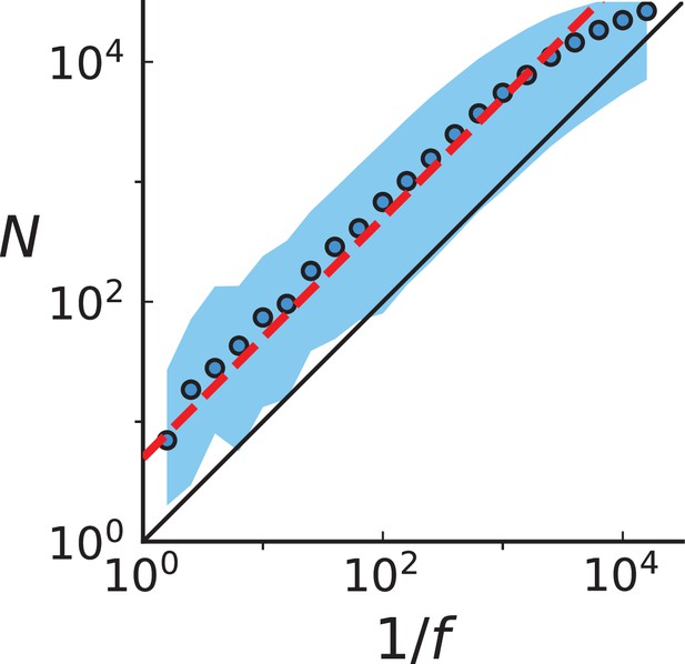
Population size at birth of a mutation with final frequency Circular markers show the mean population size for a given frequency bin.
The blue ribbon covers the 99th percentile. The red line shows the relation Equation 24 with the correction for fluctuating clone sizes, the black line shows the deterministic result Equation 21. Mutations were collected from 20 3D spatial simulations up to a population size 40,000 with birth rate , death rate , and mutation rate .

The effect of disregarding low-frequency mutations.
The mean mutational distances and their standard deviations (blue markers and blue error bars, respectively) are shown for populations grown to different sizes ( axis) at different relative death rates (left to right). In each of these panels, the orange markers show the mean and standard deviation of the mutational distance for a population of size whose low-frequency mutants with frequency have been discarded. For the effective population size we use Equation 24. Rather than staying constant as they would under Equation 21, the corresponding mean mutational distances increase with the relative death rate , and this increase is compatible with Equation 24, as seen from the orange markers following the blue ones. All quantities are averaged over 100 runs. Note that error bars give the standard deviations of the mutational distances, not standard errors.

Violin plots of model parameters (number of mutations per generation and relative death rate) inferred from different fractions of the mutations present in the Ling et al data.
Tables
Clones and their phylogeny from the Ling et al data.
Each row shows one branch in the phylogenic tree inferred by LICHeE for the Ling et al. data. Columns labelled ‘parent’ and ‘offspring’ show mutations of the parental and offspring clone, respectively. The mutations along the branch are the private mutations the offspring has gained, the difference between the two sets of mutations. ‘root’ indicates that the clone has no ancestor in the given set of clones other than the common ancestor to all clones which has the clonal mutations.
| Parent | Offspring |
|---|---|
| [30] | [30, 33, 34] |
| root | [30] |
| root | [22] |
| root | [6] |
| [23, 24] | [23, 24, 25] |
| [10, 11] | [10, 11, 12, 13, 14] |
| [23, 24] | [23, 24, 26] |
| [6, 7] | [6, 7, 8] |
| root | [3] |
| root | [15, 16] |
| [15, 16] | [15, 16, 17] |
| [6] | [6, 7] |
| [6, 7] | [6, 7, 9] |
| [15, 16, 17] | [15, 16, 17, 18] |
| [3] | [3, 4] |
| [30] | [30, 31] |
| [23, 24, 27] | [23, 24, 27, 28] |
| root | [10] |
| [30] | [30, 35] |
| [23, 24] | [23, 24, 29] |
| [23, 24] | [23, 24, 27] |
| root | [23, 24] |
| [3] | [3, 5] |
| [30, 31] | [30, 31, 32] |
| root | [1, 2] |
| [10] | [10, 11] |
| [15, 16] | [15, 16, 19, 20, 21] |
LICHeE-derived branches for tumours T1 and T2 of the Li et al data.
Each row shows one branch in the phylogenic tree inferred by LICHeE for the T1 tumour of the Li et al. data. Clones have too many private mutations to list and are therefore only numbered Clone numbers are given in columns ‘parent’ and ‘offspring’ along with the number of mutations along a branch (‘mutations’). ‘root’ indicates that the clone has no ancestor in the given set of clones other than the common ancestor to all clones which has the clonal mutations.
| T1 | T2 | ||||
|---|---|---|---|---|---|
| parent | offspring | mutations | parent | offspring | mutations |
| 15 | 1 | 32 | 4 | 1 | 2 |
| 15 | 2 | 25 | 3 | 2 | 14 |
| 13 | 3 | 8 | 8 | 3 | 6 |
| 8 | 4 | 7 | root | 4 | 20 |
| root | 5 | 68 | 11 | 5 | 4 |
| 20 | 6 | 6 | 7 | 6 | 16 |
| 19 | 7 | 30 | 1 | 7 | 27 |
| 9 | 8 | 10 | 11 | 8 | 17 |
| 5 | 9 | 56 | 8 | 9 | 7 |
| 13 | 10 | 3 | root | 10 | 38 |
| 20 | 11 | 6 | 4 | 11 | 56 |
| 16 | 12 | 19 | 7 | 12 | 10 |
| 21 | 13 | 10 | 3 | 13 | 2 |
| 9 | 14 | 14 | root | 14 | 39 |
| 7 | 15 | 57 | |||
| 5 | 16 | 35 | |||
| 12 | 17 | 12 | |||
| 21 | 18 | 11 | |||
| root | 19 | 46 | |||
| 8 | 20 | 14 | |||
| 22 | 21 | 9 | |||
| 12 | 22 | 18 | |||
| root | 23 | 2 | |||
| root | 24 | 55 | |||
| 22 | 25 | 10 | |||


